|
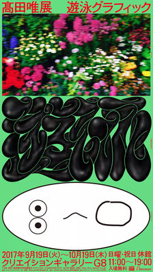
Yueran Li BA Graphic and Media Design My name is Yueran Li, a student who studies Graphic and Media Design at LCC, now is interning at Wieden+Kennedy London office. When spoken of how do you think of anti-design, it reminds me of the common way of how does advertising creative agency challenges people and make them think differently about something or some problems in advertising industry. For example, in an advertisement of Apple Pay, they didn’t say how good and how convenient about using electronic money, they flipped it to tell audience how dirty the cash is to encourage people using Apple Pay. In the same way, Anti-design is a good flip to make people rethink about design and embrace them thinking of design differently. What is anti-design? The opposite of conventional design, which challenges privilege aesthetic, good taste and constrained rules. Most of the people know The London Design Festival, but do you know there is a festival called “Anti Design Festival”? The Anti Design Festival was launched in September 2010. It was created initially as a direct response to the pretty commerciality of the London Design Festival. the London Design Festival was launched in 2003, the founder of the ADF thinks that it’s time for a change. More broadly, the ADF is a response to the cultural deep freeze in the UK which has been last for 25 years. "It will attempt to unlock creative fires and ideas, exploring space hitherto deemed out-of-bounds by a purely commercial criteria." said by the site of Anti Design Festival. The founder of ADF, Neville Brody said “We have forgotten why we are here. We have lost touch with what makes us tick, what drives us. That fire of creative possibility has started to die, and it is time to re-light it. The Anti Design Festival was born out of a need for change. A need for something new, ugly, scary and dangerous. We welcome no_use, no_function and no_fear. We welcome anarchy, without the stereotypical.” The discussion of design and anti-design is just like the discussion of beauty and ugliness. How to define what is beauty and what is ugliness? This question was addressed as early as 1993 in an article called Cult of the ugly, it claimed that: “For the moment, let us say that ugly decision, as opposed to classical design (where adherence to the golden mean and a preference for balance and harmony serve as the foundation for even the most unconventional compositions) is the layering of unharmonious graphic forms in a way that results in confusing messages.” Talking about the ugliness in graphic design, it reminds me of a new emerging graphic design trend called “New Ugly”. The Japanese graphic designer Yui Takada is an excellent representative. Takada’s work is totally different from traditional Japanese graphic design, such as the minimalist, which shows the characteristics of leisure, elegance and simplicity. These characteristics make Japanese design not only minimalist, but also contains Japan's unique and fascinating poetic realm. However, when you first saw Takada’s work, you will feel the aesthetic shock. Chaos, sloppy typography, crude graphics, strange colour schemes and careless layout do not connect Takada with Japanese design in the usual sense. However, there is no doubt that Takada's design is like an urchin challenging the traditional aesthetic system for the current graphic design.
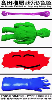
Left: Swimming Graphic (2015) Right: Yui Takada Exhibition: ding-dong bling-bling (2018) For the creation of Takada’s work, Takada found that the small advertisements on the street and the signs on the road have no sense of design at all, but are made purely for the purpose of "conveying" information, which makes him have to think about the idea of "whether I am too limited in pursuing neat things". There are too many people who just make things beautiful. So he wanted to explore a way to make the design more vivid. What he is seeking is ugliness itself, it is error itself. In order to promote people to rethink the aesthetic equality and tolerance of individual things. 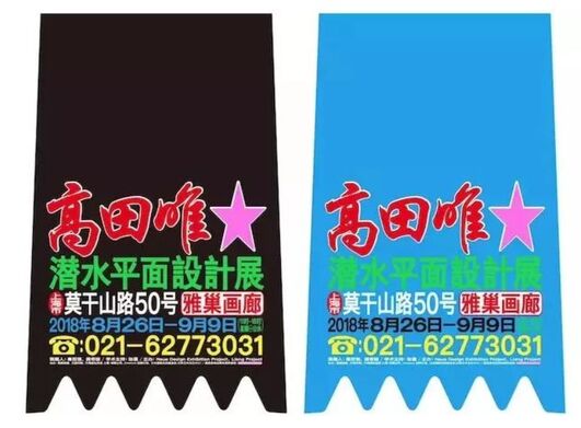  Above : Exhibition by Yui Takada, 2018 Below: Small advertisement on motorcycle fender and advertisement signs in China In Takada’s point, design is not only the pursuit of beauty in the world, a person who has not experienced formal design education and is not familiar with various design tools will sometimes make things more expressive, because their efforts to convey their ideas is beautiful in itself.
As I digging Takada’s work deeper, it seems like there is another really meaningful motivation behind Takata’s creation. In an interview, Takada mentioned that there was 30,000 suicides in Japan every year and he thought it was because of the unnatural way of working versus the way of thinking. It is a tendency among young people today to not fit in with the social rules created by adults. These things cannot be represented in images, but Takada wants to teach young people not to force themselves into society, but to be themselves. For a designer who wants to push graphic design forward, to kill individuality is to kill the greatest value. References Alex Bec. (2010) Neville Brody: The Anti-Design Festival. Available at: https://www.itsnicethat.com/articles/2931-neville-brody-the-anti-design-festival/ Cult of the ugly (1993). Available at: https://www.eyemagazine.com/feature/article/cult-of-the-ugly Justin Zhang (2018) Lesson in the "New Ugly School” of Design. Available at: https://eyeondesign.aiga.org/schooled-in-the-new-ugly-lessons-from-darius-ous-autotypography/ Ruth Jamieson. (2016) The New Wave of Anti-design Magazines Will Question Your Sense of Taste- and That’s A Good Thing. Available at: https://eyeondesign.aiga.org/the-new-wave-of-anti-design-magazines-will-question-your-sense-of-taste-and-thats-a-good-thing/ TDCDAY2020: Yui Takada / Presentation, Chiharu Watabe / Message (2020). Available at: https://www.youtube.com/watch?v=qnuIAW2IjII&t=383s
1 Comment
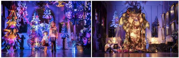
Hi, I’m Jill from Design for Branded Space. What is anti Design for me? How can we live in a world without any design? Sometimes I feel suffocated from an over-decorated room and the overflowing of information design on a poster. But sometimes I admired the sleek contemporary room and longing to look at something of context. For me It seems like there’s a love and hate relationship between designed product and design space. There isn’t a definite line of what design I like and agree with, it all seems to be based on my mood and the environment around me. Just like the Johnson Bank article about coping with irrelevance, there needs to be a connection between the real world and the design inorder to have impact. The many factors of why we may like one design over the other could be determined by our perspective. The shoe we stand in, creates a biased first impression we have towards a design. Just as a product like utensils that we use for eating. There is more than one side of perspective to a “design” product. From a designer’s perspective they may want the product to be sustainable, aiming at a specific age group, and is aesthetically pleasing. And from the user/buyer’s perspective, they may find the product not no lasting, and takes too much space in the kitchen drawers with the irregular shapes of utensils. And how about the marketing perspective? Is this product worth producing, and whose perspective should they deliver in the advertisement? What makes a product good or beneficial is pretty biased if we only view it in one perspective. Inorder to understand and judge a product we should look at it in multiperspective. And what I find is that I often overlook the intention of the designer when I am the designer myself. The rules of determining if the product is good by Dieter Rams’ 10 Principles of Good Design is a good guide to start, but what it all comes down to is the moral and judgement of the designer him/herself. Because who is to say the design is useful or aesthetic? Only when the designer clearly understands why they want to design can they determine if the design is good.  Inga Sempé designs Collo-alto cutlery set for Alessi - All of the pieces on the collection feature a long, narrow neck that links the heads of each implement to gradually tapered oblong stems.  Nendo creates kinked cutlery range for Valerie Objects- https://www.dezeen.com/2018/09/10/skelton-kinked-cutlery-nendo-valerie-objects/  Plastic: Government plans to ban single-use plastic cutlery in England-https://www.bbc.co.uk/newsround/58366984 During the time I was producing a set of utensils for Not Just a Shop, I encountered questions and doubts that emerged from research. My concept for the utensils is to encourage slow eating using sensory enhanced utensils, such as forms that allow food to stay on spoon and forks with shapes of hand. Being a creator and designer of an object for the first time has opened my view on how to take a perspective. It becomes more than absorbing what others have done to conceptualize your own thinking. During the design process of my utensils I often question myself of why would I want to make a knife hard to cut or a fork hard to hold. Who are the people that will buy this sort of product? Should I create an object that will fit the criteria set by the buyer? Or stay firm on my concept and produce an object which may trigger a new buyer? With all the thoughts flying around my head I finally tell myself to stop over thinking. If I were to consider all the aspects of how others opinion my product I would never be able to produce anything, instead of focusing on other’s perspective I should focus on my intention. My intention of creating the Eat. Slow. Utensils encourage people to enjoy food slowly, using sensory motion and texture to open the idea of experiment and experience in eating. By putting my intention first in the design of a product has helped me conceptualize my idea and add meaningfulness to the product. Even in a time where it’s hard to decide who and what you are designing for. Perhaps you already have your concept and intention firmly jotted down or maybe you still come to the same conclusion after a round of research. Don’t stop there, I think when we take time to look at how, why, and when we started we will see something that was there before but only now we see them.  Bibliography:
https://designmuseum.org/discover-design/all-stories/what-is-good-design-a-quick-look-at-dieter-rams-ten-principles https://thumbor.forbes.com/thumbor/960x0/https%3A%2F%2Fspecials- https://www.dezeen.com/2018/09/10/skelton-kinked-cutlery-nendo-valerie-objects/ https://www.wired.co.uk/article/experimental-gastronomy https://www.designcouncil.org.uk/news-opinion/what-do-we-mean-design Elisa Jonckheere
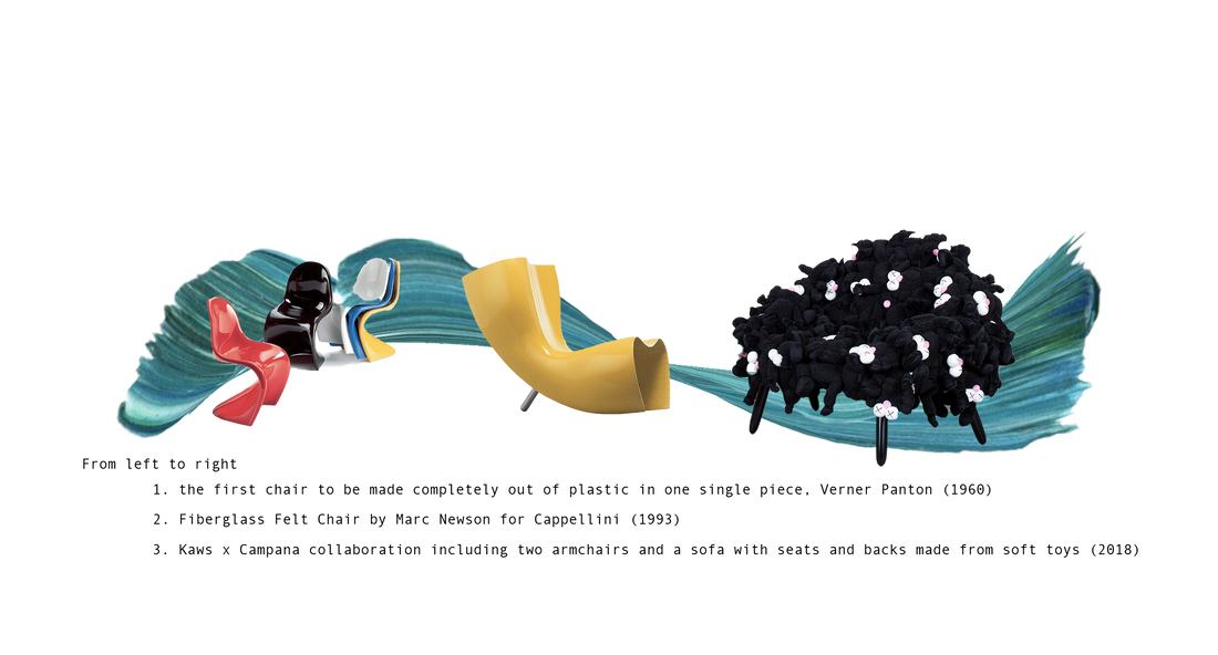
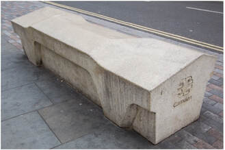
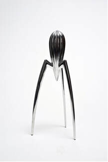
BA illustration and visual media No more individualism, youth wants to collaborate, to work together, helping each other for visibility. Many have and are suffering from working under the shadow of one name. There is only one individual who is being praised for his work and achievements, at least that’s how the fashion industry would like it to be but new designers find this to be old-fashioned as the industry still rules under criteria from the 20th century. They are seeking to reformed the industry that changed towards a more product selling and garments focus; fashion is now a financial institution. (Edelkoort, L. 2017) In the 80’s, Paris’ fashion didn’t see it coming with the arrival of the now-famous Japanese designers Yohji Yamamoto and Rei Kawakubo. Women wear worn by their untidy silhouettes with messy hair, flat shoes and no-makeup; the garments were the ones wearing the human figures. The two were said to be the ones that started the anti-fashion movements that went on until the 90’s with the Antwerp six. However Antifashion was nothing new, in the 1920’s Coco Chanel wearing trousers was already a hint to the movement. We could even go earlier in time with Elizabeth Smith Miller, an American advocate in 1800’s who is credited to be the first woman wearing pants. In the 90’s, antifashion was about deconstructions, constructions and disproportions but fashion is stagnating, Yohji Yamamoto, in 2012, states: “…Fashion is like air, we breathe air so naturally we will be influenced or polluted…”. Are the minimal deconstructed garments now a cliché? For Jeremy Leslie, it’s inevitable; trends are like viruses. Where the structure of a garment was explored in the past, we are now seeing young designers exploring textile, making their own rules, creating a new generation of antifashion designers which consequently took off during the first lockdown of COVID-19. As minimalism was its pick prior COVID-19; with its various moods over the years; fifty shades of beige, black and white, pastel, etc… which aimed for softness and calm atmosphere, we all ending dressing similarly. That sucked, didn’t it? Our clothes are meant to be reflection of our personality, some may also be a social, cultural or political statement but it felt like this was unachievable with brands that were all making look like items. On top of that let’s not forgetting the mass production, the ethical and environment issues that comes along those brands. Fashion house becoming conglomerates lost their independence to lead change. During the pandemic, people were isolated thus trying to find ways to keep busy, I could give you some examples, experimenting new hobbies, going through old stuff, cleaning their clothes,…and finally finding their grandma’s old dress. And then hits them, their grandma’s dress is now their new pants, they just created an unique piece that only them will own but moreover it’s sustainable which leads them to realizing the potential here. One thing that did not stop over the pandemic are social medias, on the contrary, they expanded, new accounts opened sharing their fun creation that were not following any conventions from the fashion industry nor any trends that were going on, the new wave of antifashion was created itself. Aside, from young designers recycling already exciting materials, some saw the potential in textile, a long forgotten craft in fashion. In the recent years, research on new materials that are environmentally and socially engage have been experimented with to design ne empowering garments that interact and embrace our bodies. An example of this would be the Rui Zhou working with knits and creating seductive pieces and states “love what makes you, you”, launched in 2019 Rui understand the cultural dispute about skin and nudity. Anti-fashion reflects on the current state of our world, on its current crisis whether they are political, social, environmental or cultural. The Vanilla issue, is another case that conveys contemporary antifashion. The online magazine promotes, with the use of Instagram, unconventional young designers making a fool of trends and fashion. Minimalism has not place at this instant, the audience wants ugly, provocative, cheap and nasty looks, a reflection of the population’s opinions on the current crisis the world was/is living. Colors are reintroduced, excessive and extravagant, goodbye to the “less is more” attitude and hello to “more is more”. Womenswear was discussed a lot but menswear is also looking at progression as well, with more playful silhouettes and colors that not only capture aesthetics but social engagements. The term “menswear” is actually wrong for me to use as we are now seeking for genderless designs, inclusivity is an inhouse rule rather than a requirement. Contemporary antifashion is not restricted to design; making fashion accessible to a wider audience; rethinking production methods; reinvent retailing; remove the classification of gender,… The pandemic had the population rethink their dependence, consumerism, and routine. Minimalism might have been mirroring these, where new designers might felt compel to produce over the top end product. We were on the look for distraction, they gave it to us. Their work are insightful, considerable and mandatory to our culture. We can give end note to Gucci is constantly reinventing its customers’ interactions with the brand, marketing and advertisements appreciably considerate, and noticeably expanding since COVID-19. Ong, J. (2020). “Gucci is constantly in transition so the brand is open to anything”: Ivar Wigan on his sci-fi fantasy interpretation. It’s nice that [online], Available from: itsnicethat.com [accessed 4 December 2021] Porter, J. (2019). ICA opens major survey of maximalist art and design on June 26. Institute of contemporary art Boston [online], Available from: icaboston.org [accessed 2 December 2021] Edelkoort, L. (2017). BofVOICES : Anti-fashion: A manifesto for the next decade. The Business of Fashion [video], Available from: youtube.com [accessed on 3 December 2021] Nicklaus, O. (2012). Antifashion. ARTE France, Lalala Productions [video], Available from : distribution.arte.tv [accessed on 3 December 2021] Jamieson, R. (2016). The new wave of anti-design magazines will question your sense of taste – and that’s a good thing. Aiga Eye on Design [online]. Available from: eyeondesign.aiga.org [accessed 2 December 2021] Steph Harrison-Baker - BA Graphic Branding & Identity I’m a Graphic Branding and Identity student currently working as a designer at Jellyfish, a global digital marketing agency which connects people and brands through multiple different digital platforms. Due to the COVID-19 Pandemic, no matter where you are located in the world, you will have experienced a lockdown at some point in the last 18 months. It is hard to imagine the world without a set of rules for almost anything now but there once was! As much negativity and disruption, the Pandemic has brought in our lives, there are many positives which have been brought about by it. One of the positives of the Pandemic has been our ability to adapt. More than ever, technology now plays a significant role in our everyday life. In times when we were unable to visit museums, fashion shows and exhibitions, they were brought to us virtually. New ways of working, travelling and socialising are now the ‘new normal’. Will we ever go back to the old ways? The London Fashion Week is an example of how such a prestigious event adapted to the situation for the better. The LFW is one of the most iconic fashion shows in the world and as a result of restrictions in the UK, it was broadcasted virtually for the first time in history. This was the first time a fashion show had ever been made into a digital event especially at this scale. This year “anyone could grab a front-row seat straight from their device’ (Lalonde, 2021). This fashion show pushed boundaries in all ways possible using technology but also in many other ways too as it combined both womenswear and menswear into one show whereas previously these had been separate shows. Is this anti design or is it just breaking the ordinary and developing new ideas? When relating the idea of ‘anti design’ back to my design pathway of branding whilst continuing to look within the fashion industry, it is hard not to notice similarities and trends in fashion houses logos. In the article “The Rise of the Anti-Brand” the author, Mandana identities that many of the top fashion houses have undergone rebrands recently whereby many of the top fashion brands now have very similar logos. For a long period of time a logo was the heart of a brand, it allowed people to differentiate brands, allowed customers to gain an insight into the heritage of the brand and to gain a sense of the brands values and tone. However, in recent years brands have “emerged from their re-design with a minimal, black on white, sans-serif (Helvetica, is that you?) – not really) logo, losing all distinctive qualities that their previous brand identities may have had” (Mandana, 2019). As a result, brands wordmarks are becoming more visually aligned allowing for customers to shape the brand through their interactions with the brand. Some could argue that this is removing the design from the brand however I believe that this is just a trend which these companies are currently following as it is fashionable. 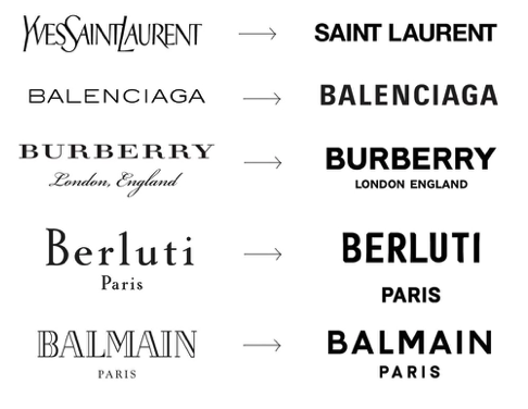 (Mandana, 2019) Anti-design is a movement which emerged in Italy in the 1960s where designers rebelled against the status quo of the more traditional modernist designs and broke the rules to create unique and less traditional things. An example of this which Charles Moffat explains in the article ‘Anti-design’ is the Panton chair designed by Vernor Panton in 1963. This piece of furniture is deemed to be the hero image for anti-design as the aesthetics of the chair had never been seen before. The unique S Shape of the chairs breaks all stereotypical designs of what a chair should look like. But why should a chair have a set aesthetic? 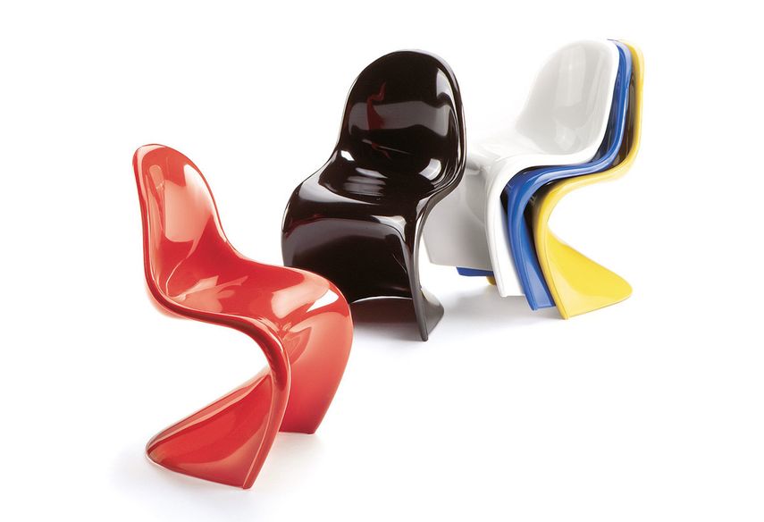 Charles Moffat (2011) My primary role as a designer at Jellyfish is App Store Optimisation where I optimise companies’ creative assets on both the iOS and Android App Stores. There are set specifications I have to adhere to when designing these creatives such as size requirements for them to be approved by Apple and Google. However outside of those ‘rules’ I have the creative freedom to design the creatives. I would say that this to me allows me to have creative freedom, especially in the brainstorming stage of the process. Is this ‘anti-design’ or is this the natural role of a designer to create new engaging ideas
Overall, I don’t believe that there is a difference between ‘anti-design’ and ‘design’ as they are the same thing. To me, design should allow for creative freedom. I believe that design is creative, and you should be allowed to create whatever you want. From an early age, I was always told that when it came to art there was no right or wrong. You are the designer and you have the freedom to make the design as unique as you want or to follow the latest trends. There will always be trends, whether you work in fashion, marketing or branding but the only way new trends are formed are by someone breaking the current trend. This isn’t anti-design this is called being creative and having your own ideas. References: Lalonde (2021) Highlights from London’s first digital-only fashion week https://www.deptagency.com/en-gb/insight/highlights-from-londons-first-digital-only-fashion-week/ Mandana (2019) The Rise of the Anti-Brand? https://medium.com/@sleeplessinldn/the-rise-of-the-anti-brand-bb154c8caf2c Moffat (2011) Anti Design http://www.arthistoryarchive.com/arthistory/antidesign/ Evangeline Cousins, BA(HONS) Design for Branded Spaces Prior to this assignment, I was admittedly unaware of the phrase, nay movement, of ‘Anti-Design’. Through research, I now understand that this sector of design, which spans across all industries, dates back to Italy in the 1960’s. Emerging as a criticism of consumer culture and statement on the excesses of Italian design and the continuous drive for novelty, in my opinion, anti-design remains a creative direction today. 
|
Archives
December 2021
Categories |
 RSS Feed
