|
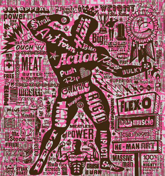
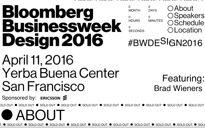
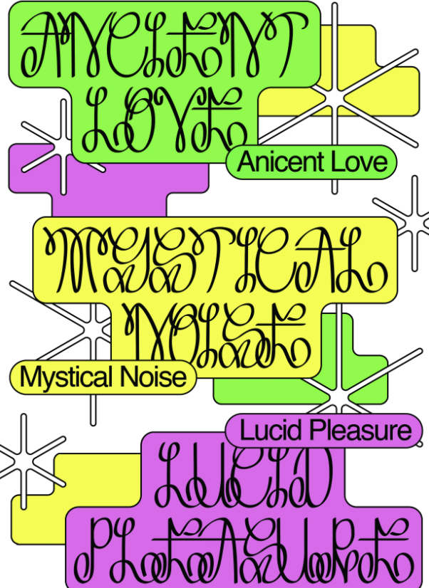
Ruth Kruger - 19021057 Through my new venture into the industry, I have seen the way that advertising and design can be overused in order to market a brand or product. The market for advertising and the market for overconsumption are often two sides of the same coin. In the effort to stop climate change design also has its part to play. Anti-design can be seen as a way to break the current mould; allowing younger generations to have their say. “Recent events of 2020 have also caused this uprising in anti-design…looking back through the years art has always been a reflection of society” (Satori Graphics, 2021) We can attribute this rise in anti-design to the disillusionment of the youth during 2020. Covid not only caused a massive shift in the economy and day to day life but also political unrest. I believe that anti design has now become a tool for these disenfranchised youths to reintroduce politics, socio-economic issues and ‘taboo’ opinions into design. This element of rebellion is not without cause and is probably why this movement is so intriguing. However, I do believe that you have to be aware of some of these rules before you break them. Similar to its comparison to brutalism, anti-design focuses on user disruption instead of integration. “Web brutalism is inspired by the brutalist architecture of the 1950s. Brutalist buildings are characterised by their heavy and ‘ruthless’ appearance.” (Moran, 2017) Just as brutalism focuses on the idea of form over function, anti-design uses basic blocky elements, clashing colours, illegible type and outdated icons to assault the eyes and gain a reaction from the user. We often design things to be palatable to a general audience while this new wave of online protest disrupts that. “Anti-design has provoked resistance in the UX community, because in many ways its goals feel like the antithesis of UX design.” (Fagerli, 2019) The antithesis of UX design is particularly interesting to me because of the specific rules we as designers follow in this particular area. Legibility, harmonious colours, clean and easy to navigate platforms have become the new predictable face of almost any major company. This is considered design purity – following these rules will lead to a ‘good design,’ Following this narrative of purity in design culture - is the real reason there is such pushback on anti-design because it doesn’t follow the rules or because it moves us away from this over designed over saturated market? “Retro and Vernacular design gave graphic designers liberation, creative freedom, a freedom to be personal and intuitive, and a willingness to go against modern design standards of the twentieth century.” (Willets, 2019) Just as many designers in 90s New York went against the tide by using “old, ugly and unreadable” typefaces, we should see this new wave as a response to the overly corporate world of design. I do believe that people respond far more to humanising elements of design which is why we often see these ‘retro-resurgences.’ Just like then designers pushed back on what was deemed improper design- “because they began their careers on formal purity and typographic refinement” (Willets, 2019) we see pushback now against this movement because it doesn’t follow the standard definition of design. Having worked for a few places now I have found that companies claim to want something ‘original’ but end up asking me to replicate the same design that everyone else is using. I understand why, if you see other companies implement something successfully there’s no need for you to test the waters yourself. However, this has led to “corporate design” or what I like to call the fruits of capitalism. “The pursuit for ever-increasing conversion rates, ever-shorter time for the user to find information and ever-optimisation of everything that is measurable in the short-term, creates a bland, dull and uninteresting experience.” (Fagerli, 2019) This is not to say there isn’t value in this type of design, just that it suffocated the industry and leaves little room for growth. I have often found myself removing my creative visions or quirks from works because it wouldn’t fit with a company’s image, only to realise how generic the image I’ve created actually is. Corporate design takes away this intrinsic human element that I look for in design. Just as people appreciated the resurgence of 70s fonts in the 90s where Helvetica had once reigned supreme, anti-design now has the task of showing us the irony of our over streamlined ‘perfected’ design today. There are many artists with growing popularity online that I resonated with such as Callum Abbot’s work. Abbot uses a mix of 2000s and early 90s graphics, bold, squiggly and almost illegible type to create this gradient, windows wallpaper, flip phone mess. His work feels so fresh even though it uses recycled elements. “He found himself sacrificing any actual function of illustration in favour of “communicating the themes of the article,” instead plastering his work “amorphous blobs,” 3D bevels and ecstatic neon colour palettes.” (Bennet, 2020) It’s such a stark contrast against the most amenable colour and type approach of larger design agencies such as Pentagram who focuses on minimal accessible but also well executed design. I think it’s easy to disregard Callum’s work when comparing it to our usual Instagram feed of minimal branding but there’s a certain charm to it that I can’t shake. In my own work I feel as if I’ve been trying to achieve something more palatable and leaving elements considered too bold for client work behind. I think as designers we should be challenging what ‘good’ design really is constantly…otherwise it’s just boring. Overall, my take if you will is that design should be an ever changing beast, there’s always going to be elements that we dislike and others we are drawn to. But the value in anti-design is that it gives designers a voice and shows how graphic design is an art form before it is a commercial weapon. Bibliography : Satori Graphics, 2021. Will ‘ANTI DESIGN’ Takeover The Graphic Design World!?. [youtube video] Available at: <https://www.youtube.com/watch?v=Bv7a3TcxugQ> [Accessed 1 December 2021]. Moran, K., 2017. Brutalism and Antidesign. [Online Article] NNGroup, Available at: <https://www.nngroup.com/articles/brutalism-antidesign/> [Accessed 1 December 2021]. Fagerli, I., 2019. Why does everything look the same?. [Online Article] UX Collective Available at: < https://uxdesign.cc/form-is-function-9a58e9f8bb75> [Accessed 2 December 2021]. Willets, B., 2019. Breaking design purity. [Online article] Medium Available at: <https://medium.com/@brandywilletts/breaking-design-purity-57bef84a81f8>[Accessed 2 December 2021]. Bennet, H., 2020. Callum Abbott on "egalitarian" design, the age of the internet and his striking speculative practice. [Online article] It’s Nice That. Available at: < https://www.itsnicethat.com/articles/callum-abbott-graphic-design-111120> [Accessed 1 December 2021].
1 Comment
Robert Urquhart
1/6/2022 07:10:57 am
interesting that you say that younger generations have the chance to speak through anti-design - i wonder what is non anti-design not doing to give voice - as you say climate change needs to be voiced - and consumerism needs to be addressed - what can design do to help this - indeed, what can we all do?
Reply
Leave a Reply. |
Archives
December 2021
Categories |


 RSS Feed
