|
Author: Natasja Derry Hey stranger! My name is Natasja and I’m studying Design Management at LCC while working in Copenhagen for my placement year. As a Visual Communication intern, I’m intrigued to understand how anti-design affects my practice and how it compares to the Danish attitude towards design. What is anti-design? Anti-Design was a design flow and style art movement originating in Italy and lasting from the years 1966 - 1980.[1] It eschews traditional design principles and conventional aesthetic tastes. It challenges us with asymmetry, clashing colours, bare interfaces, crowded elements and stark typography.[2] According to 99Designs[3], the movement is resurfacing after the lingering pandemic as a response to society being conformed to the lockdown rules.
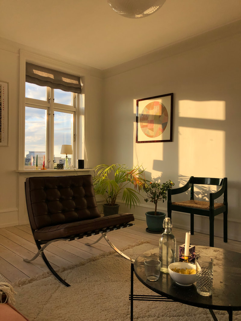
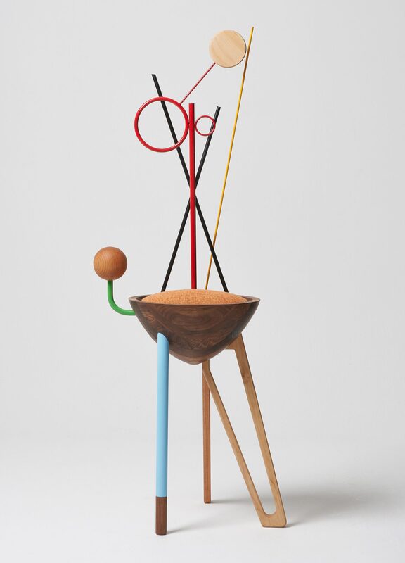
Above is a picture I took from my friend’s apartment – two twenty-year-old students live here and have brought their designer collection together. I personally haven’t come across students flats looking like this. Therefore, the temporary purchase mentality in Anti-design contrasts to the Danish mentality of investing. In my personal opinion, I agree with the Danish Modern values of investing to avoid creating more of a waste culture.
How does anti-design fit into my current job? I work in a corporate company where ‘kitsch’ and ‘bizarre’ graphic design is frightening and most certainly avoided. Novo Nordisk is a global healthcare company which prides itself in being a leader in the world of insulin and diabetics. Therefore, their CVI consists of neutral colours, a simple font and a limited photo library which communicates to their stakeholders that they are serious and compliant with medical laws. To give an example, I was recently designing thank you cards to their employees and I followed the CVI guidelines, except for one line where I chose a different font. This caused a 25-minute discussion amongst the team as to whether we could do this. Although this seems trivial (I for sure struggled to take the conversation serious) it all amounts to a shared brand identity.
Anti-design is fun and engaging, however it should only be implemented if it is appropriate in the situation. Furthermore, as a Visual Communication Intern, I need to learn and understand the rules in designing graphical content to recognise when one can break them. In conclusion, anti-design would trump the Danish Modern lifestyle as it so heavily rooted in the Danes, however there are elements that could help encourage creativity and innovation, especially after 2 years in lockdown. It’s important to understand who you are communicating to and if the principles of anti-design would catch their eye. For my next internship, I’ll be interacting with a much
1 Comment
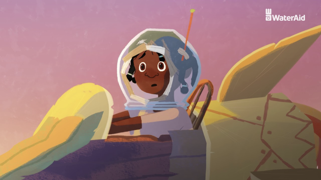
Megan Cox, IVM real | imaginary Real = existent, factual or authentic. Imaginary = fictional, pretend or fabricated. As an illustrator, animator and visual storyteller, I believe that narratives, being stories and the way in which they are told, are the most influential part of design. Whilst contemporary storytelling as a design, is the worldwide sharing of new knowledge, ideas and perspectives, I believe a good design should make a positive impact on communities or individuals. Although what is considered a ‘good’ story is subjective, we can compare how positive change results from the design of real and imaginary stories, communicated through advertisement, social media and illustrated narratives. I find charities display the greatest willingness to create positive change. ‘WaterAid’ has strongly expressed their targeted issue and goals facing lack of access to the basic human rights of sanitation and clean water, through advertisements including ‘No Choice’ and ‘The Girl Who Built A Rocket’
The ‘No Choice’ ad greatly impacts the audience by showcasing the daily struggles of the community, the deliberate inclusion of the people’s names and the urgency in their slogan. The intention of these factors are to build sympathy from the audience. However, the method storytelling through ‘guilt-tripping’ is considered an unappealing design, especially in western countries, where it has becoming normal to believe that the realities of these adverts are exaggerated or staged and people will therefore dismiss the truth of problem and forget the original purpose of the advert. Furthermore, I think ‘The Girl Who Built A Rocket’ presents a mixed reality. Animation is a form, or anti-design, in itself that requires the fabrication of characters, setting and style, yet it still succeeds in conserving the original purpose of inspiring positive change. By highlighting the campaign in a positive way, it encourages audiences to get involved and allows them to empathise rather than sympathise with the character. I feel although the creative ownership of the animation is choosing to hide much of the real suffering that takes place, this imaginary narrative would more likely encourage a western audience into wanting to make a positive difference. education | entertainment “Good design is honest.” – Dieter Rams “Good design motivates.” – Otl Aicher Aicher’s quote intentionally distinguishes the idea that good design should motivate rather than inspire. Relating this to storytelling, we can understand that the best narratives should provoke action over thoughts alone. In correlation with Rams’ quote, I think real stories are more likely to do this, because people will strongly empathise with honest experiences faced by those living in their same reality. Social media is a space that holds constant conflict of what is real and imaginary, or in other words, honest and fake. The article, ‘Welcome to the TikTok Economy’ in Fortune Magazine, describes TikTok as ‘something radically different’, because the platform and the type of content shared within this space, can be viewed as a design system that opposes the negative effects of social media. Instead of feeding the cycle of false self-expression leading to and from perceptions of social standards, the article emphasises that TikTok is a space for anyone to be their authentic selves and not be ashamed or judged but rather feel like they are part of a worldwide community of diversity and acceptance. The ability TikTok users have by taking part in trending content and ownership of sharing their own stories, doesn’t require one to go against the crowd, as anti-design and most social platforms employ, but instead celebrates authenticity and brings about more positive mental wellbeing. Furthermore, trending content is also greatly affected by stories from entertainment industry. For example, the recent fictional TV series, ‘Squid Game’, became a worldwide phenomenon, influencing fashion, games and the growing viewers of Asian media. However, I think that although there is importance in popular culture and entertainment, the widely shared news of the murder of George Floyd has set off a much bigger positive impact of the BLM movement. When faced with the question of what is more important, there is no doubt that the sad but true story of Floyd’s murder has resulted in necessary ongoing activism towards positive social change for underrepresented communities.
Overall, the line between what is real and imaginary is exactly where most narratives sit; our reality is sometimes falsely expressed or not exposed in its entirety and imaginary spaces will always reflect parts of the real world. The creativity and scope of imaginary worlds can engage and motivate us in ways the predictability of the real world expressed in visual media most often cannot, offering greater chance for growth and mitigation of future scenarios. However, in the present, I think that honest stories have immense power to activate positive change that will last, both within individuals and communities across the world. Baumartner, J. (No date) Imagination Is the Root of Innovation. Available at: https://www.creativejeffrey.com/creative/imagination_innovation.php?topic=creativity Domingo, M. G. (2020) Dieter Rams: 10 Timeless Commandments for Good Design. Available at: https://www.interaction-design.org/literature/article/dieter-rams-10-timeless-commandments-for-good-design Dunne, A. And Raby, F. (2013) Speculative Everything: Design, Fiction and Social Dreaming. Cambridge, MA: The MIT Press. Hawkins, Alex. (2021) What’s Driving Squid Game’s Success?. Available at: https://www.stylus.com/whats-driving-squid-games-success O’Brien, J. M. (2021) ‘Welcome to the TikTok Economy’, Fortune, (October). Scrypto (2017) WaterAid Promotion | Donate Now! No Choice TV advert. 14 August. Available at: https://www.youtube.com/watch?v=xdJeCefyGMY Studio Guerassio. (No date) Inspiration vs. Motivation. Available at: https://www.studioguerassio.com/inspiration-vs-motivation/ WaterAid (2021) The Girl Who Built A Rocket. 8 February. Available at: https://www.youtube.com/watch?v=lmBp2-t38Mw Michael Williams - BA Graphics & Media Design As I stumble on Anti-Design, the articles proclaim the movement as one of the crucial aspects to challenge any system that exists regardless of the consequences. However, to others, they declare to speak for a right cause. In my defence, I believe Anti-Design both have a carnage but with the right reasons. Figure 1: Rocket Bunny Nissan 240SX (S13)My first example is a Japanese auto modification called Rocket Bunny. They are known to design wide-body kits and are operated by an engineer named Kei Miura. With no degree of manufacturing, Kei Miura was self-taught as a designer (Speedhunters, 2014). He wanted to challenge the performance and the look of standard manufacturing kits by designing his unique wide-body kits on the Nissan 240SX (S13), whereas his idea was to remove the rear bumper as part of his design. He argued that he heard that most of the power came from the rear end, so he thought to improve it, why not remove the bumper completely? (Speedhunters, 2014) Since then, Miura's crazy idea shifted to be an iconic figure in the racing community. Here communicates that sometimes it is best to remove an item to improve the product. Figure 2: Rocket Bunny logo designed by Kei MiuraWith his logo, he expresses the rebel culture of racing. The design replicates a hand sign that usually states the word “perfection”. However, you will be beginning to question why the hand is not flipped the opposite way to replicate the letter B of the word Bunny? With you not knowing the design is indicating that the design body kits are not mainly for legal racers yet their look and style is so creative it will be illegal to dislike it. Figure 3: Images of the Carnival of Crisis parade, 2021Another great example is Carnival of Crisis which is a two-week conference in response to COP26 (Fashion United, 2021). Artists and art colleges have joined together to create the impact by designing prints on posters and flags, plus taking to social media about the awareness of not acting now. To some extent, this might be a good cause due to the materials that they are using. When I was contributing to their workshop, I have noticed they used materials that mostly came from second-hand products and waste clothing. This process challenges the art culture by using sustainable resources to change the environment. Figure 4: Designs symbols for Carnival of Crisis, Michael WilliamsAs a response to Carnival of Crisis, I designed a symbol to resemble their message while having the same strait edge rebel approach. The design is a smiley face with one eye as a dot while the other is a circle. This is to show the characteristics of what they are about. Beneath it is a hand sign symbolising love. I wanted to show that even though the movement seems different they are protesting and speaking out for the love of the environment and the people of the future. In conclusion, what respects these designs and artists is the interest in taking risks without defining other people’s thoughts and opinions. Is the willingness to have your voice be heard loud enough for others to listen and to do it by any means necessary. For some, this might come off as disruptive and inappropriate but for others is a new way of bravery and thinking outside of the box. Recourses
|


 Artwork by Nejc Prah via nejcprah.com |  A screenshot from the ‘Remi Wolf - Hello Hello Hello (Polo & Pan Remix)’ music video |
In my current internship I find myself facing a predicament in which I must adhere to brand guidelines that are misaligned with my own creative vision. I’ve had to overcome this by learning to detach myself from the corporate designs I create, and set aside time for me to pursue personal projects that are fulfilling in ways my day job is not. These personal projects are, naturally, the opposite of what I make at work. But however hard I may try to keep these two sides separate, it is an inevitable fact that they will influence each other eventually. Themes of anti-design will creep into the works of graphic designers stuck behind office desks, and the cycle continues on.
In conclusion, design and anti-design are two sides of the same coin that's in a constant state of spinning through the air, influencing each other and moving at the same trajectory, yet forever opposing the other. They are reliant on each other, but they will never see eye to eye, and they’re a lot closer to each other than they may think.
In conclusion, design and anti-design are two sides of the same coin that's in a constant state of spinning through the air, influencing each other and moving at the same trajectory, yet forever opposing the other. They are reliant on each other, but they will never see eye to eye, and they’re a lot closer to each other than they may think.
Bibliography:
- 99designs. 2021. 12 inspiring graphic design trends for 2022. [online] Available at: <https://99designs.co.uk/blog/trends/graphic-design-trends/#5>
- Jamieson, R., 2016. The New Wave of Anti-design Magazines Will Question Your Sense of Taste—and That’s a Good Thing. [online] Eye on Design. Available at: <https://eyeondesign.aiga.org/the-new-wave-of-anti-design-magazines-will-question-your-sense-of-taste-and-thats-a-good-thing/>
- Martinique, E., 2016. Anti-Design Movement - Aestheticism of the Modern Era | Widewalls. [online] Widewalls. Available at: <https://www.widewalls.ch/magazine/anti-design-italian-movement>
- Moffat, C., 2011. Anti-Design - The Art History Archive. [online] Arthistoryarchive.com. Available at: <http://www.arthistoryarchive.com/arthistory/antidesign/>
- Moran, K., 2017. Brutalism and Antidesign. [online] Nielsen Norman Group. Available at:<https://www.nngroup.com/articles/brutalism-antidesign/>
- https://www.lingscars.com
Avanti l'Avant New
Gìgì Gregory / Artist & aspiring art director / BA Design for Art Direction
Anti-design has enticed a new generation of creatives to push forth the potentials of ‘the before’ as the 1960’s movement has returned to fuel our souls with a sense of faith for our present and future. Critically analysing the way the world was at a pre-pandemic state, we are now ready, as global survivors, to reprimand and repair the precedent dereliction of societal systems with the forceful will to re-place a universal loss with a different approach in designing our reality. Indeed a new way of seeing what we once saw before.
In the same way the Italian anti-designers critiqued the Modernists for their form-following-function mindset, young people, despite their immanent battles with increasing mental health issues corroded by COVID-19, are directly backtracking the mixed messages scattered by governmental bodies, re-designing visual messages to convey their own truths of today. As a result, we are witnessing a tidal wave of expressionistic actions that are rewriting the rules of design which are simultaneously reflecting the condition of post-pandemic citizens. Anger, delusion, disappointment and death have internationally corrupted the propositional opportunities of the years we were looking forward to and left nations with a void of mistrust, even for those who passively accept the wrongs of the world through matter of habituation and quotidian ignorance. A worldly peace has been disturbed and creatives have shifted their energy towards the rebellious and revolutionary appeal of anti-design to regenerate the power of their voices.
With complexity and digital compoundness, young designers are eager to break the rules of graphic design with a newfound attention to distortion. Ironically, in opposition to today’s convulsed contradictions, the intricate aesthetics in anti-design, that may seem illegible at first, promote the viewer to multiple legible opportunities, opening a utopian gateway for intuitive creativity. Through this approach, the simplistic essentials of design that our eyes are used to, are being re-evaluated and re-designed through the ‘Anti’, consequently bringing the art of perception into a futuristic foreplay for those of analytical nature. Those who we define as ‘young thinkers’, known for their constant questioning of everything defining quotidian life. Those young catalysts.
The known to be strange and misunderstood beauty of anti-design is lost in its so called ‘ugly’ translation. Unfortunately for some, the challenge of looking beyond an initial perspective, a first point of view, distances the viewer from the more profound concept of anti-design, it’s power to create change, to cause action. This ‘ugliness’ has been conceived as a form of rebellion and for this reason it is almost impossible to ignore the unapologetic boldness of anti-designers. We welcome this energetic movement back into the present because now, more than ever, we need people to notice the un-noticed, to see more than what meets the eye and to interrupt the nonchalance attitudes of compliant acceptance. Lives have been lost because some questions were never asked, never answered, so this is the time for the youth to bring forward what was part of the past, what was in the ‘before’, in a controlled distortion of context. If we are failing to control the hands that are responsible for what we have lost, then as creatives, we will train the public eye to look further into the authenticity of authority and to look at themselves through how they view the object. Traditionally, just like the original anti-designers, we are subverting roles.
I believe one of the biggest misconceptions of rebellion and anti-design is that to be Anti, is perceived as being aggressively against, however, Anti is pure opposition and to oppose what is it that makes our now, is to understand what will make our tomorrow. I’ve heard the disputation around the possibility of Anti-design passing over like a pattern or a trend, but I believe it is because of the Anti in our ways of thinking that we remain relevant and that we manage to repair, to prevent as well as to produce and to promote as a national body and as free individuals. It is a choice to see what is beyond first sight and first impressions. Anti-design is universally accessible to anyone who seeks deeper comprehension, to anyone who looks for multiple meanings. The accumulation of minds that constructively call for change through subtle rebellion and curiosity are those who are leading our future to a state of collective consciousness. A universe where people are more willing to learn and to re-visualise, instead of pretending to have seen and understood all of which could be out there and all of which could already be here.
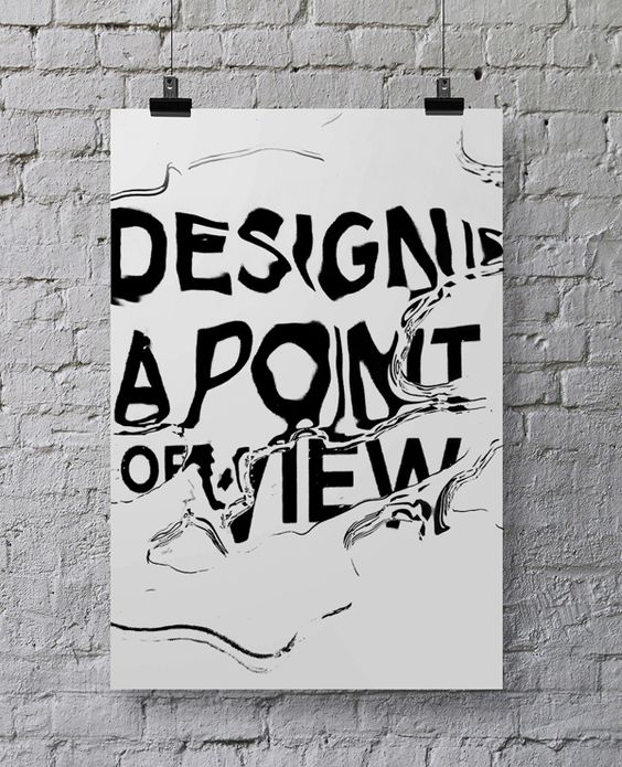
Image 01: 'Design is a Point of View'. Unknown.
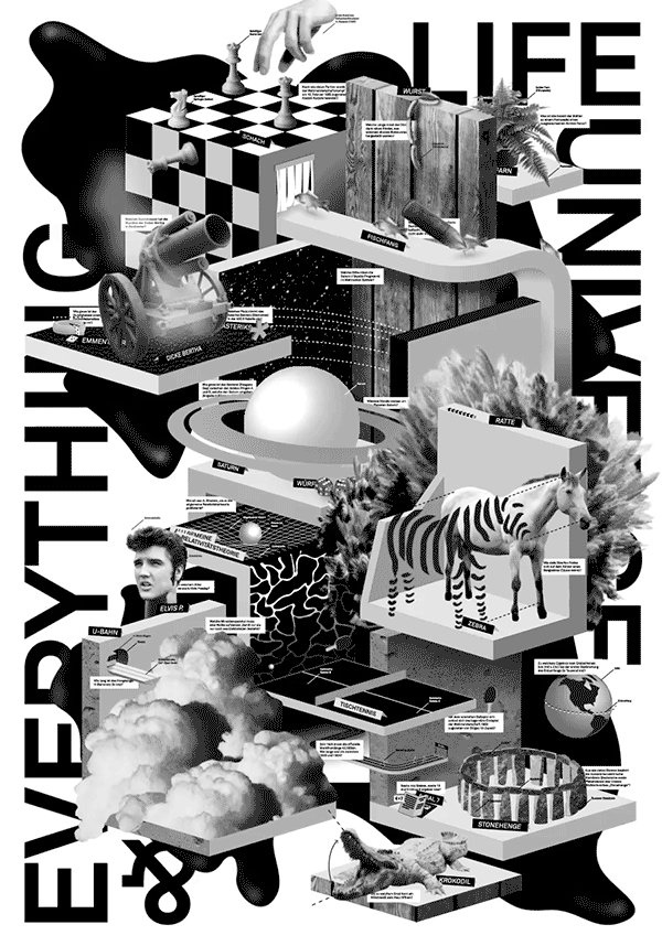
Image 02: 'Life, Universe & Everything' by John Schaub
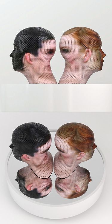
Image 03: 'Portrait360' by Gianluca Traina
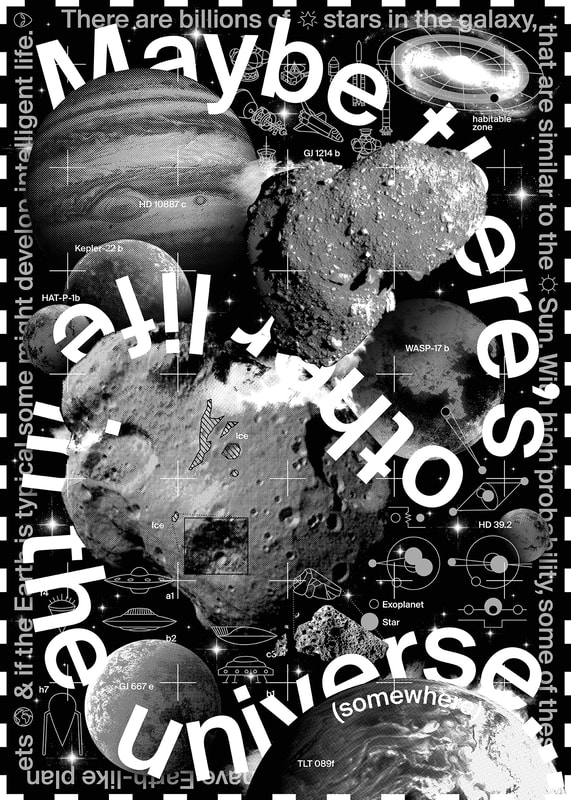
Image 04: The Other Side by John Schaub / Click to see GIF (It's worth it).
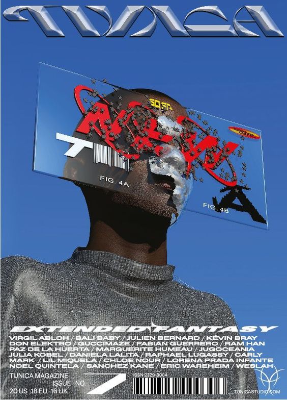
Image 05: Tunica Magazine. Issue No.7 Extended Fantasy. Info: 'A Thirst for Knowledge'.
SOURCES & LINKS:
Coping with Irrelevance. Michael Johnson (Johnson Banks, 2020).
The New Waves of Anti-Design Magazines Will Question Your Sense of Taste & That's a Good Thing. Ruth Jamieson (Eye on Design, 2016).
An Anti-Design Thinking Theory of Design(ing). Jonathan Ventura & Dina Shahar.
User Experience. The Rise of Anti-Design. Daniel Kalick (Aiga Design Conference, 2017).
Will Anti-Design Takeover The Graphic Design World? (Satori Graphics, 2021).
Anti Design. Over's 2020 Trends Kit.
Anti-Design Movement: Aestheticism of the Modern Era. (Widewalls).
Brutalist web designs. The Ugliest Design Trend of 2020. (Template Monster).
The Life & Times of Ettore Sottsass. (Design Public).
Covid Impact On Young People With Mental Health Needs. (Young Minds, 2021).
The First Secret of Great Design. Tony Fadell. (TED Talks, 2015).
Ending quote:
"Almost every great cultural movement in history began with an intuition to purposefully go where you're not supposed to go."
Comments are welcome.
My name is Liza, and I’m an Illustration and Visual Media student. As a design student and an intern, I often feel challenged with an idea of the extent to which design should evolve. During brainstorming, designers throw ideas around, bounce them off each other, desperately looking for the one that works. I believe that there is no right or wrong in the design. There is only an endless number of options and paths to take. This notion can be supported by the fact that art movements like Anti-design existed side-by-side with Modernism, defying and challenging its main principles. Anti-design artists pursued different ideas, creating unique objects ‘rather than embracing style, mass production, consumerism and sales. I will look at whether the work of the Anti-design movement is still relevant today and what form it takes.
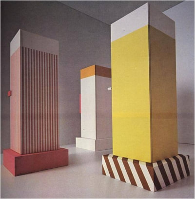
The design scene always had both mainstream and an underground look. These two complement each other and make the design better in the long run. Although, in the short period when the rivalry reaches its climax, some design outcomes can appear to be nothing but radical and consequently short-lived. The Anti-design movement was the opposite reaction to the mainstream, so even though it didn’t class itself as an underground movement, it certainly acquired some of its primary features. An example of design whose sole’s purpose was to challenge Modernist design principles is a series of cupboards designed by Ettore Sottsass (1966). Objects that are decorative and abstract made it to art history books but not our homes. Maybe the reason is the cheap, fragile materials used to make these monoliths looking cupboards. Maybe a rebellious nature of the movement and focus on bizarreness was a limiting factor that didn’t let the Anti-Design outscore mainstream Modernism?
The design scene always had both mainstream and an underground look. These two complement each other and make the design better in the long run. Although, in the short period when the rivalry reaches its climax, some design outcomes can appear to be nothing but radical and consequently short-lived. The Anti-design movement was the opposite reaction to the mainstream, so even though it didn’t class itself as an underground movement, it certainly acquired some of its primary features. An example of design whose sole’s purpose was to challenge Modernist design principles is a series of cupboards designed by Ettore Sottsass (1966). Objects that are decorative and abstract made it to art history books but not our homes. Maybe the reason is the cheap, fragile materials used to make these monoliths looking cupboards. Maybe a rebellious nature of the movement and focus on bizarreness was a limiting factor that didn’t let the Anti-Design outscore mainstream Modernism?
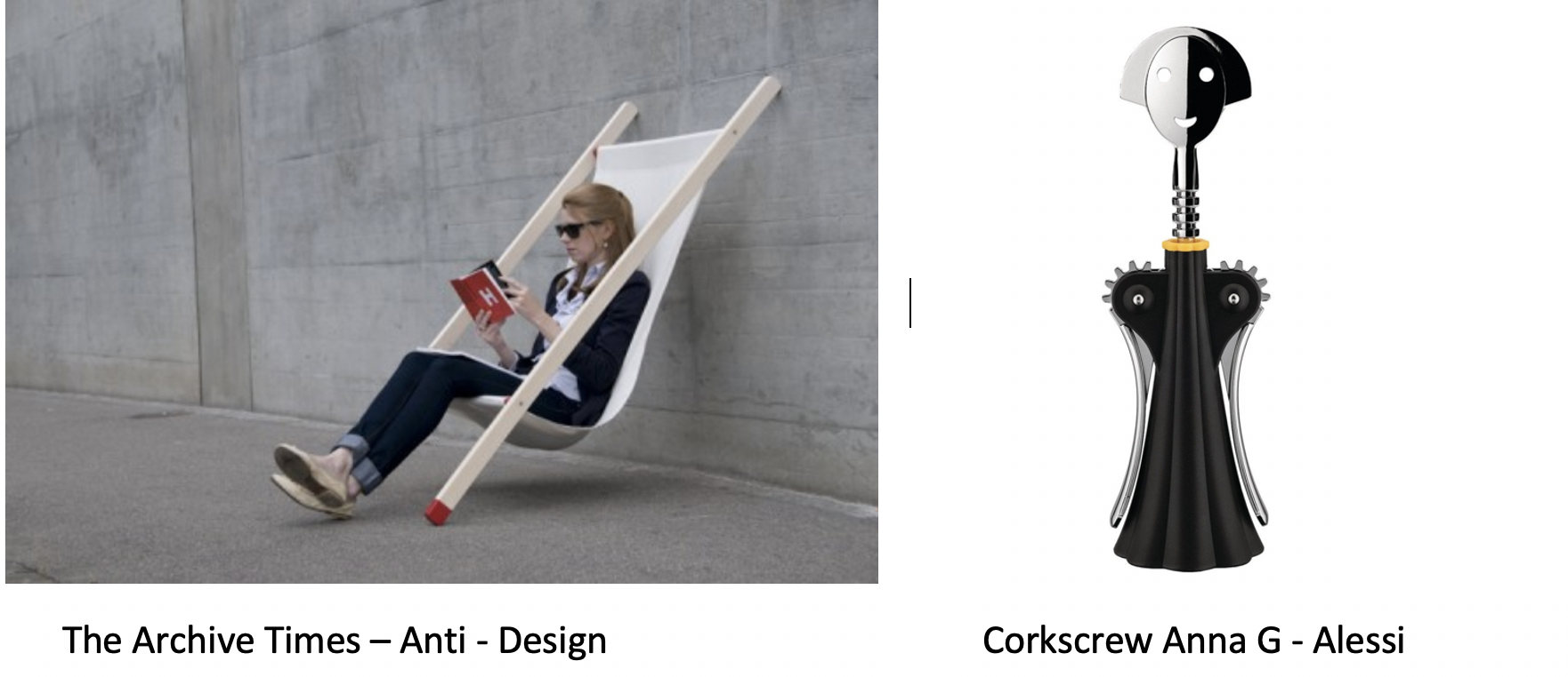
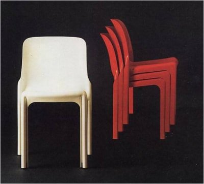
On the other hand, despite thriving for uniqueness, bright colours and unusual forms, there was a major preoccupation with space and storage within the movement. They were exploring ways in which their designs could become collapsible or stackable. This has led to the creation of the Selene chair by Vico Magistretti (1966). The name we are more familiar with now is stackable plastic chair. Back then, it was revolutionary because it allowed the user to participate in the design process by stacking chairs together. Such a radical decision proclaimed the Anti-design artists as forward-thinking and innovative. By creating a product that brings designer and user to the same level, the design industry began to accommodate its products to the needs of society and not vice versa. Years later, affordable essential goods will be available at a range of prices and colours. However, at the same time, new desirable products will be invented, more sophisticated, rarer, the ones that distinguish an individual from others.
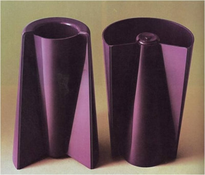
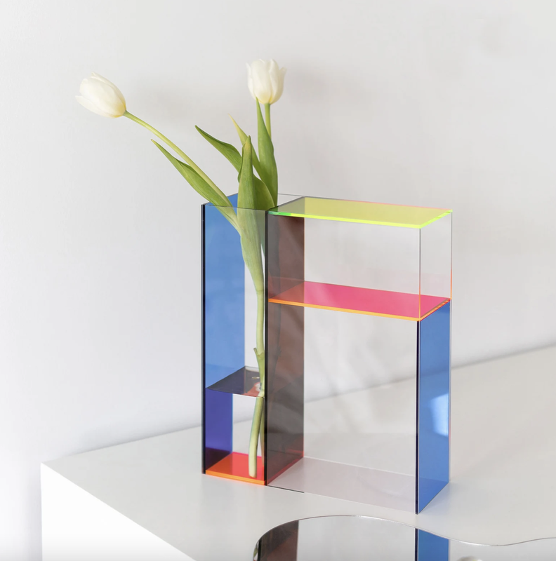
It's important to mention the role of the Anti-design movement in the making of these desirable products. The ones that stand out because of their unusual look do not class as necessities and have an aesthetically pleasing appearance. The beauty of an object built or made is one of the central elements that influences an individual's health and society’s wellbeing. Nowadays, it's normal to purchase a product that brings you joy but doesn't serve any function. However, it probably seemed unnecessary to design a Reversible Vase (Enzo Mari) in 1969. Sophisticated and thoughtfully executed object, designed to accommodate the needs of modern households. Now, you can access dozens of products online by typing reversible vases in the search engine. And the customers are buying the products that fit their interior, make their lives easier or happier. The Anti-design movement might not be around anymore, but its core principles have stuck around for a while.
 |  |
In conclusion, the Anti-design movement was a unique period that shaped the contemporary design market. It challenged visual uniformity and the traditional definition of aesthetic. A new aesthetic was born that opened another pool of ideas and opportunities that inspires designers up until this day. Challenging the mainstream design appears to be a good tradition to keep the design field fresh and relevant. While some of the movement's designs disappeared over time, others flourished in new environments. New generations of designers found creative ways to accommodate Anti-design principles and use them for good. As a creative, I agree that design is an ever-growing and evolving industry that becomes too homogenous sometimes. However, I believe that good ideas always matter and will be noticed. Not every good design is great, and that is the trick.
Rokusek | Marketing by Design. 2020. Antidesign is the new design - Rokusek | Marketing by Design. [online] Available at: <https://rokusek.com/2020/10/antidesign-is-the-new-design/> [Accessed 5 December 2021].
Martinique, E., 2016. Anti-Design Movement - Aestheticism of the Modern Era | Widewalls. [online] Widewalls. Available at: <https://www.widewalls.ch/magazine/anti-design-italian-movement> [Accessed 5 December 2021].
Moffat, C., 2011. Anti-Design - The Art History Archive. [online] Arthistoryarchive.com. Available at: <http://www.arthistoryarchive.com/arthistory/antidesign/> [Accessed 5 December 2021].
Mortelmans, D. (2005) Sign values in processes of distinction: The concept of luxury . Semiotica, Vol. 2005 (Issue 157), pp. 497-520. https://doi.org/10.1515/semi.2005.2005.157.1-4.497
Zeki, S. (2019), Beauty in Architecture: Not a Luxury - Only a Necessity. Archit. Design, 89: 14-19. https://doi.org/10.1002/ad.2473
Images:
Etsy.com. 2021. Nordic Acrylic Vase Minimalist Geometric Flower Pot Morandi | Etsy UK. [online] Available at: https://www.etsy.com/uk/listing/987641290/nordic-acrylic-vase-minimalist-geometric?ref=pla_similar_listing_top-1&pro=1 [Accessed 5 December 2021].
Steph Harrison-Baker- BA Graphic Branding & Identity
I’m a Graphic Branding and Identity student currently working as a designer at Jellyfish, a global digital marketing agency which connects people and brands through multiple different digital platforms.
Due to the COVID-19 Pandemic, no matter where you are located in the world, you will have experienced a lockdown at some point in the last 18 months. It is hard to imagine the world without a set of rules for almost anything now but there once was! As much negativity and disruption, the Pandemic has brought in our lives, there are many positives which have been brought about by it. One of the positives of the Pandemic has been our ability to adapt. More than ever, technology now plays a significant role in our everyday life. In times when we were unable to visit museums, fashion shows and exhibitions, they were brought to us virtually. New ways of working, travelling and socialising are now the ‘new normal’. Will we ever go back to the old ways? The London Fashion Week is an example of how such a prestigious event adapted to the situation for the better. The LFW is one of the most iconic fashion shows in the world and as a result of restrictions in the UK, it was broadcasted virtually for the first time in history. This was the first time a fashion show had ever been made into a digital event especially at this scale. This year “anyone could grab a front-row seat straight from their device’ (Lalonde, 2021). This fashion show pushed boundaries in all ways possible using technology but also in many other ways too as it combined both womenswear and menswear into one show whereas previously these had been separate shows. Is this anti design or is it just breaking the ordinary and developing new ideas?
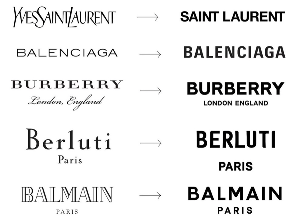
When relating the idea of ‘anti design’ back to my design pathway of branding whilst continuing to look within the fashion industry, it is hard not to notice similarities and trends in fashion houses logos. In the article “The Rise of the Anti-Brand” the author, Mandana identities that many of the top fashion houses have undergone rebrands recently whereby many of the top fashion brands now have very similar logos. For a long period of time a logo was the heart of a brand, it allowed people to differentiate brands, allowed customers to gain an insight into the heritage of the brand and to gain a sense of the brands values and tone. However, in recent years brands have “emerged from their re-design with a minimal, black on white, sans-serif (Helvetica, is that you?) – not really) logo, losing all distinctive qualities that their previous brand identities may have had” (Mandana, 2019). As a result, brands wordmarks are becoming more visually aligned allowing for customers to shape the brand through their interactions with the brand. Some could argue that this is removing the design from the brand however I believe that this is just a trend which these companies are currently following as it is fashionable.
Due to the COVID-19 Pandemic, no matter where you are located in the world, you will have experienced a lockdown at some point in the last 18 months. It is hard to imagine the world without a set of rules for almost anything now but there once was! As much negativity and disruption, the Pandemic has brought in our lives, there are many positives which have been brought about by it. One of the positives of the Pandemic has been our ability to adapt. More than ever, technology now plays a significant role in our everyday life. In times when we were unable to visit museums, fashion shows and exhibitions, they were brought to us virtually. New ways of working, travelling and socialising are now the ‘new normal’. Will we ever go back to the old ways? The London Fashion Week is an example of how such a prestigious event adapted to the situation for the better. The LFW is one of the most iconic fashion shows in the world and as a result of restrictions in the UK, it was broadcasted virtually for the first time in history. This was the first time a fashion show had ever been made into a digital event especially at this scale. This year “anyone could grab a front-row seat straight from their device’ (Lalonde, 2021). This fashion show pushed boundaries in all ways possible using technology but also in many other ways too as it combined both womenswear and menswear into one show whereas previously these had been separate shows. Is this anti design or is it just breaking the ordinary and developing new ideas?
When relating the idea of ‘anti design’ back to my design pathway of branding whilst continuing to look within the fashion industry, it is hard not to notice similarities and trends in fashion houses logos. In the article “The Rise of the Anti-Brand” the author, Mandana identities that many of the top fashion houses have undergone rebrands recently whereby many of the top fashion brands now have very similar logos. For a long period of time a logo was the heart of a brand, it allowed people to differentiate brands, allowed customers to gain an insight into the heritage of the brand and to gain a sense of the brands values and tone. However, in recent years brands have “emerged from their re-design with a minimal, black on white, sans-serif (Helvetica, is that you?) – not really) logo, losing all distinctive qualities that their previous brand identities may have had” (Mandana, 2019). As a result, brands wordmarks are becoming more visually aligned allowing for customers to shape the brand through their interactions with the brand. Some could argue that this is removing the design from the brand however I believe that this is just a trend which these companies are currently following as it is fashionable.
(Mandana, 2019)
Anti-design is a movement which emerged in Italy in the 1960s where designers rebelled against the status quo of the more traditional modernist designs and broke the rules to create unique and less traditional things. An example of this which Charles Moffat
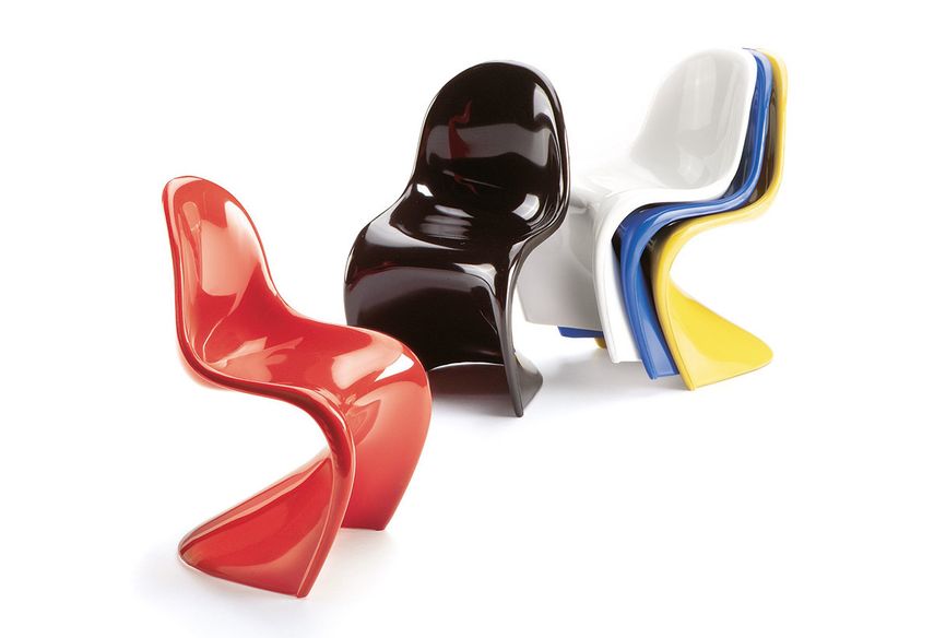
Explains in the article ‘Anti-design’ is the Panton chair designed by Vernor Panton in 1963. This piece of furniture is deemed to be the hero image for anti-design as the aesthetics of the chair had never been seen before. The unique S Shape of the chairs breaks all stereotypical designs of what a chair should look like. But why should a chair have a set aesthetic?
Explains in the article ‘Anti-design’ is the Panton chair designed by Vernor Panton in 1963. This piece of furniture is deemed to be the hero image for anti-design as the aesthetics of the chair had never been seen before. The unique S Shape of the chairs breaks all stereotypical designs of what a chair should look like. But why should a chair have a set aesthetic?
Charles Moffat (2011)
My primary role as a designer at Jellyfish is App Store Optimisation where I optimise companies’ creative assets on both the iOS and Android App Stores. There are set specifications I have to adhere to when designing these creatives such as size requirements for them to be approved by Apple and Google. However outside of those ‘rules’ I have the creative freedom to design the creatives. I would say that this to me allows me to have creative freedom, especially in the brainstorming stage of the process. Is this ‘anti-design’ or is this the natural role of a designer to create new engaging ideas
Overall, I don’t believe that there is a difference between ‘anti-design’ and ‘design’ as they are the same thing. To me, design should allow for creative freedom. I believe that design is creative, and you should be allowed to create whatever you want. From an early age, I was always told that when it came to art there was no right or wrong. You are the designer and you have the freedom to make the design as unique as you want or to follow the latest trends. There will always be trends, whether you work in fashion, marketing or branding but the only way new trends are formed are by someone breaking the current trend. This isn’t anti-design this is called being creative and having your own ideas.
References:
Lalonde (2021) Highlights from London’s first digital-only fashion week https://www.deptagency.com/en-gb/insight/highlights-from-londons-first-digital-only-fashion-week/
Mandana (2019) The Rise of the Anti-Brand? https://medium.com/@sleeplessinldn/the-rise-of-the-anti-brand-bb154c8caf2c
Moffat (2011) Anti Design http://www.arthistoryarchive.com/arthistory/antidesign/
Hello. I’m Sun Woo Kim, majoring in Illustration and Visual Media.
This is the first time I’m hearing about the term ‘anti-design’, and therefore, it took time to grasp the general idea of the movement and it was a little difficult to understand the concept at first. However, after reading articles and researching related artists, I found one aspect of Anti-Design movement that I’m particularly interested in: How the movement was about being against consumerism, mass production and designers’ greediness in Modernism period. As a result, design objects from ‘Radical Design Period’ (which is an another word for Anti-Design movement) were represented by its unique style with exaggerated forms and vivid colours which was the opposite of Modernism design. While Modernist stood by ‘form should be followed by functionality', designers who supported the Anti-Design movement were much more interested in changing people’s traditional ideas on objects. By applying the irony and Kitsh style, the ultimate goal was to criticise consumers who buy mass produced objects and to send them a message to think carefully and question their purchases.
This is the first time I’m hearing about the term ‘anti-design’, and therefore, it took time to grasp the general idea of the movement and it was a little difficult to understand the concept at first. However, after reading articles and researching related artists, I found one aspect of Anti-Design movement that I’m particularly interested in: How the movement was about being against consumerism, mass production and designers’ greediness in Modernism period. As a result, design objects from ‘Radical Design Period’ (which is an another word for Anti-Design movement) were represented by its unique style with exaggerated forms and vivid colours which was the opposite of Modernism design. While Modernist stood by ‘form should be followed by functionality', designers who supported the Anti-Design movement were much more interested in changing people’s traditional ideas on objects. By applying the irony and Kitsh style, the ultimate goal was to criticise consumers who buy mass produced objects and to send them a message to think carefully and question their purchases.

After learning about these, I reflected on these ideas and realised I also value functionality over form when I shop. For example, when I’m choosing a kettle, I first consider how quickly it can boil water, rather than its colour and form. However, there are times when I do the opposite. When I want something, rather than need something, colour and form are more important than functionality. In other words, I’m considering to spend my money on something I probably don’t need because I like how it looks. After this realisation I questioned the designer’s role and their social responsibility. Should a designer design objects to respond to people’s needs or wants?

How do we find a balance between creating wants for our artworks and not supporting consumerism?
What does it mean to create design objects in a unique style without encouraging consumerism?
What does it mean to create design objects in a unique style without encouraging consumerism?
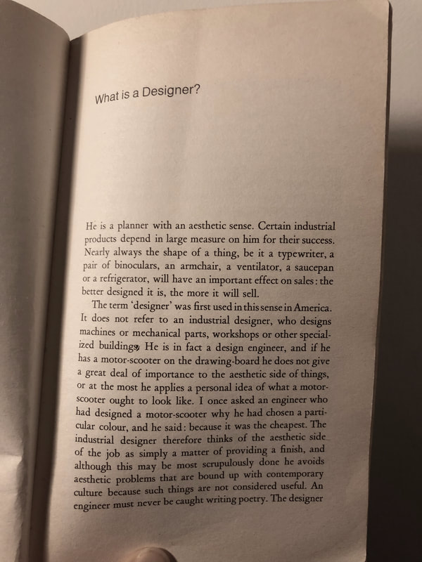
Then, I looked into a definition of ‘designer’. What does a designer do? According to the book ‘Design as Art’, the term ‘Designer’ was first used in America. “It does not refer to an industrial designer, who designs machines or mechanical parts, workshops or other specialised buildings. He is in fact a design engineer, …” and the author continues with “designer knows that the ultimate form of the object is psychologically vital when the potential buyer is making up his mind.”

According to Bruno Munari, ’Designers’ are someone who connect consumer’s mind and aesthetics of objects. They chooses a certain colour and a certain form to convince people to like their objects. In fact, they are more concerned about people’s wants than needs.
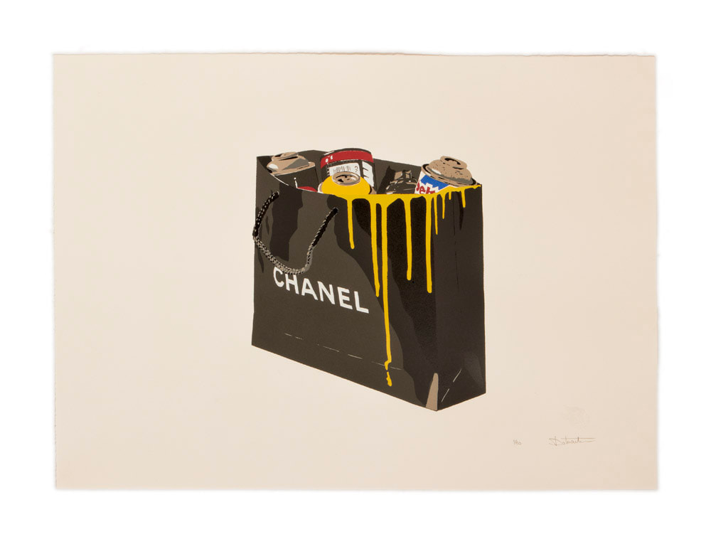
All these points led me to the term ‘Anti-Consumerism’, which has many aspects such as sustainability, criticisms of the fast-fashion industry, over-priced products, etc. However they all say the same message; to carefully consider every factor when purchasing. Do I really need this? Does the market trick me into thinking I need this? Who is profiting from my purchase? If I try to translate the questions from a designer’s perspective, it will be something like, Do consumers really need this?, Is it okay to trick them into buying something they don’t need?, Is there someone else earning money from my design products?.
As a student majoring in Illustration and Visual Media, I wanted to look into artists working with their visual language to question themselves or to send a message to society.

There was a time when cheap-material, and cheap-production process in order to make the most profit in the shortest time were considered the best, and in many cases, they still are. However, I see more and more of big and small design companies making changes in this for more important issue. I believe no matter in what position you are in the design process, we all are capable of sending a right message to consumers.
References & Image Sources
http://www.arthistoryarchive.com/arthistory/antidesign/
https://www.widewalls.ch/magazine/anti-design-italian-movement
https://www.dezeen.com/2018/03/02/woongki-ryu-abstraction-chair-expressionist-artwork-wassily-kandinsky/
https://signatureupholstery.co.uk/20th-century-furniture-design-modernism-the-bauhaus/
https://www.argos.co.uk/product/9172362
https://www.behance.net/gallery/14491157/Anti-consumerism-project?tracking_source=search_projects_recommended%7CAnti%20Consumerism
https://uxdesign.cc/consumerism-a-dilemma-for-designers-cdf0952d846d
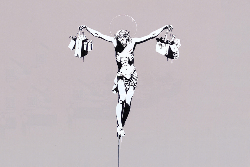
https://banksyexplained.com/christ-with-shopping-bags-2004/
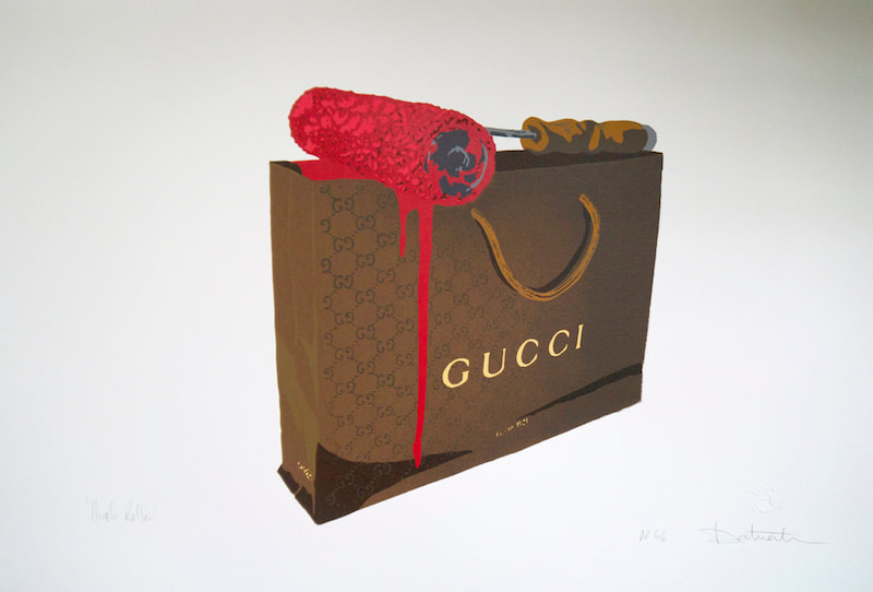
https://dotmaster.co.uk/print-archive/
https://kristinekawakubo.com/Anti-Consumerism
Hi all, I am Axel, a Mexican illustrator currently enrolled in London College of Communication, studying Illustration and Visual Media.
A common issue like this, a common threat even, can be a great equalizer from which to continue on as a unified system. We must harness this opportunity to bridge our differences moving forward by using design to enable a positive conversation about the future. Every time there is a global pandemic there is a form of renaissance directly after, in which old modes of thinking are shed and art is consumed like never before. Culture bounces back and innovation is accompanied by opportunity. A historically positive moment like this is our responsibility as designers to lay the groundwork for the socially and ethically proactive world we want to see. My work as an artist has been guided by the desire to see our mental health as the new dimension we walk and live in, one where we all feel the same; we must nurture this headspace as much as our bodies because the world post-pandemic will be marked by a more diverse peoples that cannot be seen through the lens of language or skin tone, but by the content of our intentions and our actions to see these through.
In my work as a designer, I inject a meaning to an otherwise black and white stenciled image through my use of playful shapes and colour. Doing so, I strip the physical world around us from its subjectivity and enter a mindset in which reactions are the way we see, a pure single colour rather than shades of many. This way of seeing the world may change our perceptions of both past and future, an emotional filter, and so my job as an artist has been to share this: We all have a common language, emotions, we all feel the same and so we must use this and the pandemic as a starting point for further collaboration. Based on our intentions for betterment, we all look the same. A great example of this equalizer in language is in the Bouba/kiki effect, first devised as an experiment in 1929, this design put two images with different edges, one with sharp spikes and another one smooth, and amongst people with different languages, all interpreted Bouba as the soft edged shape. Thus, with each scene I create is an effort to give a single emotion its own space and therefore its justification, catharsis. I aim to share spaces in which people can feel a certain way, think all a certain way, rather than mix us all together and demand a single victorious thought/emotion to rule, often what I feel is creating chaos in otherwise peaceful systems. A democratic space for emotions where we may all find that our very reasons to feel might be more alike than not.
Back in 2016, before the pandemic, in the publication of Scientific American Ian Golding and Chris Kutarna discussed how we are already culturally headed for a new renaissance, insinuating that the worldly turmoil that we are experiencing today is actually moving design forward. The Black Death had tapered off, Europe’s population was recovering, and public health, wealth and education were all rising. (Golding, Kutarna 2016) This is by no coincidence, written three years before global catastrophe, when politically the world had never been under such pressure. Young people now more than ever, are taking to the streets to demand better conditions and a promise of a future. This unification is possible due to our years of migration and technological advancements that have been exponentially increasing in the past hundred years. We have more in common than ever, and with literal advancements also come new ways of thinking. This new modus of cooperation promises a larger leap forward in terms of quality of life, all fueled by culture, itself fueled by art.
“COVID 19, like any disruption, essentially confronts each of us with a choice:
1) to freeze, turn away from others, only care for ourselves, or
2) to turn toward others to support and comfort those who need help.”
Otto Scharmer (2020)
Narrowing down my choices for design has been helped by concepts such as false news. Information operations and warfare otherwise known as influence operations (Waltzman 2017) has the awareness of perception reach a point where it is harnessed by few and weaponized to such extents that wars are fought in the name of brands (such as Coca Cola’s involvement in the assassinations of union leaders in Colombia, or Chiquita’s very own funding of paramilitary groups killing innocents). Many young people who have been born in this era of advertising have begun to understand the insidious nature of emotional harnessing through imagery and have in turn brought on a post-literal meme era where irony and a tone of compliance to the system is used to subvert this same system. Memes are now a universally understood response, a new hieroglyph we can all agree signifies a single agreed upon emotion. I propose that art in its current most popular form, advertising, is the most threatening form of design. It is a surreal denial of reality. If there is one thing that ads have inspired is a unified response to them, resentment and disgust. No wonder, if our main usage of art as a planet is fueled by this emotion, and text that is double-speak (such as in the book 1984), that the world is in the state that it is. Therefore we must respond by justifying the raw truth of our human experience. Not for the sake of beauty or to sell but rather for the sake of truth. I want to make it so the next movement, the majority of images are for a positive reaction to authentic life, rather than a fake idealised marketing strategy. If perception can be weaponized for polarisation, then symbols have an equal power to unify us for a common cause.
“Objectivity is a myth which is proposed and imposed on us."
Dimitry Kiselev, director general of Russia’s state-controlled Rossiya Segodnya media conglomerate (2014)
This contemporary effort is fueled not by my ink and colour but by the minds of the audiences and their own instincts to recall a personal experience from a single frame. However different these triggers might be, (and I can only imagine how different they might be) they all converge in this one painting and that is something we may all agree on. Fact is that an image won’t stop being simply because we disagree, no matter how different a global event like this might reach us, we can all ethically and responsibly approach and respond to it. Global warming, the pandemic, social injustice are all hindered by an inability to believe that we are all going through the same issue. Addressing complex issues like this must be done by deconstructing the different factors that make these systems, I believe a great number of these issues are tied to emotional blockades.
I compliment this effort by writing poetry that furthers the context of each scene, dialogue that has been plucked from my very own thoughts and experiences and worked until it has been stripped of anything that could be unique to me, my space or my time, to say something everyone might understand, vague but universal and singularly tied to emotion. I believe we all understand happiness and the desire for love, even if sometimes complexity and history make it difficult to accept this. Moments like this are all something we can agree on.
BIBLIOGRAPHY
https://www.scientificamerican.com/article/are-we-living-in-a-new-renaissance/
https://medium.com/presencing-institute-blog/setting-in-motion-a-new-renaissance-df6c36477a9e
Molina, Maria D., et al. "“Fake news” is not simply false information: a concept explication and taxonomy of online content." American behavioral scientist 65.2 (2021): 180-212.
https://journals.sagepub.com/doi/full/10.1177/0002764219878224
https://www.rand.org/content/dam/rand/pubs/testimonies/CT400/CT473/RAND_CT473.pdf
Elias Caro, Jorge Enrique, & Vidal Ortega, Antonino. (2012). The worker's massacre of 1928 in the Magdalena Zona Bananera - Colombia. An unfinished story. Memorias: Revista Digital de Historia y Arqueología desde el Caribe, (18), 22-54. Retrieved December 05, 2021, from http://www.scielo.org.co/scielo.php?script=sci_arttext&pid=S1794-88862012000300003&lng=en&tlng=en.
Archives
December 2021
June 2021
May 2021
April 2021
March 2021
January 2021
December 2020
November 2020
September 2020
August 2020
 RSS Feed
