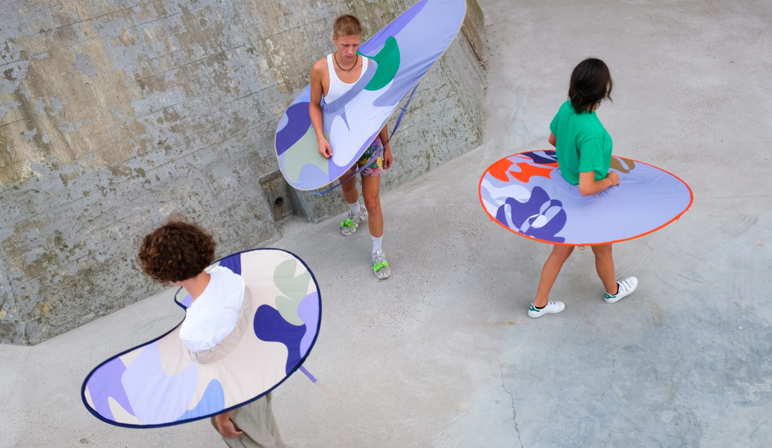
 My name is Tia Johnson, a Graphic and Media design student at LCC and I will be looking at the topic of Anti-design. During late 2019 when the world was looking forward to celebrating a new decade, the unfortunate event of a global pandemic shook the world to its core and in a way shaped human behaviours and habits in a long-term way; we now see people wearing masks, socially distanced spaces, more sanitisation stations and a wide scale promotion of vaccinations. Though the promotion of this is through scientific advice to stop a wider spread, how this promotional material got to the public was though campaigns using posters, advertisements and other creative technology to improve and educate within the pandemic. Since 2019 up to current day, we have seen a rise in designers finding creative strategies to be a part of tackling of the global pandemic; as well as other important issues. From a brief perspective, we can assume it is because anyone would love to use their talents to promote a world cause or come up with solutions that can better improve the earth; though from scratching through the surface you can start to see that designers are tackling their own problem; irrelevance. There is now a need to be useful, and a dissolve of creation for pure aesthetics. This is where we are seeing the rise in anti-design, the anti-design movement rewarded functionality rather than beauty, style, mass-production and greed. Anti-designers wanted people to think about the objects they were buying or the material they were viewing, even if this product ended up being thrown away in the end. An example I can give of a pandemic solution that embraces anti-design is the wearable pop-up ‘distance keepers’ designed by Anna-Sophie Dienemann; this accessory is to encourage social distancing as it pops out a ring of personal space for the wearer. This is something that does not take in fashion as a clothing statement (though she has tried to make the garment as flattering as possible) this is a statement of safety and is functional as a protective device. Picture: Models wearing the ‘Distance Keepers’ *photographer unknown* A source I looked at for writing was the quote by Scott Ewen “Designers make the most beautiful trash.” From this quote I was conflicted to his meaning, was it a criticism of the overconsumption of materials used in design? Or was this a critique following design outcomes from corporations and mass production favouring looks to solving solutions? In my course, I have been taught that a successful graphic designer needs to be a problem solver to add value to design works produced. This quote also followed through my brain when looking at the article ‘The New Wave of Anti-design Magazines Will Question Your Sense of Taste-and That’s a Good Thing’ and the article ‘Coping with Irrelevance’ by Michael Johnson. The wave of anti-design has hit the publishing industry, with Indie magazines shifting from the aesthetics of clean, minimalist, white spaced pages to unrestraint of rough, shabby and more-is-more design aesthetic. Aesthetically, I believe that this shift has been brewing for a while, with the use of minimalism becoming a cliché in modern indie magazines, this new style of magazine allows freedom of creative expression for the designers, which is a refreshment to the ‘rules’ that are set out in publication. Interviewing Charlotte Roberts and Bertie Brandes, the creators of Anti-Design magazine ‘Mushpit’ they explain they were tired of feeling burned out from needing to produce works that fit mass-production and consumerism saying: “We were both testing out jobs in fashion and were already quite disillusioned by our experiences. After one too many tellings off about not packing a sample in the correct tissue paper, parodying the industry became a no-brainer. Our aim is to provide an alternative and honest voice for young women.” With honesty being their strategy, we have also seen a shift in production materials used in indie mags; with experimentation of cheaper paper, low-culture values and much more reductive price points. This shift to me is to make the magazines more reachable to an audience, so that more people can see the message the magazine is trying to spread; this to me is a good goal however some could argue that it is clashing with anti-design as it could be seen as more mass productive with a lower price point, I argue that this is mainly to ensure different people (particularly working-class people who are pushed out of creative industries) get a view; I just hope that with the worries of sustainability these products are recyclable as the anti-design movement looks more into temporary than long term design solutions; which can have a negative effect on the planet with waste later. Looking at the article ‘Coping with irrelevance’ by Michael Johnson, we see points of discussion that shows design communicators are going through a struggle of producing relevant works, from a design of the McDonalds golden arches being separated as point to social distancing, good idea but does it provide functionality to the issue? He argues not, he says there is opportunities for designers to make a difference, however there is misdirection, consumer obsession and unconcentrated; that a few ad posts and posters will not change behaviour and have a strong presence. I must disagree with his statement that a few adverts and posters will make a difference, throughout the pandemic posters displaying information on correct handwashing, information on the spread and general designs to improve moral of the communities has been a benefit; the government has used the talents of designers to promote campaigns that have in the long run been successful. I do agree however that designers can think more of a relevant way to promote their skills within the pandemic, with an example of social media posts by Johnson Banks displaying typography layouts conveying the message of social distancing, as its creative and holds purpose. I do agree with his statement that some designs seem ineffective and selfish, with McDonalds social distancing poster garnishing a few laughs here and there is doesn’t particularly stand out in comparison to other meaningful designs; some could argue that the McDonalds image is shamelessly self-important.
My summary of what I think of anti-design is that it has good intentions, but I can understand that it may not work in long term solutions such as for corporate or mass production; anti design does though display to me a personal development of an idea and problem solving; which for a creative graphic designer like me is a very interesting movement to document. Sources used Michael Johnson. (2020). Coping with irrelevance. Available: https://www.johnsonbanks.co.uk/thoughts/coping-with-irrelevance. Last accessed 05/12/21. Ruth Jamieson. (2016). The New Wave of Anti-design Magazines Will Question Your Sense of Taste—and That’s a Good Thing. Available: https://eyeondesign.aiga.org/the-new-wave-of-anti-design-magazines-will-question-your-sense-of-taste-and-thats-a-good-thing/. Last accessed 05/12/21. Jennifer Hahn. (2021). Anna-Sophie Dienemann creates wearable pop-up "distance keepers". Available: https://www.dezeen.com/2021/02/02/anna-sophie-dienemann-bounding-spaces-social-distance-keepers-coronavirus/. Last accessed 05/12/21. Charles Moffat. (2011). Anti-Design. Available: http://www.arthistoryarchive.com/arthistory/antidesign/#:~:text=Anti%2DDesign%20was%20a%20design,and%20used%20irony%20and%20kitsh.&text=In%20architecture%20this%20was%20also%20known%20as%20the%20Radic. Last accessed 05/12/21.
1 Comment
Robert Urquhart
1/6/2022 07:05:42 am
Thanks for shaing, I love that Scott Ewen quote “Designers make the most beautiful trash.” - HI get it, however, he is limited in his understanding of design - it is not all visual design - fashion / graphics - What about useful, lifesaving, devices etc? UX design is useful, not always 'beautiful' but needed.
Reply
Leave a Reply. |
Archives
December 2021
Categories |


 RSS Feed
