|
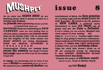
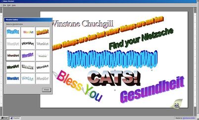
Eloise Atter, BA Graphic Branding and Identity Conforming to Design Principles Since I started a placement, I have learnt core principles of design and conceptual thinking whilst designing for clients internationally at a television design studio in London. So far, I have been re-branding and refreshing television networks and channels in Slovakia and Romania. Understanding design principles is important to understanding different cultures in order to make sense to the client and their audience. I have understood that in order to design successfully for a large target audience, conventional design holds value in appealing to specific groups of people. This includes conforming to gender stereotypes by metaphorically painting a picture of who the channel is and creating a character to design for. Designing conceptually is something I have most often been taught; however, it restrains artistic expression. The Freedom of Anti-design “Modernist designers believed that the form should follow function. Thus, the great emphasis was placed on the style and the aesthetics of good form. Aiming for functionality, simplicity and the reduced colour palette, modernists wanted to make objects that would fit in with the modern lifestyle and be useful, but unobtrusive. All these principles were turned upside down when Anti-design took the stage.” To me, anti-design is another term for freedom of expression by irradicating any design rules and encouraging irrationality rather than being rational in conventional design and ‘following function’. In the early stages of a project, brainstorming ideas and concepts is a form of freedom as it makes room for mistakes in a rational design setting. Although this rational way of thinking is involved, I would like to think that anti-design ideology is practiced during the brainstorming process. Its influence on new ideas and concepts for a television channel encourages freedom of expression and therefore makes way for uniqueness. Unconventional Magazine A good example of how anti-design is used in magazine is Mushpit, an ‘anti-indie satirical women’s magazine’ who use what is considered ‘ugly’ fonts and layouts and cheap paper. “These aren’t magazines for neatly displaying on your coffee table, they’re more at home splayed across a bathroom floor… at once the most beautiful and stupidest thing you’ll ever read.” This type of magazine brings a new and interesting side to magazine compared to the indie / luxury magazines printed on more expensive paper and consist of minimalist style and considered layouts. The founders of Mushpit have worked in the fashion industry and have been ‘told off’ for not doing menial tasks the correct way, for example using the wrong tissue paper to wrap a garment. It seems to me as if Mushpit thinks of the fashion industry as pretentious and very confirmative in their management, which is ironic as modern fashion is notorious for being experimental and rule breaking. Therefore, their magazine brings an honest and humorous insight into the fashion industry for young women. There is a humour to this type of magazine as it feels like it doesn’t take itself too seriously and, in a way, makes fun of conventional magazines. Creative technologist Rifke Sadleir recognises what ‘bad’ design means to him… “I suppose most of the ‘bad taste’ stuff is pure nostalgia, but also, now we’ve enough distance from it, it’s really funny.” I agree with what Sadleir says when he refers to anti-design because the fonts used by Mushpit reminds me of a Bratz doll box or Microsoft Word’s Word art. Therefore, this style makes feel nostalgic, but as we recognise its age and ugliness, it also makes me ‘question my sense of taste’ as I love how this aesthetic subverts fashion culture by injecting satirical humour. The Need for Convention in Television Design
Unconventional magazine appeals to a specific audience whereas television design needs to appeal to a wider audience. In my opinion, anti-design would not be as successful in mainstream television at this moment as the type of design needed to communicate successfully to larger audiences need to be considered contextually and aesthetically. Conventional design suits the psychology of the audience because it is design that they are used to and can be understood clearly. Additionally, television design must be versatile as it is scheduled and repeated across an entire network. There could be space for anti-design in television in the future as the consumption of media evolves, more likely on niche channels and streaming services, where there is more room for freedom of expression and risk taking. Amazon (2021) Bratz 20 Yearz Special Edition Original Fashion Doll Cloe (Image) https://www.amazon.co.uk/Bratz-Yearz-Special-Original-Fashion/dp/B08FGLD6V7 Jamieson. R (2016) The New Wave of Anti-design Magazines Will Question Your Sense of Taste - And That's a Good Thing https://eyeondesign.aiga.org/the-new-wave-of-anti-design-magazines-will-question-your-sense-of-taste-and-thats-a-good-thing/ Martinique. E (2016) Anti-Design Movement - Aestheticism of the Modern Era https://www.widewalls.ch/magazine/anti-design-italian-movement Trend Hunter (2016) Make Wordart (Image) https://www.trendhunter.com/trends/make-wordart Williams. M (2021) The Rise of Anti-design https://www.creativereview.co.uk/anti-digital-graphic-design/
1 Comment
Robert Urquhart
1/6/2022 06:49:08 am
interesting to think about anti-design in TV - I wonder where glitch art could fit into this? Is glitch art anti-design too?
Reply
Leave a Reply. |
Archives
December 2021
Categories |


 RSS Feed
