|
Author: Natasja Derry Hey stranger! My name is Natasja and I’m studying Design Management at LCC while working in Copenhagen for my placement year. As a Visual Communication intern, I’m intrigued to understand how anti-design affects my practice and how it compares to the Danish attitude towards design. What is anti-design? Anti-Design was a design flow and style art movement originating in Italy and lasting from the years 1966 - 1980.[1] It eschews traditional design principles and conventional aesthetic tastes. It challenges us with asymmetry, clashing colours, bare interfaces, crowded elements and stark typography.[2] According to 99Designs[3], the movement is resurfacing after the lingering pandemic as a response to society being conformed to the lockdown rules.
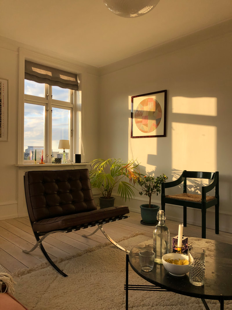
Above is a picture I took from my friend’s apartment – two twenty-year-old students live here and have brought their designer collection together. I personally haven’t come across students flats looking like this. Therefore, the temporary purchase mentality in Anti-design contrasts to the Danish mentality of investing. In my personal opinion, I agree with the Danish Modern values of investing to avoid creating more of a waste culture.
How does anti-design fit into my current job? I work in a corporate company where ‘kitsch’ and ‘bizarre’ graphic design is frightening and most certainly avoided. Novo Nordisk is a global healthcare company which prides itself in being a leader in the world of insulin and diabetics. Therefore, their CVI consists of neutral colours, a simple font and a limited photo library which communicates to their stakeholders that they are serious and compliant with medical laws. To give an example, I was recently designing thank you cards to their employees and I followed the CVI guidelines, except for one line where I chose a different font. This caused a 25-minute discussion amongst the team as to whether we could do this. Although this seems trivial (I for sure struggled to take the conversation serious) it all amounts to a shared brand identity. Anti-design is fun and engaging, however it should only be implemented if it is appropriate in the situation. Furthermore, as a Visual Communication Intern, I need to learn and understand the rules in designing graphical content to recognise when one can break them. In conclusion, anti-design would trump the Danish Modern lifestyle as it so heavily rooted in the Danes, however there are elements that could help encourage creativity and innovation, especially after 2 years in lockdown. It’s important to understand who you are communicating to and if the principles of anti-design would catch their eye. For my next internship, I’ll be interacting with a much
1 Comment
Robert Urquhart
1/6/2022 03:23:08 am
This is a really interesting post - I like the clash of Anti- Design and Scandinavian culture - kind of the perfect area for disturbing the Scandi aesthetic - also where you worked in healthcare so much is around making people feel safe through design your 'Burger King' typeface is perfect!
Reply
Leave a Reply. |
Archives
December 2021
Categories |


 RSS Feed
