|
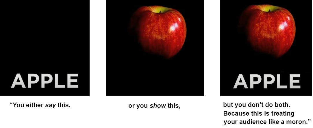
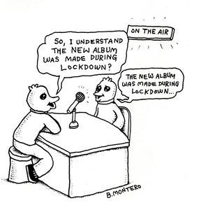
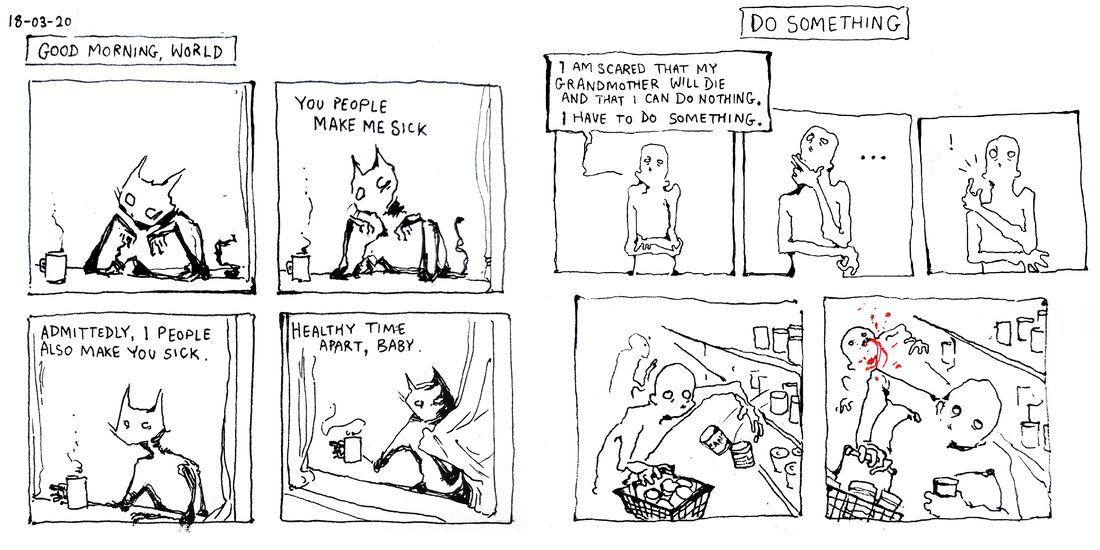
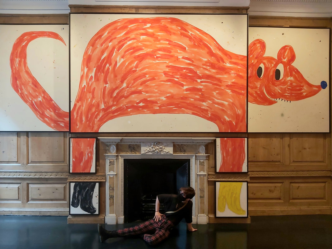
Mo Morrell, BA IVM, DPS year 2021. I’m writing under the pretense that ideas are spoken through design, and that we can agree this is what makes creative practices a universal language; something indispensable in an era of mass miscommunication. It’s time to build on the point that design is the dormant language we need to keep considering, and that it’s important to know what we’re saying - and not saying - using it. A well designed visual or object can communicate much like a person would; with respect, kindness, threat or malice. A poor design miscommunicates. This is exemplified by American graphic designer Chip Kidd. “Anti-design” is different. Anti-design doesn’t need to tell you anything. It can be considered pointless, a waste of creative input. But it can be argued that anti-design reminds us who we are, reminds us that there are no rules to design. It celebrates design without being designed for anything in particular, simply itself and the language it speaks. This makes it a valuable asset when considering activism and rebellion through design. This couldn’t be more relevant than in 2021. Technology can easily be considered the most powerful advancement of the 20th and 21st century. What we want is for technology to empower us all as individuals, but what I’ve found more often in my working practice is that technology is used to capitalist ends - a select few in power above us designing a system that steers our rhythms, through technology that changes our approach to everything from news, health, friendships and financial independence. This kind of control is a misuse of design, dangerous in it’s insidiousness, and permeates cultural thinking as preceding a future dystopia. This is exemplified in the way that science fiction author Philip K. Dick wrote about design, often coming back to objects as a thematic evil with humans at their mercy. A good example of this is in Ubik, 1969. “The door refused to open. It said, ‘Five cents, please.’ He searched his pockets. Sure enough; payment to his door for opening and shutting constituted a mandatory fee.” In 2020, as global pandemic became a reality, “dystopia” only expanded in the cultural consciousness. A lockdown with indeterminate end and the effects of social isolation gave me time to examine my perspective on independence and individualism as a designer. I wasn’t alone in this, as I found many people in my network approach the same thing. Bjenny Montero shared this self-reflexive comic panel, that exemplifies the thought. I began considering; where do our thoughts go in isolation? What is their value, and what is worth sharing. There is an invaluable purpose in this kind of work. Empowerment of the individual is the antidote to capitalism. The thoughts of those who would be considered “the consumer” - including those thoughts reflective and with no decided aim - are spoken through decided documentation, experimentation, “anti-design”. I take part in this in my own practice, something that developed over lockdown. I consider this fundamental to what I want to communicate through my work. In September, I visited Szabolcs Bozó exhibition at the Carl Kostyál Gallery in Burlington. Bozó is a designer I admire; his work communicates a playfulness, almost a complete meaninglessness, that flies in the face of any commercial gain with his childish and whimsical monsters. Draw to amuse yourself, reclaim your practice. This is a melding of aesthetics and ethics that is relevant to anti-design. The lifecycle of brand adhered design in technology is something very different. It communicates the same thoughts, from brand to brand: hold attention and gain consumption. For active and thoughtful designers, this is only exhausting. It’s always bothered me how the soundwaves in the spotify logo lean slightly to the right. It was only recently that I found through research that this is because the current design is a distillation of the original logo. In the original, it’s clear the soundwaves bounce to the right to balance the space, with four letters on the right of the O and only two on the left. In the distilled version we have today, it just feels like asymmetry. Look at that 2mm tilt, the designer tried to hold on to the original. They didn’t change and upgrade the design, they shrunk it for simplicity. But they still tried to hold on. To me, this marks the impetus behind commercial design as an oppressive force. I would like to embrace anti-design as a pushback. Going back to Philip K. Dick, I can conclude by celebrating anti-design as a liberation of our abilities, and a call to arms for the dismantlement of power structures - not to forget, we are the minds that designed them in the first place. “From the drawer beside the sink Joe Chip got a stainless steel knife; with it he began systematically to unscrew the bolt assembly of his apt’s money-gulping door. ‘I’ll sue you,’ the door said as the first screw fell out. Joe Chip said, ‘I’ve never been sued by a door. But I guess I can live through it.’” The hilarious art of book design (2012), Chip Kidd. Available at: https://www.youtube.com/watch?v=cC0KxNeLp1E [Accessed: 05/12/2021]
DICK, P. K., & SZAFRAN, G. (1969). Ubik. New York, Bantam Books. Bjenny Montero, 2021 - (Available at: https://linktr.ee/bjennymontero) The Carl Kostyál Gallery, Szabolcs Bozo - (Available at: https://kostyal.com/artists/szabolcs-bozo/ [Accessed: 04/12/2021]) The Rise of ‘Maximalism’ and a desire for escapism and fantasy: Medvedow J. (2019) Less is a Bore: Maximalist Art & Design https://www.icaboston.org/articles/ica-opens-major-survey-maximalist-art-and-designjune-26 [Accessed: 05/12/2021]
1 Comment
Robert Urquhart
1/6/2022 06:55:19 am
“Interesting to say Anti-design” is different. Anti-design doesn’t need to tell you anything' - a paradox?As by not telling you - it is telling you something!?! Interesting post, thanks for sharing.
Reply
Leave a Reply. |
Archives
December 2021
Categories |

 RSS Feed
