|
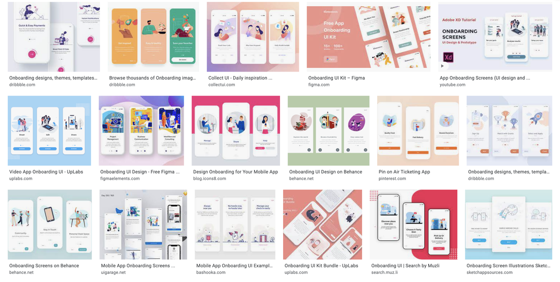
Google search results for 'onboarding UI' Madeleine Boyd Graphic and Media Design If anti-design seeks to disrupt the design trends we are immersed in each and every day, it’s re-emergence throughout the course of the COVID-19 pandemic may have struck the right balance of both the best and worst time to do so. If we start at the beginning of the pandemic for the UK in March 2020, what was arguably the most noticeable shift in how we lived our day to day lives? It became screen-based. From education and healthcare to shopping and social functions, pretty much every aspect of how we live as a society today was quickly converted to live in a digital world while our physical worlds became more isolated than ever before. I have no doubt everyone remember their own attempts to bridge this physical gap with at least one or two new platforms or features that encouraged us to live our isolated lives in a somewhat more social way. We quickly became oversaturated with digital content in a very short span of time, driven through necessity in an attempt to keep everything moving along as we attempted to adjust to this ‘new normal’. While this is a simple retelling of an unprecedented global event, I see it as what opened the door for an aspect of the anti-design movement to return. Though rather than focusing on its original subjects of physical objects this allowed anti-design to have a presence in the digital sphere we have so quickly adapted to living in. Some argue that digital design overall - be it an app, a website, a program, or some other version of a digital environment a user interacts with - looks the same. While some find the typical ‘modern, minimalist, clean’ interface make a pleasing experience to interact with, others have become tired of the carbon-copy nature of these applications in our digital lives. As someone currently working in a UI/UX field, I find it fascinating to hear and read about these two opposing perspectives, and to see the the ever-growing expanses of both. It has to be acknowledged that yes, many applications are constructed with a (shockingly) similar look and feel across the board. Some of these features include the same style of illustration, the repeated use of popular stock photos, and rounded corners running rampant to name but a few (Malewicz, 2020). In Daniel Kalick’s 2017 talk on ‘The Rise of Anti-Design’ (AIGAdesign, 2018) he speaks on pattern, business, and simplicity being the three issues with today’s UX design, and highlights simplicity as the leading cause of what we now see as a problem with repetitive and characterless platforms. While anti-design is “an expression of rebellion - bending, stretching, and re-interpreting the rules of [graphic] design” (Over, 2020), digital platforms - particularly those trying to establish themselves in a dense field of competitors - have a very small window to earn the trust of a new user so choose to use familiarity and an overall crowd-pleasing aesthetic to win the most interest in a short span of time. Anti-design in this space opens the possibility of questioning: how can something entirely new be used to achieve the same thing, but by eliciting a response of excitement or sudden interest rather than being the ‘same old thing’? Of course you can come at anti-design from a range of angles here, but I am choosing to focus on what is essentially breaking apart UI trends that we have become so accustomed to. Often found alongside descriptors such as ‘brutalist’ and ‘grunge’, has this rougher - and perhaps older - web style been able to make a successful return because we have developed our technology to support this as a purposeful stylistic choice rather than a limitation of something new and still growing? Maybe, but that could lead to a discussion further astray from anti-design and move into another territory entirely. In the sense of UI, anti-design has a tendency to be described as “intentionally creating ugly, disorienting, or complex interfaces…Some use harsh colours, disorienting patterns, weird cursors, and unnecessary distracting animations” (Scacca, 2018). A bold and distracting interface creates a colossal interference in what we expect to see, which must generate curiosity. As mentioned earlier, with the amount of time we have spent staring at screens over the past year and a half, its no wonder that a style so defiantly different rose up from the monotony people were immersing themselves in every day. What I question in this is approach is the purpose, and if how it may interfere with functionality. Is anti-design more appropriate for certain audiences over others? If in response to overused design trends, what is the true impact of “intentionally creating ugly, disorienting, or complex interfaces”? (Moran, 2017) Is it be in the genuine interest of the companies, brands, or people to take a bold step away from what people already know and trust, or is it a publicity stunt? Is the point of anti-design even to be ‘effective’ in any way at all, or does it exist today to disrupt repetitive trends? I do not believe there is a singular answer to this, and must depend on a combination of factors from the demographic of users to whether a revolutionary approach to how a user interacts with an interface (for the sake of visual style) is appropriate for certain subject areas. When our worlds have been turned upside down and we seek comfort in familiarity, what can anti design bring to the table? Sources
AIGAdesign (2018), User Experience | The Rise of Anti-Design, Available at: https://www.youtube.com/watch?v=s1CLA2MgvrA Malewicz D (2020), The 5 main anti-trends in design, Available at: https://uxdesign.cc/the-5-main-anti-trends-in-design-e5629c1b217d Moran K (2017), Brutalism and Antidesign, Available at: https://www.nngroup.com/articles/brutalism-antidesign/ Over (2020), Over’s 2020 Trends Kit - #6 Anti Design, Available at: https://www.madewithover.com/trends-copy/anti-design Scacca S (2018), Brutalist Web Design: Where Did It Come From and Why Is It Back?, Available at: https://wpmudev.com/blog/brutalist-web-design-where-did-it-come-from-and-why-is-it-back/ Vakhnenko H (2021) Minimalism in Mobile App Design as a Powerful Current Trend, Available at: https://agilie.com/en/blog/minimalism-in-mobile-app-design-as-a-powerful-surrent-trend
1 Comment
Robert Urquhart
1/6/2022 06:50:35 am
Interesting post - i wasn't familiar with Daniel Kalick’s talk before, thanks for sharing!
Reply
Leave a Reply. |
Archives
December 2021
Categories |


 RSS Feed
