|
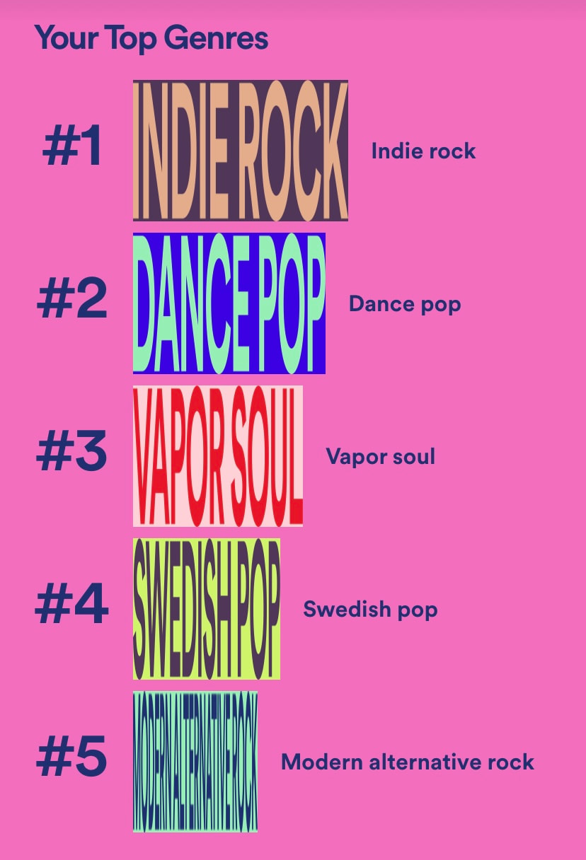
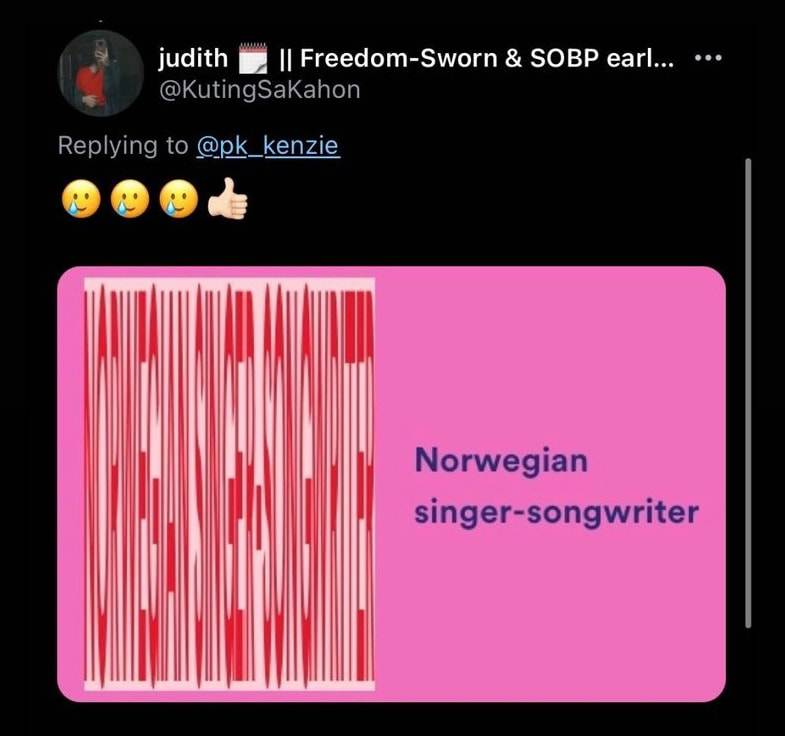
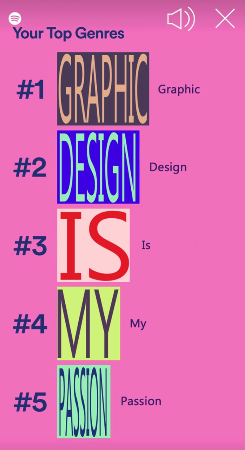
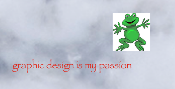
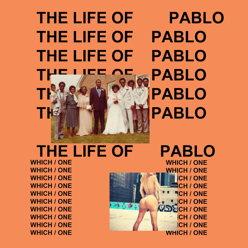
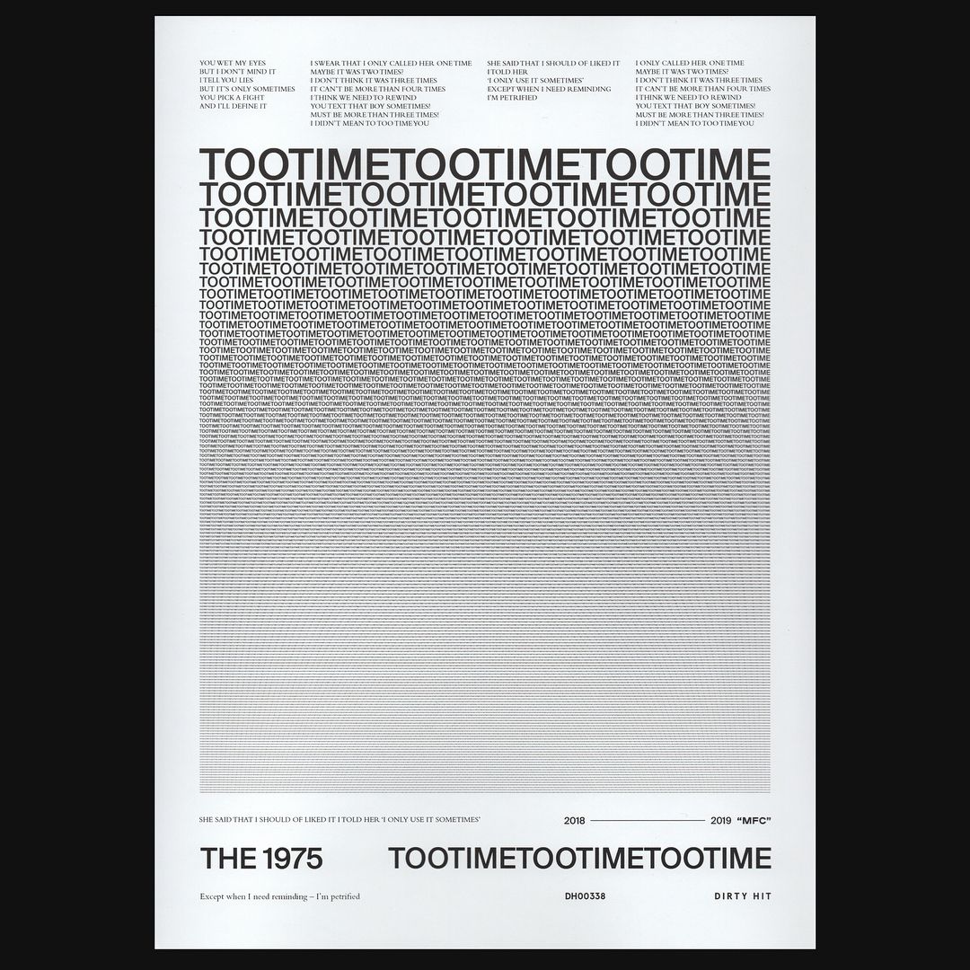
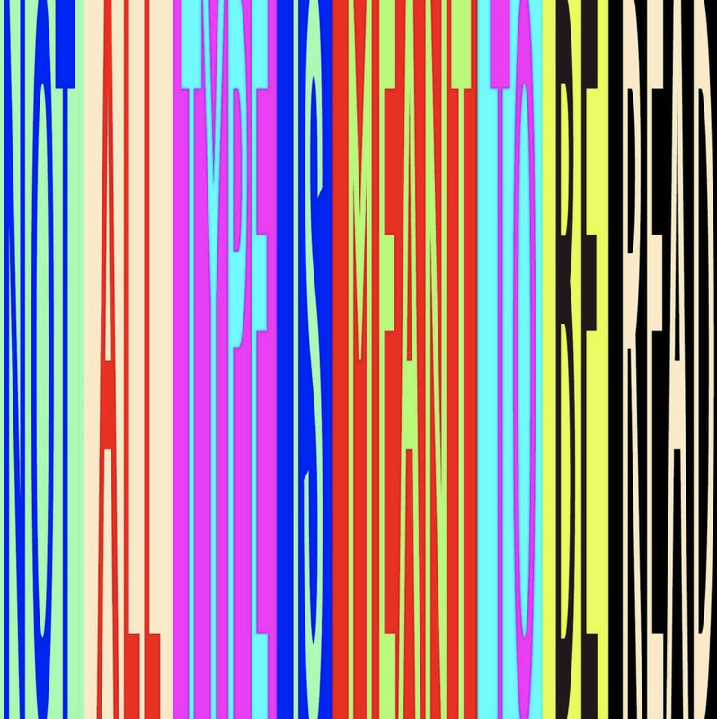
As an intern at a design studio, I have spent a lot of time thinking about pieces of work that excite me, and the type work that I aspire to make in the future. More than that, it’s also about how the work is done. I want to become a designer that people reach out to, to solve their problems. At the end of the day, it’s not about my own desired aesthetic identity, it’s about solving other people’s problems accurately and efficiently. A new creative brief is always exciting – it becomes my artistic playground where I can create things within the constraints. Knowing where the work will sit in the world and who the target audience is where I am at my most creative. Fundamentally, it’s called graphic design. When you spend your nine to five Monday to Friday designing on a grid and typesetting in InDesign, you suddenly become extremely aware of every piece of visual communication you pass by. Just in the same way your firefighter relative will be extremely concerned seeing the fire safety of your flat when they come to visit. Most people outside the design world however will not spend any time thinking about the way a poster has been typeset. In Design as Art, Bruno Munari writes: “People haven’t got time to stop in the street, size a poster up, see what it refers to and then decide whether or not it interests them. Communication must be instant and it must be exact.” In conclusion, most people won’t think about the dressing of the letters… Until something looks “off”. The hottest talking point in the last week has been Spotify Wrapped – the annual insight into everyone’s music listening habits. This year, the conversation on social media wasn’t just about the music stats – it was about the graphic design of the interactive story inside the app, where something surely did look “off”. Let’s take a look at my top genres: Screenshot of my Spotify Wrapped 2021. EXTREMELY condensed type. You don’t need to be a designer to understand that something is not right here, because you simply cannot read that this is meant to say “Norwegian singer-songwriter”: From @KutingSaKahon on Twitter. Attending a design school, one of the first basic typographic rules I learnt was: Never. Stretch. Type. The discourse of this one design element spread wide and far, and I spent some time scrolling through Twitter and Instagram to see what people thought. Some people were extremely upset seeing the condensed element, arguing that Spotify’s designers broke the simplest design rule. Someone reacted by posting this: "Graphic design is my passion" typeset in the Spotify Wrapped 2021 style from @nanastudioz on Twitter. It did make me laugh – a brilliant meme based on the Graphic Design is My Passion meme, that first originated from Tumblr. The original meme shows a clipart picture of a frog, alongside text typeset in Papyrus (famously renowned for being an “ugly” font). Basically, this meme format functions as a reaction - a “digital eyeroll” - to unpurposely poorly designed visual elements. The original Graphic Design is My Passion meme. Was the extremely condensed type a conscious decision from Spotify’s design team? I would say yes. Spotify’s Global head of design Rasmus Wangelin explained how people around the world in 2021 have started embracing the unknown, and the Wrapped identity was meant to reflect all of this. And most people online also seemed to dismiss the piece of legible sans-serif next to the condensed. So, what was the point of all of it? For me it is just making a statement. The 2021 Wrapped identity certainly got people to talk. Clever move, Spotify. When the basic design rules are chucked out the window on purpose, it falls into the category of Anti-Design. Spotify Wrapped 2021 is just one of many examples, and by looking at others, we can start getting a grip of the bigger picture. Take Kanye West’s Life of Pablo as an example. Kanye West - Life of Pablo album cover. Or the work by Samuel Burgess Johnson. Samuel Burgess-Johnson for The 1975. Is there a reason for the repetitiveness? In the age where consumer capitalism affects every aspect of our lives, and where we see a rise in the voices of protest, designers will ultimately seek new ways of doing things – turning against the traditional rules. The key to good graphic design is precision and legibility, but designers can break these rules if they only know how and when to break them. By doing so, designers can create bolder work, whilst still adhering to the key message they’re trying to deliver. The work of Samuel Burgess-Johnson, for example, communicates by using typography, but the typography becomes and art form, by the way it is being repeated and stretched. It generates a direct, visual interest. I also thought of David Carson – founding art director of Ray Gun music magazine in the ‘90s, and famous for his expressive approach to typography. Speaking about how design seems to be in a place where it’s becoming more standardised and perhaps too easy to understand, Carson says: “Everything looks the same. There are no visual clues that this is something special, or that you really need to read this.” Carson’s notion of the trend toward uniformity seems to be shared by many other designers. As a reaction to this year’s Spotify Wrapped, @kel.lauren posted this on Instagram: "Not all type is meant to be read". @kel.lauren on Instagram. She writes: “I invite designers and viewers alike to reimagine our relationship with type, and how it can be used BEYOND simple communication. How typography itself is a stylistic graphic AND an art form…”
As graphic designers solving other people’s problems; always conscious about the context of our work, there is also room for expression and for play. If there is a reason behind that stretched type and those broken design rules, go for it. Rules are meant to be broken. Spotify’s designers knew for sure that people would talk about their stretched type. At the end of the day, if the message is still there and the solution is creative and innovative, who said design needs to be boring? We live in strange times, and it sure would be weird if design wasn’t reflecting this. Karolina Alvekrans BA (Hons) Design for Art Direction BIBLIOGRAPHY Bamsey, A. (2021) Spotify Wrapped is a design nightmare. Available at: https://www.creativebloq.com/news/spotify-wrapped-font Lanks, B. (2017) The Father of Grunge Typography Calls Out Lazy Design. Available at: https://magenta.as/the-father-of-grunge-typography-calls-out-lazy-design-daae470a685a Made with Over (2020) OVER'S 2020 TRENDS KIT - TREND #6 Anti Design. Available at: https://www.madewithover.com/trends-copy/anti-design Munari, B. (1966) Design as Art. Satori Graphics (2021) Will ‘ANTI DESIGN’ Takeover The Graphic Design World!? Available at: https://www.youtube.com/watch?v=Bv7a3TcxugQ&ab_channel=SatoriGraphics Spotify (2021) Global Head of Brand Design Rasmus Wangelin Explains the Creative Behind Spotify 2021 Wrapped. Available at: https://newsroom.spotify.com/2021-12-01/global-head-of-brand-design-rasmus-wangelin-explains-the-creative-behind-spotify-2021-wrapped/
1 Comment
Robert Urquhart
1/6/2022 06:41:45 am
love your Screenshot of Spotify Wrapped 2021! Kanye and 1975 also excellent - they really stand out as great communication don't they! Great blog post!
Reply
Leave a Reply. |
Archives
December 2021
Categories |
 RSS Feed
