|
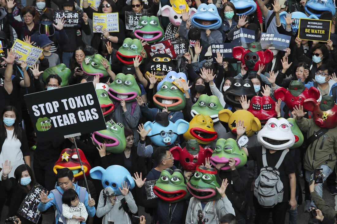
Look, I feel like we’ve all been a bit down these past few months; lockdown with winter added to the mix wasn’t an ideal scenario. It’s cold, grey, and we can’t leave the house. I became very distant toward design and my own practice, but I want to stress that this hasn’t been a wasted term, despite feeling that it has. I’d love to say that I used to time effectively and picked up various new hobbies and my life is absolutely perfect but that just isn’t true. What I did do, was read a little more. Admittedly I still haven’t read much but it has been an exponential increase since last term, or if we’re being honest, since I was about 16. Ironically one of the main books that I got engrossed in was ‘In Praise of Idleness’ by Bertrand Russell; a collection of essays written during his lifetime. For the purpose of this blog post I’m going to focus on the the first essay in the book; with the same heading as the book title (link below) however it is a collection that I would highly recommend to anyone interested. Despite written in 1932 it’s principals are eerily relevant today. Essentially Russell argues that too much emphasis has been placed on the value of ‘hard work’ and argues the importance of having free time to explore hobbies/interests without the focus of monetary gain/value. Comparatively against that ‘rise and grind’ mentality that we see today, where we’re pressured to monetise everything that we do and create. “In a world where no one is compelled to work more than four hours a day, every person possessed of scientific curiosity will be able to indulge in it, and every painter will be able to paint without starving.” B.Russell, ‘In Praise of Idleness’ p.14 Obviously, this is living in a hypothetical world and our life is inherently centred around money and so I do completely understand where the ‘rise and grind’ mindset comes from. However, this ethos made me reconsider my approach to my design and practice. Like I mentioned earlier, I have been seeing, not necessarily a lack of creativity, but a lack of motivation towards design. Unintentionally I had taken a step back from playing an active role in (digital) design; instead I found myself drawing more and reverted back to a sort of creativity that I hadn’t looked to in a while. This was also around the time that the Sarah Everard case was emerging, which eventually turned into Kill the Bill protests, so activism and protests stormed the front of my mind. Here, I also want to mention that I had the pleasure to help a flatmate with their campaign for SU elections a few weeks prior as I think it better explains the thought process I experienced. Despite having been interested in activism and politics for years, this was the first time I had considered combining the two with my own work as a designer. Sustainability of my own design has always been a thought during my creative practice but for some reason when it came to activism and politics my brain had compartmentalised the two into completely separate categories, only over this period of intense activism had I first really thought of bringing both ‘passions’ together. Recently I also read ‘The Politics of Design’ (Ruben Pater) which also was along this same path of combining the two areas; in it, it essentially argues that all design is, without fail, political. I should add that I feel as though this conclusion says more about our sOciEtY rather than the entirety of design and it’s principals. The book touches on a myriad of examples where politics and design have impacted each other; which creates a really good overview of a lot of interesting topics, annoyingly it’s a little brief for my liking but still good nonetheless. Here I would like to talk about how visual language, especially in the age of the internet have impacted protests and activism. For instance Pepe the Frog has been prevalent in various movements; most notably the alt-right since the 2016 Trump campaign, which Trump himself acknowledged, furthering the message that the ‘symbol’ communicated and represented. Where, in this example, the symbol was largely confined to an online presence, it rarely made a physical appearance in the ‘real world’, in Honk Kong it was a different story. Pepe was reclaimed by pro-democracy protesters in Hong Kong in 2019; the symbol of Pepe was remoulded and brought into the ‘real world’ taking up ‘real space’. Graffiti, masks and protest signs were created; the entire meaning of the same symbol is a completely different one to the one we see in America and alt-righters. Although it’s the “same” image, the differences are clear - despite having the same origin, the manipulation from both ‘movements’ of the motif have differed drastically. Using motifs and symbols to uniform a protest is not a new concept, but the addition of internet culture has created a ton of new possibilities. A notable symbol that we see in tangent with protests and activism is the fist, designed for the Black Lives Matter movement. However, I want to distinguish the difference between the fist and Pepe; the fist was created specifically for the movement, it’s creation and purpose serve the same meaning. But when we look to Pepe, it wasn’t created with a message to convey; instead it spread on the internet, becoming a well known image to which each group/movement could co-opt for their own political purpose separately. I think during this period of time, despite looking back I didn’t ‘physically’ create that much; my mentality has shifted. I had time to reflect on what drives me and my creativity without actively participating in design itself. Taking this time to understand why I do what I do is an important factor for everyone and anyone’s creative practice, which is probably an opportunity only a privileged few would have been able to experience prior to this pandemic. Amber Cape BA Graphic and Media Design :)  Hong Kong Protests 2019 - Pepe the Frog reclaimed Hong Kong Protests 2019 - Pepe the Frog reclaimed
0 Comments
Leave a Reply. |
Archives
December 2021
Categories |

 RSS Feed
