|
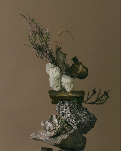
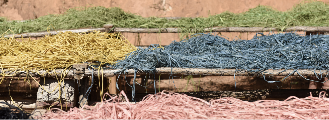
My name is Fantine. I am a Graphic and Media Design student in LCC. Since my last blog post, I got lucky enough to become part of Rémi Paringaux’s team. I have been working for him for two months now, and learnt more than I could imagine. As a result of the pandemic, he decided to launch his own brand focusing on well being products. I would describe his brand as a very strong invite to harmony and living altogether in a community. It translates caring, sharing and nature in a the most simple and poetic way. The brand identity has been a very important point during every single steps of the development. Our main focus is to create something that makes sense, that attract people’s attention and impact them as a person. “Designed for those who see — and seek — the opportunity to create change.” During this internship, I have been learning a lot about the backstage of launching a brand. I found myself improving my communication skills within this team. I have to manage my own timetable to get the work done at the end of the day while keeping communication going with the people I have to collaborate with. I am discovering all the hidden aspects and jobs behind a brand, and am learning to share ideas and work with them. My current role is to design the website. I have been doing this for over a month now, and have had to send every single pages to the developers for them to start coding. But beforehand, I was organising the social medias to make them consistent. I had to make some research about photography to find photos we could buy the rights for in order to use in our website and social media. This internship taught me a lot, most particularly, the importance of sustainability. Since the very first day working with Rémi, I realised how important sustainability was for his brand. Indeed, the packagings are 100% plastic free, vegan and reusable. Every shampoo bottle is made of metal and held by a vegan leather strap. We want our products to be a perfect balance between luxury and affordable, between design and marketing and between personal and commercial. As designers, we put a strong importance to the visual and its communication. Our visual communication is based on natural colours such as an olive green or a soft beige. We chose an organic style for our illustrations while the font used looks like a handwritten letter. By putting nature and sustainability as our main focus, we challenge ourselves to stay eco friendly in our speech. We want to reach people and show them the importance of reusable products by adapting ourselves to our audience in a sustainable way. Moreover, the scents we use in our products are naturally made in the uk. Before this internship, I never really had the opportunity to see how to develop a sustainable product or design. I think we are entering in an era where sustainability is becoming more and more important for people, and it’s good, as creatives, to react and make some changes by reducing our use of plastic and making reusable products. As a young graphic designer, I felt deeply inspired by the message of the brand that I am working on. The ability to bring people altogether in a community focusing on sustainability and nature while visually communicating this same message through design, typography and photography is definitely something I want to use as an inspiration. Here, a photograph taken by Julia Hetta from her collection called “Still Life”. My internship taught me a lot about photography. I discovered Julia Hetta and fell absolutely in love with her work. I have always loved Still Life painting but never really payed attention to Still Life photography. I think Still Lives artworks are a good representation of nature and sustainability. We often find fruits or vegetables only. They are being used as the focal point of the photos or painting. Therefore, they are the first thing the audience is looking at. I would like people to have the same reaction looking at my designs in the future. I want them to see the sustainable aspect, to see the message within the design. This internship inspires me to use nature more, to turn something that we all have into something beautiful. My plans for the future are to focus more on printing and typography. I would love to learn about the traditional printing techniques and about the rules of typography. While working with Rémi, I had the opportunity to make a lot of research for the brand’s visual identity and I found a deep interest for typography design. I have been thinking about several projects I could start working on and I made some research about how to keep them sustainable. I want my work to touch people as much as it touches me. I found this website that has an amazing sustainable approach and is making eco friendly bags in Madagascar :
“Our collections are designed with 100% natural materials that acquire their own character over time. The natural product matures with time, developing an increasingly supple hand and a beautifully vintage coloration.” Maison NH. Paris - https://www.maisonnhparis.com/pages/sustainable-approach I have the chance to be half madagascan and I think I should definitely use this unique part of my identity to create some change. Fantine Dubreuil, GMD https://fantinedubreuil.cargo.site @fantine_dbr / @fantinedesign
0 Comments
Leave a Reply. |
Archives
December 2021
Categories |


 RSS Feed
