|
Margarida Ferraz Dias, Graphic and Media Design As my second month at Vanity Fair, things could not be more hectic. Alongside all the editorial work I have been asked to do, the organisation of the Bloomberg & Vanity Fair Climate Exchange Gala has been one of the most stressful events to organise. The Gala is dedicated to the Bloomberg Philanthropies and their impact on climate change. Besides of the gala itself, the main goal from Vanity Fair was to gather as many artists as possible to shoot for a spread of the magazine, regarding climate change and who has been recently involved in fighting it. This photoshoot was a great experience to work alongside a great photographer, Matt Holyoak, known for epic shoots for most fashion magazines. Besides of gathering most of the richest people on the planet, it is also a combination between artists, influencers, actors, singers and entrepreneurs from all over the world. It is been very tiring and stressful but rewarding at the same time, by seeing the event itself coming together and the feedback after the actual Gala. Not only I was able to work as an editorial designer for all the aspects in promoting the Gala but also boost up my PR skills in such a big event like this. I have been loving working with Vanity Fair & Tatler and I believe it has been a very good opportunity not only to practice as a designer but also to build a network of contacts for people who might help me in the future. I'll leave the link for the event pictures here, if you guys want to take a look: https://www.vanityfair.com/london/photos/2018/12/bloomberg-vanity-fair-climate-exchange-mike-bloomberg-stella-mccartney-paloma-faith#6
0 Comments
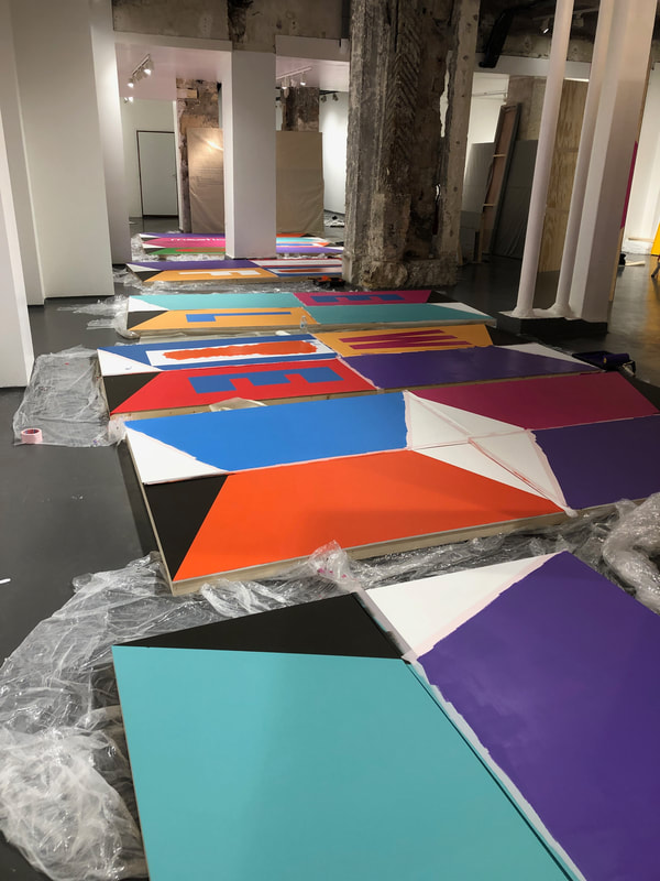
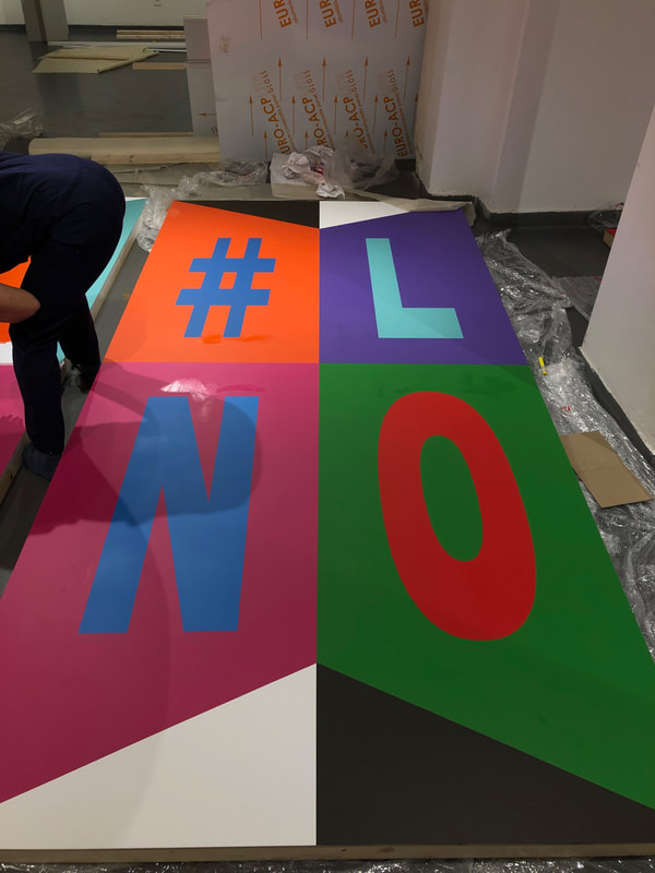
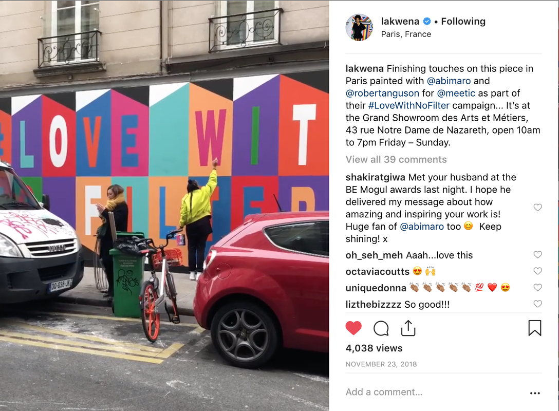
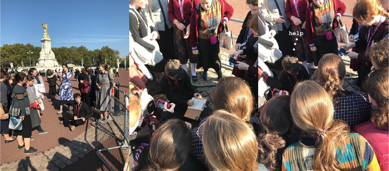
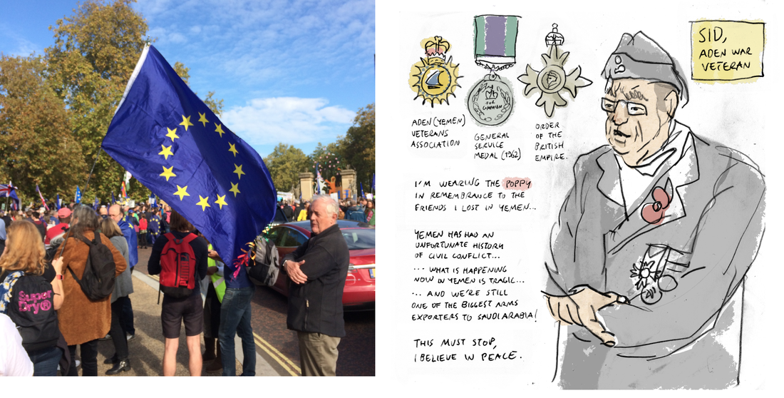
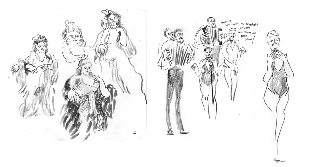
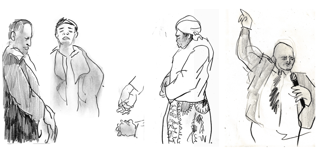
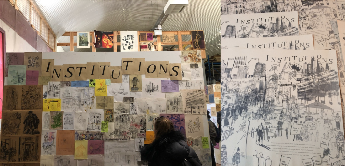
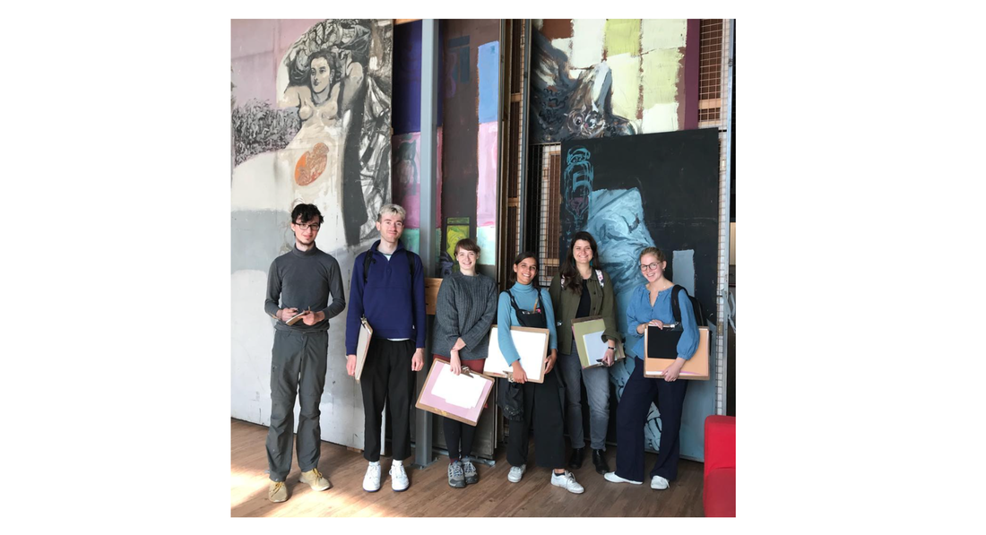
Angus Robertson Graphic and Media Design Recently, I have been thinking a lot about the currency of design/art, and the exchanges that exist both within the creative industries and across into other industries. Through some great conversations and observations on how exchanges are made, it has caused me to question the motivations behind being the ‘creator’ and the ‘consumer’ . Working as a Studio Assistant for artist Lakwena, I have seen project commission enquiries ranging from small scale personal commissions for artwork for someone’s home or for a gift, to gallery exhibitions, public sector projects and to international commissions for corporate companies. With this, there comes payment of different sizes, and shapes. Whether this be sums of money, promise of ‘exposure’ or just a shared interest in the goals and message of the project varies job to job. And so, I have spent a lot of time thinking about where the line is drawn between financial gain and artistic integrity. ’Selling out’, is a term thrown around within most fields where the artist must decide between financial gain and creative integrity. Unfortunately, the case often is that you must make some sort of compromise in order to pay your way. I’ve learnt that most of the money lies in work for large corporate organisations who perhaps don’t value individual style and ideas as much as delivering their own message. Something that Lakwena and I discussed, is the idea that often corporate commissions aren’t looking to collaborate in a way which values the artist as a contributor in terms of concept, ideas and themes, but uses them as a tool to deliver their own message. Perhaps the organisation has picked up on a particular style and sees this as a fit for their brand, and so wants the artist to mould this style to fit their own vision. Further to this, I have observed the way that artists are often used as a currency of their own within corporate organisations. Through using an artist for their campaign/product, to them this represents something ‘edgy’, ‘thoughtful’ or ‘individual’. But rather than actually represent these qualities, the aim is really to give an impression of being this way. We of course see this enacted on many other levels, big brands wanting to appear in touch with issues affecting minority groups (e.g making adding the rainbow pattern to their logo to appear supportive of LGBTQI+ issues). This of course operates on a different level completely, but is along the same train of thought where companies are drawing from various sources to gain cultural capital. This takes me back to my original point, it is necessary to be aware of and mindful of compromises that must be made in order to participate and engage your work with the wider world whilst making a living from it. Furthering this idea through my own experience, on a much smaller scale and with far less impact. In a previous placement I recently finished working with, I was left at times feeling like I was there as a technician/art-worker/tool of sorts. My ideas weren’t really what I was there for, it was more my capacity to undertake their own vision and message and create work in large volumes/at speed. I fully understand that largely an intern is employed to do low level tasks and that this is to be expected, however it definitely caused me to consider the value of our time as creatives. All cynicism aside, in November I was very lucky to join Lakwena in Paris to assist on the painting of a 17 metre long mural commissioned by Match.com for their '#lovewithnofilter' campaign. Regardless of opinions of working for big brands, this was a really great learning experience in the logistical aspect of a creative project which requires meticulous planning and preparation in order to execute well. And of course no complaints in a free trip to Paris! Mark Henson BA Illustration and Visual Media It can be odd to think that, throughout most of human history, hand-drawn artwork was the most effective means of providing a visual account of the world around us… Even decades after the advent of photography, some events where still presented to the public through the work of skilled illustrators, namely war artists who consolidated the genre of ‘Reportge Illustration’. Flash forward to today’s restless visual culture, shaped by a device in our pockets capable fo broadcasting anything to anyone at any moment, and it’s not hard to see how illustration, as a means of reportage, may have fallen a bit out of favour… However illustration can still offer us a unique perspective in this regard, particularly in contrast to the immediate and ubiquitous means of media generation and consumption we’ve grown accustomed to. This is what five eager artists and I explored during the Topolski residency in the fall and winter of 2018. This opportunity was put in place by the living relatives of the great polish reportage artist Feliks Topolski, who made a name for himself in UK after the second world war with his prolific compulsion to sketch current events as they unfolded and publish them as a series of ‘Chronicles’. In the spirit of reviving his legacy and passing on the torch to new generations, six young artists have been invited to his studio in Waterloo every year since 2013 to produce a new chronicle; this year the flame rested in our hands. And by flame, I mean pencil. One that wore down quicker than any pencil I’d worn before, as I did my best to keep up with the frantic sketching schedule during the reportage days in various locations around London. The theme for our Chronicle was centred around London’s ‘Institutions’, exploring them from outside and within. This included some obvious ‘Big Institutions’, such as Buckingham Palace, where we drew the changing of the guard. I also had the bizarre experience of being swarmed by a group of east-european schoolgirls for whom, it seemed, the sight of a person drawing on location was akin to witnessing the second coming of christ. 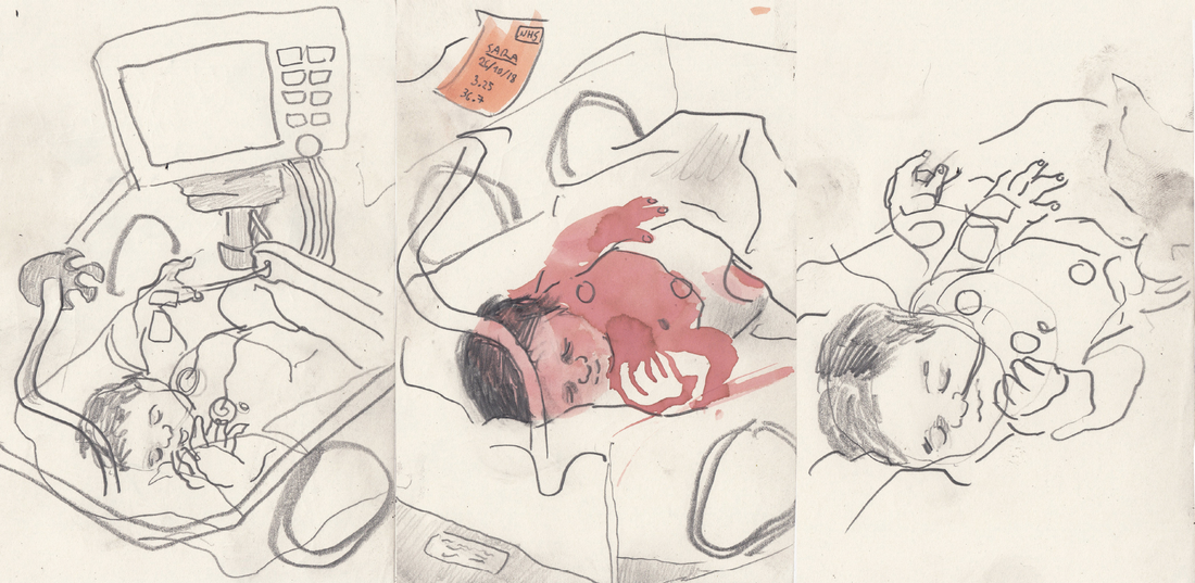 Another memorable experience was drawing newborn babies in the maternity ward at Chelsea and Westminster Hospital, which actually felt like witnessing a miracle. Politics where inescapable during the height of uncertainty over Brexit, so we drew at events like the People’s march for the EU in October. In overwhelming public gatherings like this one, or the processions of remembrance day, I resorted to interviewing people on the side, drawing them as we talked, in an attempt to capture smaller stories that could echo the sentiments of the masses. I had, for instance, a very insightful conversation with a war veteran who proudly whore his uniform and medals, while also condemning the actions of the British empire and current arms trade sponsored by the UK, and insisting that the red poppy should stand for peace. We where also invited to look beyond conventional notions of what ‘Institutions’ could be. This was encouraged by interesting juxtapositions, like the day we drew in churches, the prayer room in London’s central mosque, and the unique sanctuary of British culture that is Wetherspoons… somehow, it all came together and made sense. Not to mention, a few days later, we found ourselves at a queer cabaret night in Vauxhall drawing outrageous drag queens, lewd slapstick and kinky musical acts; which I have no shame in admitting I enjoyed thoroughly. It wouldn’t require a stretch of the imagination then, to conceive what the conservative christian Nigerian communities in east London would have made of that latter event… A street preacher vigorously yelling from his megaphone “If you are a man who thinks he is a woman, the Holy Spirit will straighten you out!” might serve as a hint… However, this strong belief system, so easily dismissed in an increasingly progressive society, had me intrigued. In fact, it became the focus of my individual reportage project. Before I knew it, I was being integrated into what most people would call a cult. To keep things short, I’ll just say it was a fascinating experience during which I did my best to push preconceptions aside and make way for nuances to emerge on the following question: are the beliefs these people hold bringing them closer together or pushing them apart? I relied on field recordings, testimonies and interviews alongside location drawings to capture my interactions and produce a body of work that could shed a bit of light on this still very open issue. The project was showcased alongside five other unique contributions by the residents in our group show, also featuring reportage work we produced together throughout the residency and compiled into the chronicle. It was quite a feeling stepping back and seeing what three months of stepping outside our respective comfort zones had amounted to. Overall, it was an honour to take part in this collective endeavour pushing forward what I believe to be a valuable artistic cause. It’s important to note that many of the experiences we had where either initiated by the appeal of drawing, or facilitated by it’s discreetness in sensitive environments.
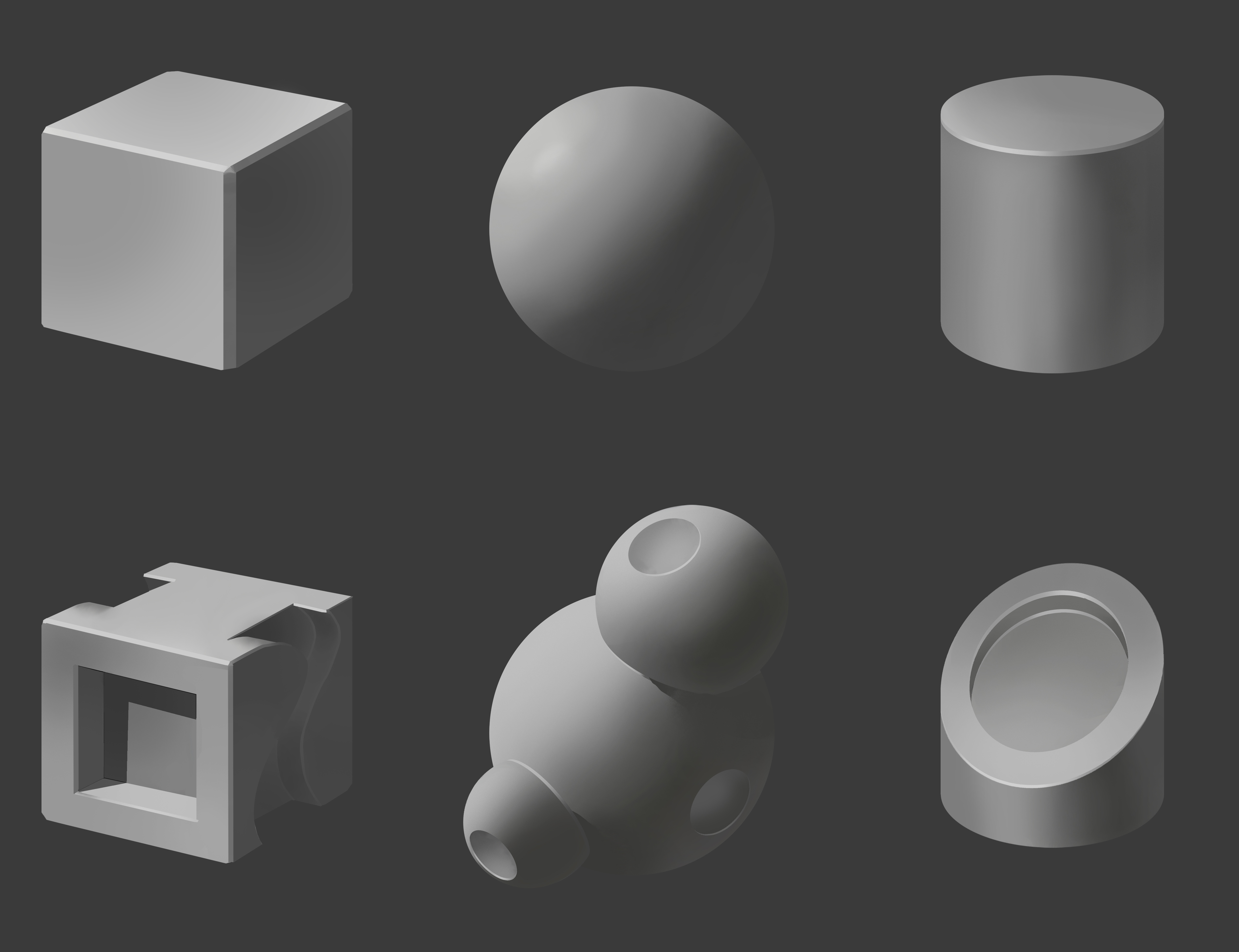
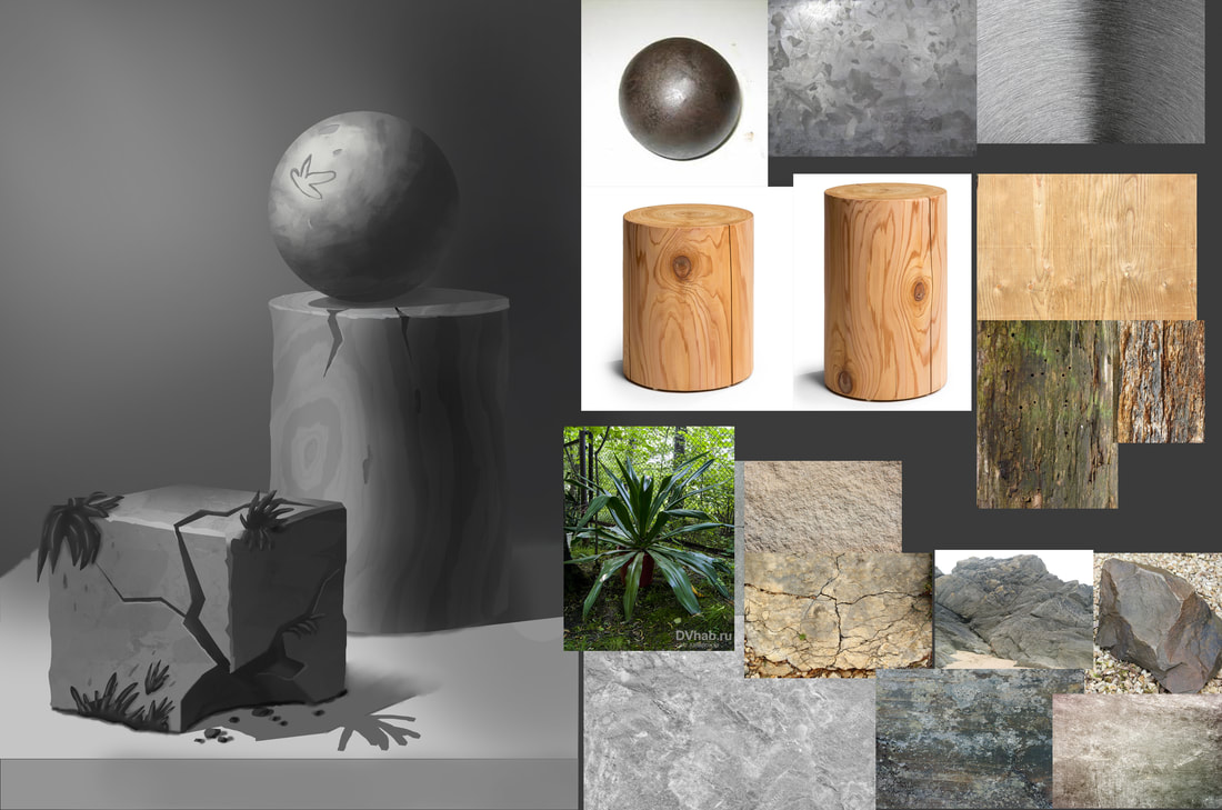
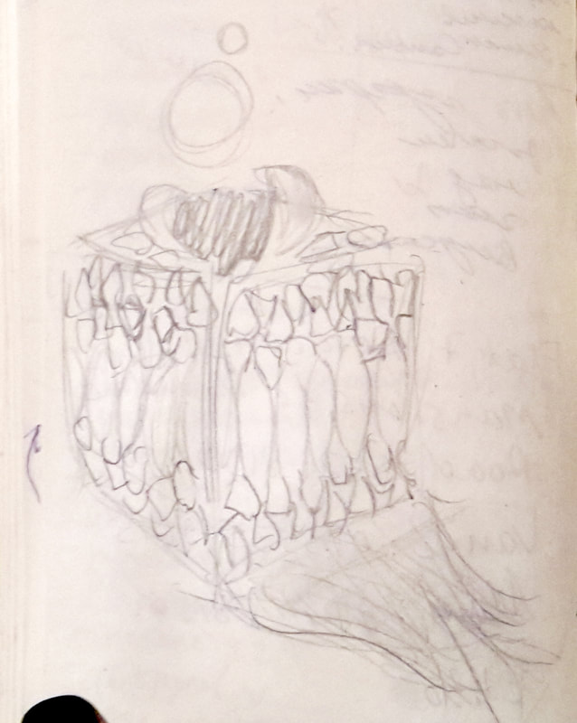
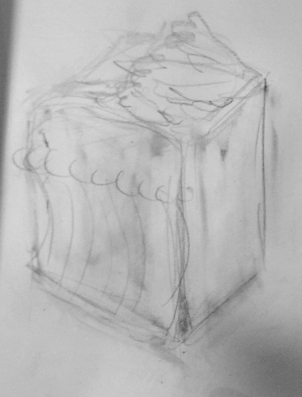
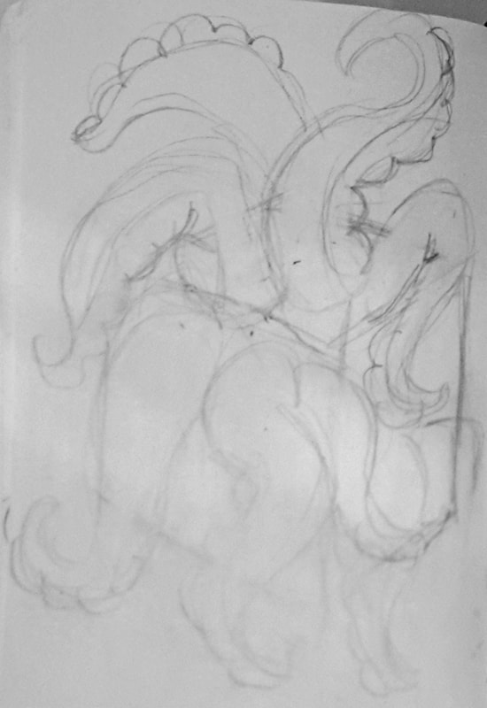
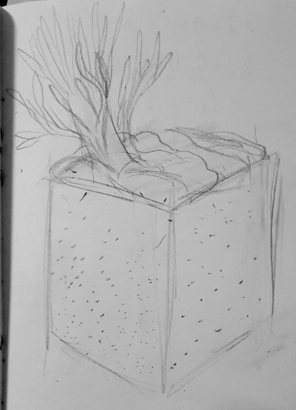
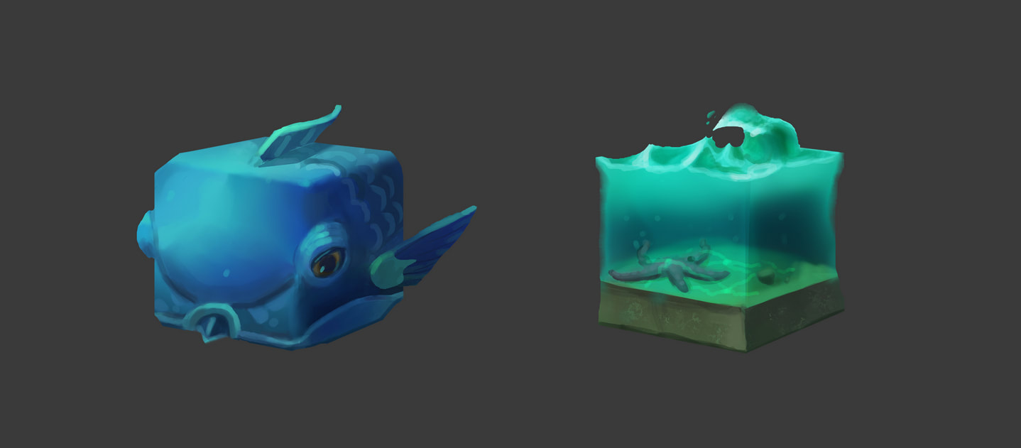
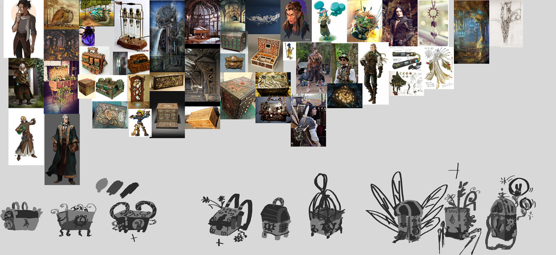
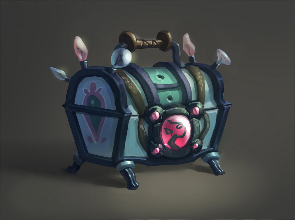
Though reportage illustration has become niche, and is often overlooked, we can now lay claim to many things we got away with, capturing situations and moments that where only possible because of the fact that we held a pencil, not a smartphone or camera, in our hands. A special thank you to Shana, Natasha, Georgie, Luke, Marta, Laura, Gary, and Theresa for the amazing experience. I learned a lot from every single one of you. 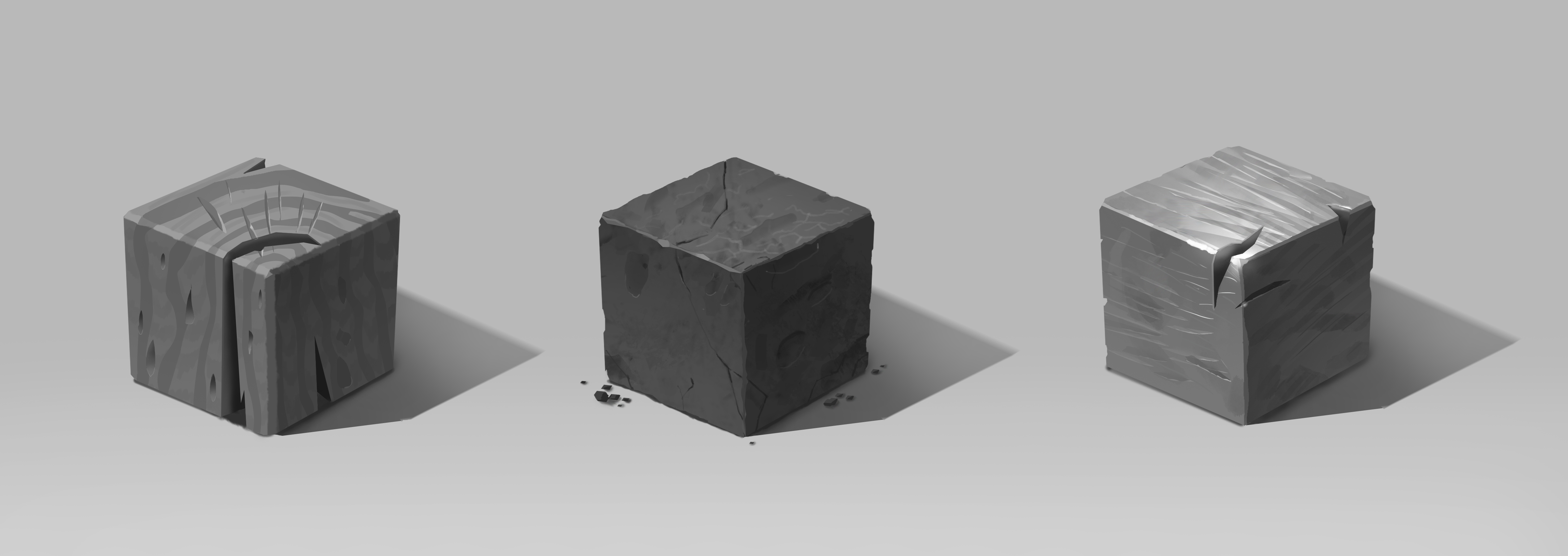 by Katya Koroleva IVM In August I started doing an online CG painting course in SkillsUp school. SkillsUp is a St Petersburg - based computer graphics school, which has both offline and online lessons. I decided to take on this course because one of my long-term goals is working as a computer game concept artist, which requires CG skills. I know photoshop pretty well, but I don't do much of painting in it, up until now I've always been more of a traditional media artist, but I have a graphic tablet. The aim was mainly getting used to drawing on the tablet and learning some tips and tricks of painting in Photoshop. This was my first online art course ever. I've never done this before, but I have read reviews of this course from others. They warned: stock up on instant noodles and microwave dinners as you will not have time to do anything else. OK, I thought, this advice is for working people, who would do assignments after their main job. I was free-ish is August and the beginning of September, so I thought it wouldn't be as harsh for me. But it was still quite tough, as life got in the way. Friends and relatives needed attention, internships needed to be applied for. In the end I did have some extra hours in a week compared to my working groupmates, but with moving to London it was more complicated. Here I had to sort out my new accommodation, the situation with the internet was not clear, as I moved into a new house occupied by new tenants. And the LCC library was still on Summer schedule closing at 6. And now there was a time difference of 2 hours earlier. So, when the Russians came home from work at 7pm, it was still 5 pm in London, so it was kind of tricky logistically to attend the feedback sessions which were in a live online session. I had to do this in a Pret a couple of times, which made it hard communicating through a microphone. In week one we studied lighting and how to paint lighting on simple objects such as spheres and cubes. Then we hopped to creating textures, still in black and white. The main point was to use appropriate reference photos, and to copy the textures as best as you can. The sum-up of these couple of weeks was to paint a black and white still-life from simple objects (sphere, cylinder and cube), and assign textures to each of them: stone, metal, wood. Next, we continued with colour theory and learned how to paint textures in colour. First, we copied some after the teacher, and then we had to invent our own textures. It could be a series, it even could be a mini-prop for a game, but it had to be close to a cube in form. I picked the aquatic topic. This was the week I had to move from Moscow to London, so I had to sketch on the plane. I ended up finishing only two cubes out of four : a cuboid parrot fish and a slice of water, which I later turned into stickers. In week 8 we started working on our final piece - a prop for a character, namely a chest or a bag, something they put things in. Of course, it all starts from writing down all the characteristics, race and occupation of the character that you're designing for, because the prop should show who it belongs to. I decided to make a trunk for an elf-biologist in a steampunk setting. We had to gather lots of reference pictures, make many iterations of the silhouette, try out different colour schemes, for which you also had to find references. And finally, after two weeks of polishing every speck of texture and lighting on your thing, you had a whole game prop ready for your portfolio. Legend has it, pro-artists can paint a prop in a day, well, we’ll see how it goes in the future… The 12 week Photoshop painting course in SkillsUp ended on the last day of October. It was a stormy time for me, battling procrastination and spending sleepless nights doing homeworks before the deadline. I could have been better organised, but this is the person that I am. It was comparatively better than any study tasks I ever done, because I am highly motivated to learn CG and get a job in the games industry, so I tried my best, but you don't turn from an avid procrastinator into a time management wiz overnight, so it went how it went. I managed to do the bare minimum to pass the course, but I would like to work more on the assignments, to complete the extra homework and to have a fuller portfolio.
https://madeinartslondon.com/pages/ekaterina-koroleva https://www.behance.net/Katya_Kor https://www.instagram.com/thegreatartofkate/ This enterprising opportunity was to create a product to sell during the LCC “Pop-Up Gift shop” at “The Studio” in Elephant and Castle Shopping Centre. The YMCA charity received donations from the profits made from the sales.
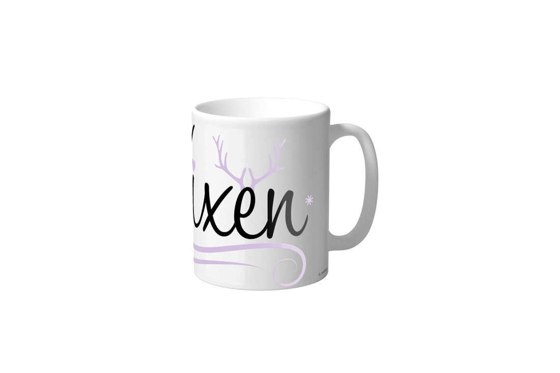
My first idea was to design a body positive zine in order to then sell and raise awareness. However, I encountered an issue, even though the body image zine was an ambitious idea the print cost much more than expected, therefore I would not make any profit. I decided to expand this project later on in the year, as a self-initiated project, as I felt my idea had a meaningful message that should be spread. Nevertheless, I decided to design something more in theme of the upcoming Christmas Season. These included a set of reindeer inspired mugs. Each mug comprised the name of one of Santa’s Reindeers, I created a different design for each name in order to best describe a variety of different people, making it the perfect Christmas gift. These again I was able to experiment with the use of illustration, allowing me to expand my graphic design skills. Ewa Dykas Graphic and Media Design 3 @_ewadesign Jessy Heikrujam - BA Design Management & Cultures Minimalism in design has been the trend for a while. From industrial design to graphic design, the idea that less is more have become a norm in design. It is seen in works of industrial design legends like Dieter Rams, Hans Wagner and other modern designers. We can see the hints of it on designs from almost every part of the world. The popularisation of the movement by brands such as Ikea and minimalist brand like Muji have helped the movement reach larger audience as well. The movement has recently been quite influential in architecture and has manifested in architecture in the form of tiny homes. The world is on the verge of an important phase in its existence, where the effects of our actions towards nature could have adverse effects on the future of the planet. As a furniture designer, my fondness for minimalism and love for clever space management in tiny homes have got me hooked on to this movement as well. I even plan to build one for myself in a few years. The major USP of the tiny house movement which is its sustainability, cost and time effectiveness would easily convinced anyone that it's a great idea to build one. But recently, I have become quite sceptical of the trend as it has given me a few questions about the ethics and the genuineness around of the trend. Can the tiny house movement last? Is it really sustainable? Is it ethical to raise a child in a tiny house or have a family? I feel that every human deserves to choose their own style of dwelling, but I also fear that the normalisation of people living in small spaces could harm the future of housing. This tiny 125 sq. metres flat in Kensington was being sold in 2017 at the price of £225,000. This may not seem right today, but if we normalise living in tiny spaces, this may soon become an acceptable practice in the future. With prices of micro-apartments such as this sky-rocketing, I feel that it would be a great reminder for the people fuelling the tiny house movement to understand that normalising living in micro dwellings will affect the way we lived in the future. Several companies have jumped in to cater to the demand created by the movement. For example, Danish company Vipp manufactures Shelter, a 592-metres square tiny house which comes filled with the company's line of homeware products, which would cost you £585,000. The trend is definitely a positive trend. Living in a small space often requires getting rid of belongings and keeping only the essentials. But with companies trying to cash in on the trend, specifically in the case of the VIPP Shelter, where the house is made from unsustainable 500 tones of glass and metal, I feel that following a trend blindly could do more harm than good to the environment and to the future cost of housing.
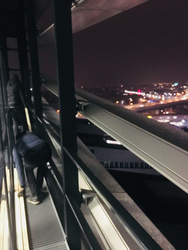
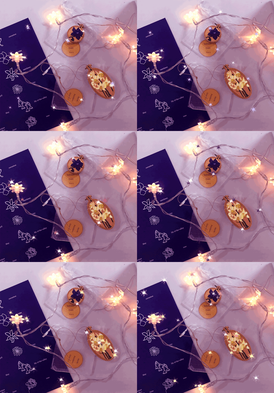
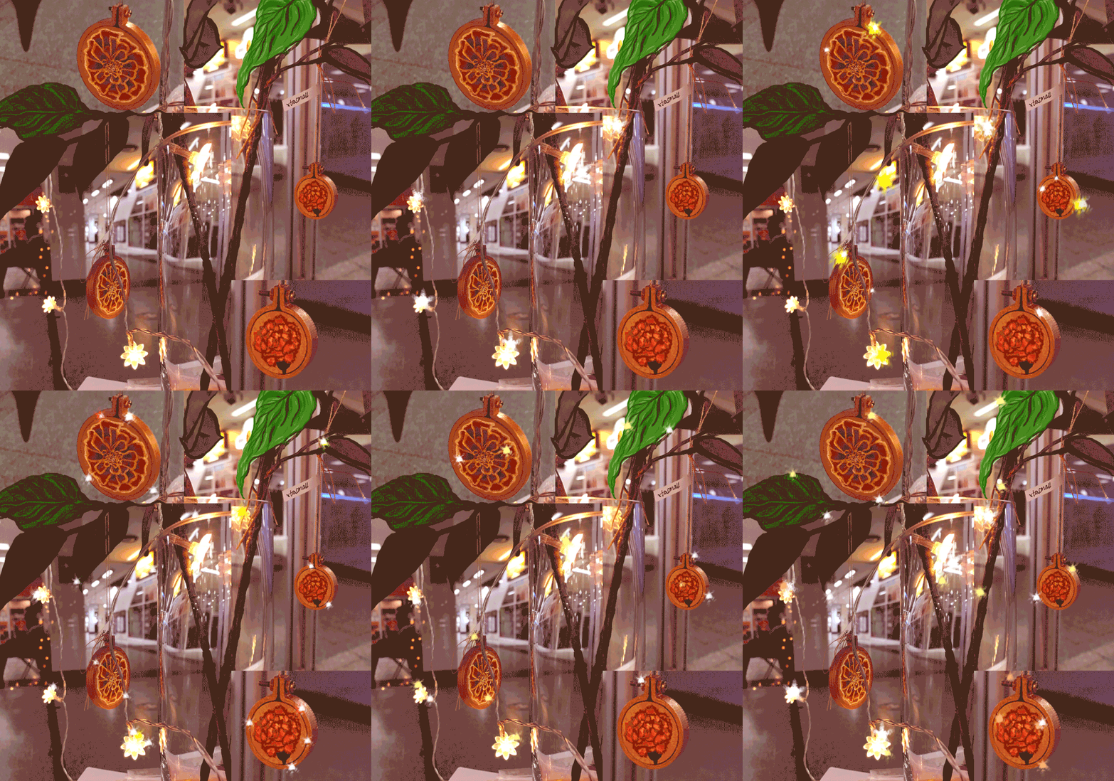
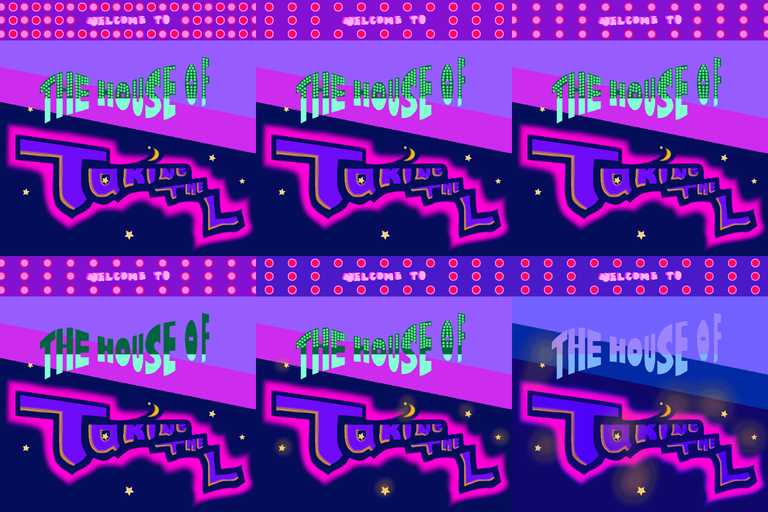
0 Likes Share by Ethan Phan (GMD) My internship in Vienna started in November at BPNXT, a multi-disciplinary studio. The first few days of the job was all about getting to know everyone and learning a new set of software, the Affinity family. Another thing that took me longer to get used to was the numbing cold of Vienna, already in winter when I arrived! The studio is relatively small so I was given a good degree of independence. I produced my first work within two weeks, a website for a financial advisory company in Africa. The design went through a few feedbacks from my mentor in the graphic team and the studio director, before reaching its final look and being approved. After that, I was given various tasks to work on the graphic elements of different brands. Beside graphics, the studio also works in 3D art installations, which is something I found myself doing a lot more towards the end of my internship. Even though I wasn’t working in graphics as much as I would want to, there is certainly a good feeling about directly creating something tangible. Our latest project involves me and the installation team climbing outside the 11th floor of a skyscraper to mount an outdoor light installation. Not sure if my insurance plan covers that. The multi-disciplinary structure of the studio has given me a new perspective on different areas of design and how graphic design can be integrated with them. Nevertheless, I would prefer to work more on graphics on future internships. Katerina Demetriou-Jones BA Illustration & Visual Media Since August I’ve been applying for placements and I finally got one in December! HOWEVER I just want to relay my experiences thus far because some of it has been such a shambles! Back in October I got a reply to do some freelance work for a textiles company and they asked me to attend an interview at their studio in South Kensington. Being the Watty gal that I am, I hopped on the train at Watford Junction with my portfolio in tow. Arriving outside the studio I was told that they had had a flood and couldn’t interview me. So I was there, all dressed up and interviewable with nowhere to go! But I just had to take the L! And it’s okay we carry on. An application I sent to Noodoll (who create these lovely toys) got a reply and they asked me to create a GIF of one of their toy characters or create my own, and I had so much fun doing this! I spent the whole day on it (see below!) They replied and said they liked it but they had found a more suitable candidate for the position. Is ok another L what can you do! Another application I sent to a lady for painting a mural in a new sausage restaurant resulted in her asking me to send her some ideas of what I would do! This was a particularly busy time for me so I spent three mornings preparing my ideas and mock-ups when I had the time and sent them off, sent follow-up emails and never heard back. So many L’s so little time!!! Then the DPS pop-up shop opportunity came up and it was a lovely experience. I made 12 pendants to sell (see below) - one for each month of the year, all including little paintings of that particular month’s birth flower and all attached to string so they could be hanging decorations or even swapped for a chain to wear as a necklace. I had some wonderful chats with people and they seemed to be very popular with mums <3 I like that people felt a connection to them as they were able to look for their own birth month and/or just find a flower they liked. My friend Sun bought April – the birth flower is a daisy and the meaning is sun rise - it was perfect for her! This made me so happy. It is safe to say my spirits were lifted by this and I started to feel better about all of the L’s because this pop-up experience turned out to be a very positive one. I was doing around four applications a day after that, and eventually got a reply and have been interning for a jewellery designer – Melissa McArthur – helping out with her website and doing little illustrations for it too. I’m really grateful for this opportunity and will be continuing to apply for placements so I can see what else is out there. An important thing to remember is that I was applying for four months, and I’m still planning to apply for things now I have this placement, but the experience of creating and designing a variety of art from toys to sausage murals to the DPS pop-up shop wouldn’t have come about had I not been applying for so long without many replies and many rejections. It also gave me time to develop my own artwork without the pressure of it being a uni project. It can be really disheartening and I had so many days where I was just crying in ma bed (pls) but sometimes you need that break and to have a Netflix day, and just try again tomorrow if you can. All artwork by me :)
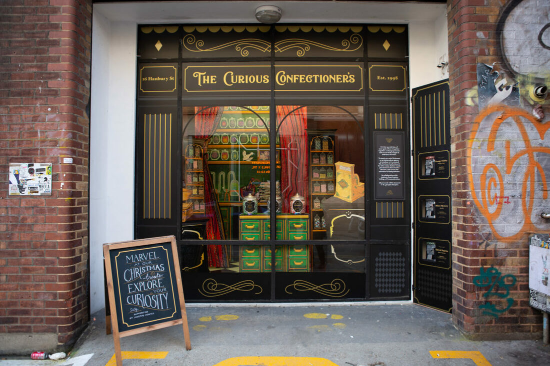
It was around June just before we embarked on our DPS year, that myself and an incredible team of talented creatives landed the opportunity to design the 2018 Wieden and Kennedy Christmas window. After pitching a outlining idea to the Creative Director it was all systems go to flourish our vision into a fully functioning, interactive window that embodied the W&K theme of celebrating 20 years as an independent design agency.
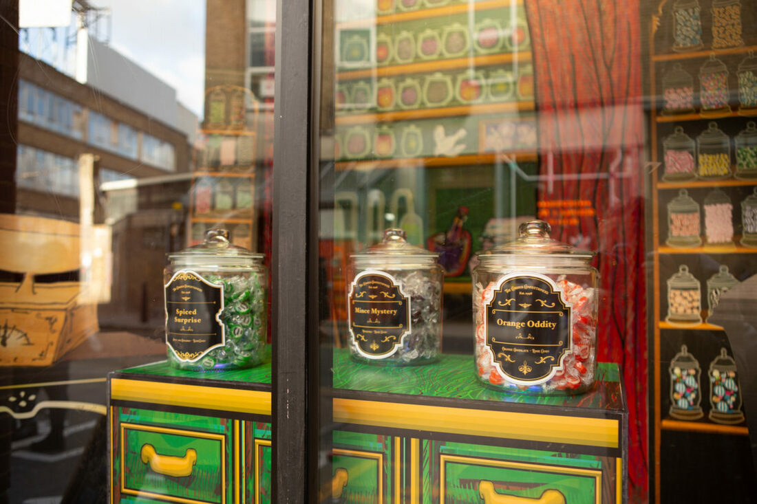
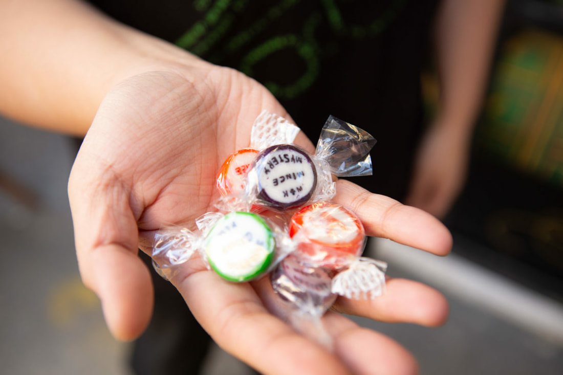
This was unlike any project we had ever worked on before, having to tackle new challenges, skills and collaborations. We spend many sessions working with the W&K team, establishing a visual style, set design and a strong narrative that linked the wacky world of window with the amazing work W&K do and the fantastic charity they support- St Joseph’s Hospice. On the 19th of December we launch The Curious Confectioners, a place for passers by to tantalise their tastebuds on our weird and wonderful sweet concoctions. The window features a stage like set design that depicted our confectioners shop and secret laboratory. Row upon row of brightly filled jars entice the audience to make their own independent choice and say yes to a new choice. We chose to create custom sweet flavours that viewers may have never seen before, these included rock flavours of: Mince Pie, Chocolate Orange and Apple & Cinnamon. The project, of course, didn’t come without its challenges, for many of us this was the first time working for a real life client. Having to attend regular meetings and having to consistently deliver progression on the project and move it forward towards the launch date. But all of this has come down to months of invaluable experience, a relationship with a world renowned design agency and a fantastic project to inject into our portfolios. As a team myself, Hannah Woodall, Lakhi Son, Pheobe Man, Laura Rojas and Adamandia Pashalidi are extremely grateful to have been able to carry out this project and present a piece of work that we are all extremely proud of. A massive thank you to the team at Wieden and Kennedy for bringing our vision to life and also to Laura Vent whom we couldn’t have completed the project without. DESIGN IS A CRUCIAL PART OF MODERN CULTURE AND COMMUNICATION. IN SOME WAYS, DESIGN IS MORE EFFECTIVE THAN LANGUAGE OR VERBAL COMMUNICATION. THIS IS BECAUSE IT HAS THE ABILITY TO TRANSCEND THE BARRIER BETWEEN DIFFERENT LANGUAGES, AS IT SPEAKS A MORE COLLECTIVE FORM OF VISUAL COMMUNICATION. DESIGN IS ALSO INNOVATIVE AS IT IS COMPLEXLY ENGINEERED TO KEEP UP WITH NEW TECHNOLOGIES AND PLAYS A MASSIVE ROLE IN CULTIVATING NEW TRENDS. DESIGN THEREFORE, IS RESPONSIBLE FOR FINDING NEW ETHICAL AND SUSTAINABLE WAYS OF CONTINUING THE PRACTISE. THIS COULD BE ACHIEVED THROUGH USING RENEWABLE AND RECYCLED MATERIALS FOR PRINT MEDIA WHILE UTILISING DIGITAL DESIGN. THE INCREASING USE OF SMART PHONES ALLOWS OPPORTUNITY FOR A NON-WASTING, MAXIMUM EFFECTIVENESS FORM OF DIGITAL DESIGN.
DESIGN IS A NECESSITY, AS IT ACTS AS A TOOL OF DIFFERENTIATION IN A FAST-PACED WORLD OF INFORMATION AND DISTRACTION. IN THIS WAY DESIGN STIMULATES GROWTH, AND HAS THE POWER TO REACH THE WIDE GLOBAL MARKET. BRAND IDENTITY DESIGN CAN ACT AS A COMFORTING RELATIONSHIP BETWEEN PRODUCT AND CUSTOMER. IT PROVIDES REASSURANCE AND RELIABILITY THAT THE CUSTOMER CAN DEPEND ON FOR SATISFACTION AND A LONG-LASTING CONSUMER RELATIONSHIP. IT HAS BEEN A FASCINATING EXPERIENCE LEARNING THE ROLE IN WHICH DESIGN PLAYS IN BUILDING A BUSINESS’S IDENTITY AND HOW IT CAN BE USED TO REACH ITS TARGET AUDIENCE. I HAVE THOROUGHLY ENJOYED MY BRANDING PROJECTS, EXPLORING WAYS IN WHICH TO COMMUNICATE IDENTITIES FOR BRAND DESIGNS AND MEDIUMS INCLUDING PRINT AND SOCIAL MEDIA. |
