|
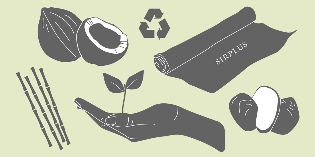
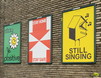
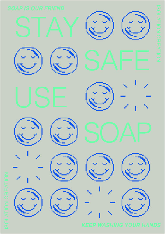
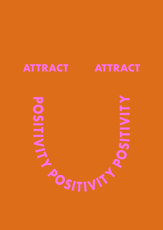
Rosie Williams, GMD 15/04/20 As I reach the end of my placement with the eco-conscious menswear brand SIRPLUS, I have identified a stronger interest in ethical and sustainable design. I have learnt about the ethical approaches SIRPLUS takes to be a responsible fashion brand in contrast to the majority of fashion brands that are environmentally and socially harmful. It has driven me to research more about ethical design, the negative impacts of consumer culture and become a more responsible designer. In the book Design: The Whole Story, Dan Griliopoulos highlights the rise of consumerism during the 1960’s. The ideology that anything old is undesirable was infused into society by advertisement and corporate businesses. This resulted in the constant need for new products to be produced, accelerating economic growth but having extreme negative environmental consequences. Since then the demand has continuously increased. The fashion industry and fast fashion culture fuels this ideology and is having detrimental effects on people’s human rights and our planet. According to the book Slow Fashion: aesthetics meets ethics by Safia Minney, 1.5 times the worlds resources are already being used, this is a frightening figure that can only be decreased if we reduce consumption and slow down the amount we buy. Minney also refers to the Ethical Trade Initiative study carried out in 2015 discovering that 71% of senior executives of retail and supply companies suspect that a type of modern slavery exists somewhere along the production line of their products. Learning these facts has inclined me to re-evaluate my way of living and how I can contribute to a sustainable revolution through designing with more purpose and not purely for aesthetic value. Although the fashion industry is a big contributor to social and environmental problems, there are many ways fashion brands can be more responsible and challenge fast fashion culture. Working for SIRPLUS has taught me many of these methods. I have learnt about the extensive list of eco-friendly materials that can be used to make clothes, for example, corozo nut, milk casein and coconut shells to make buttons, recycled polyester and cotton and even recycled bottles to make fabric. Along the way, I have learnt about methods and organisations to tackle the negative impact cotton production has on the environment and the workers. For example, the farming of organic cotton uses no pestisides or harmful chemicals during process. This not only helps reduce the pollution created by the chemicals, but also ensures the workers are not being harmed by them either and at the same time they are still provided with jobs. BCI (the Better Cotton Initiative) is a not-for-profit organisation dedicated to creating a fairer cotton production system for the workers and environment. Another organisation that SIRPLUS sources fabric from is Lenzing EcoVero. They create sustainable viscose from certified renewable wood sources and eco-friendly production methods. Other ethical methods SIRPLUS uses are making sure their clothes are made as locally as possible, ideally in England but also in other countries in Europe. As the name SIRPLUS suggests they also use surplus fabrics supporting the reduction of waste. They collaborate with charities and aim to help people out whenever possible. For example, they are currently using their delivery service to deliver food and essentials to people in need. With all this knowledge I have gained and ways a brand can be ethical, I am able to apply similar approaches to future jobs and projects. I can also use this knowledge to promote and educate people about these approaches through my design. It has provided me with a source of inspiration for future projects. Visual design through media has immense power to educate and influence society positively. This power has been used unethically time and time again to manipulate people. Society has been programmed through advertisement and capitalism that you can’t be happy with what you already have. It suggests that our happiness lies within materialistic possessions. It is time for this perception to be challenged in order for rapid consumer culture to deteriorate and for a sustainable future to exist. “The real JOY of design is to deliver fresh perspectives, improved well-being and an intuitive sense of balance with the wider world”, this quote by Alistair Fuad-Luke reflects the positivity of design’s powerful ability to offer new views and harmony to our lives. Graphic design in particular, provides an accessible platform to educate people. It can also challenge negative beliefs, like the belief that we are not happy unless we have something or are a certain way. The recent campaign by studio Lennarts & De Bruijn ‘stay sane, stay safe’ is a project that I’ve been inspired by and a perfect example of how graphic design can positively impact society. The campaign encourages creatives from all over the world to design posters celebrating and thanking key workers during the coronavirus crisis and also reminding the public how they can stay safe. My learning experience at SIRPLUS and my increased interest in sustainable design, has informed my practice. I have become a more conscious and responsible designer and the knowledge I have gained will help navigate future projects. Fuad-Luke highlights in the book Design Activism: Beautiful Strangeness for a Sustainable World, the need for more activist designers. From reading this I would like to become part of the activist design community and also encourage other designers to join in order to help design reach it’s full potential. I would like to become a part of the sustainable design revolution. Bibliography Better Cotton Initiative (2020) Who We Are. Available at: https://bettercotton.org/about-bci/who-we-are/ (Accessed: 10/05/20) Fuad-Luke, A. (2009) Design Activism: Beautiful Strangeness for a Sustainable World. New York and Oxon: Taylor & Francis. Griliopoulos, D. et al. (2016) Design: The Whole Story. London: Thames & Hudson Ltd. Lenzing EcoVero (2020) The New Standard in Eco-Responsible Viscose. Available at: https://www.ecovero.com/b2b# (Accessed: 10/05/20) Minney. S. (2016) Slow Fashion. Oxford: New Internationalist Publications Ltd SIRPLUS (2020) Journal. Available at: https://sirplus.co.uk/blogs/news (Accessed: 12/05/20) Studio Lennarts & De Bruijn (2020) Stay Sane Stay Safe Platform. Available at: https://www.lennartsendebruijn.com/projects/stay-sane-stay-safe (Accessed 10/05/20) Williams, R. (2020) Attract positivity [Digital Typographic Poster]. (Accessed: 27/04/20) Williams, R. (2020) SIRPLUS Sustainable Blog Banner [Digital Illustration]. (Accessed: 21/04/20) Williams, R. (2020) Stay Safe, Use Soap [Digital Poster]. (Accessed: 23/04/20)
0 Comments
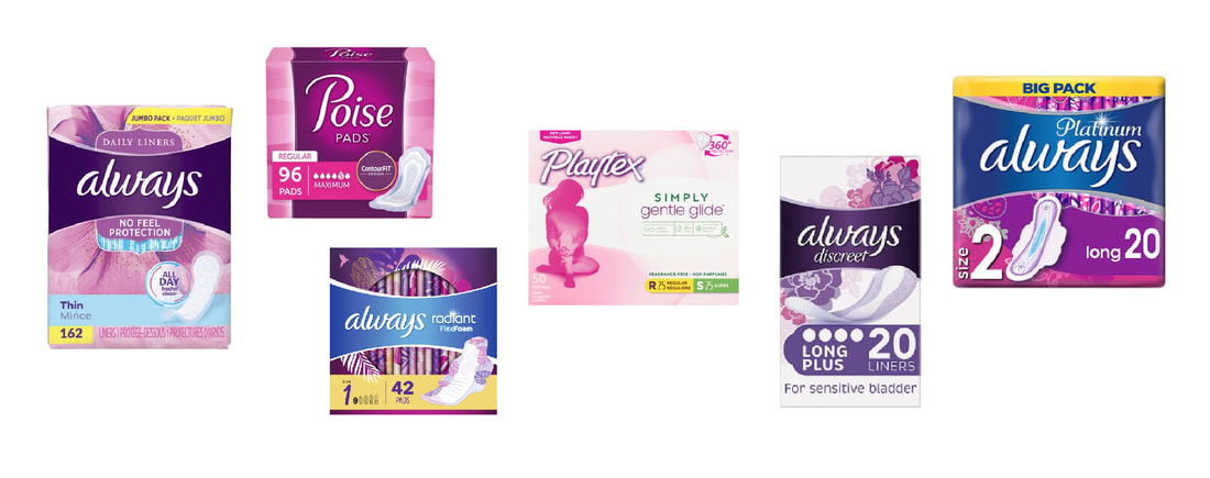
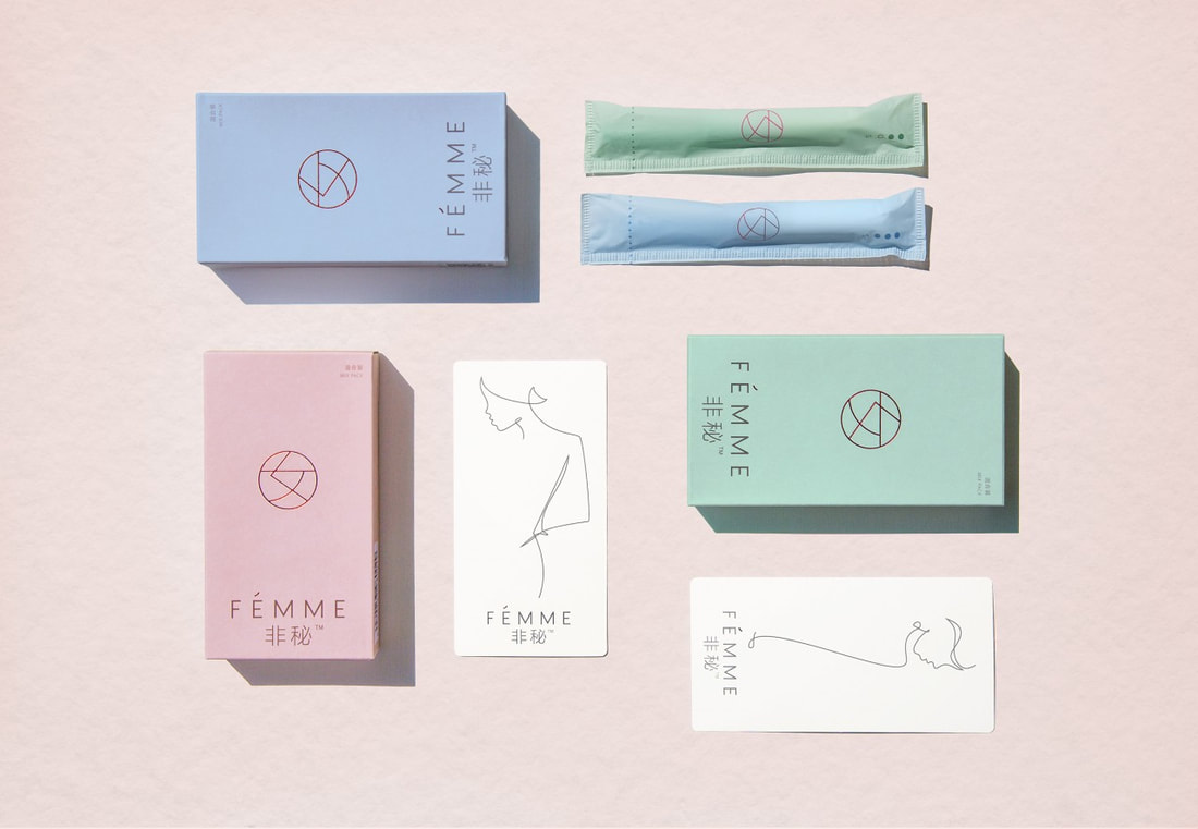
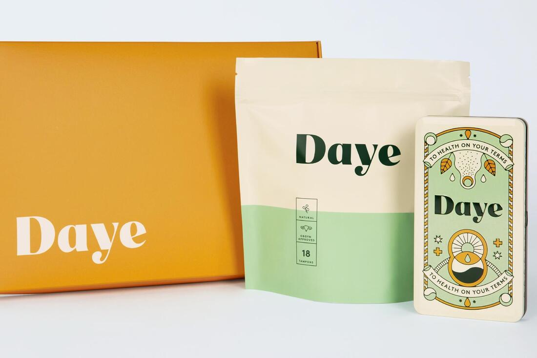
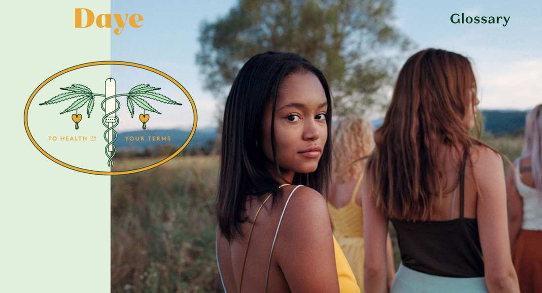
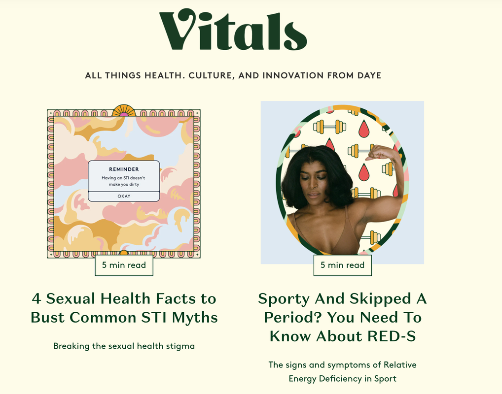
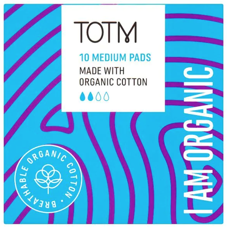
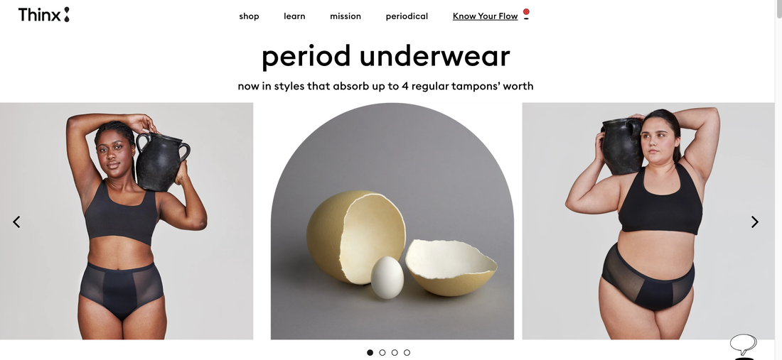
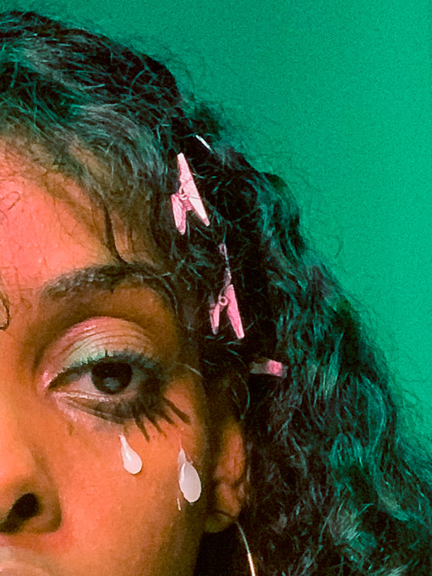
Rosie Williams, GMD 23/12/19 During my recent placement with the London based design agency Rare Design, I identified a new interest in branding and the messages given from certain packaging. Whilst on this placement, I carried out a research project exploring the graphic language and tone of voice used on painkiller packaging. I found it really interesting defining the similarities and patterns commonly seen throughout painkiller packaging and how certain colours, shapes and phrases are used to attract a specific audience. This led me to start subconsciously analysing packaging everywhere I went. Through this I noticed the amount of gender stereotyping used on packaging (especially medical and hygiene products). It has sparked an interest in the branding of menstrual and feminine hygiene, considering why it needs updating and learning more about the new brands and campaigns that are challenging the negative stigmas around women’s menstrual cycle’s and body’s. There are negative associations with the menstrual cycle that need to be challenged and the design of sanitary and feminine hygiene branding can provide a platform for this to happen. Negative connotations surrounding menstruation have been around for a very long time. In the article How did menstration become taboo?, Anna Druet refers to sections of the Quran and bible labelling the menstrual cycle as “impure”, “unclean” and suggesting that anyone who touches a women on her period also becomes unclean. Druet points out that period stigma is a manifestation of anti-feminism. From these negative preconceptions about menstruation it has become a subject that cannot be openly discussed and is viewed as shameful. Through my analysis of sanitary product branding I have discovered a pattern in the tone of voice, language and visual aspects that emphasise these negative beliefs around periods. Words like “discreet” are used, reinforcing the belief that periods are something women should be ashamed of and hide. The unnecessary overtly feminine visual features like the use of pastel pinks and purples, sparkly and floral graphics are common. The font used is often a script font, again reflecting qualities of fragility and narrow societal depictions of what femininity means. This also excludes women that don’t identify with these portrayals of femininity and it is not sensitive to transgender men who still get periods. I have recognised a need for the design style to be updated, not just because of the above reasons but because it’s boring and not current. There is a need for the branding to correspond with the new feminist liberal attitude of today. In the article Branding and Product Design, Monika Hestad discusses the importance for the context of the product to be taken into consideration when designing it’s branding and the damage it can have on a brand if this is not done. This strengthens the argument that sanitary product packaging should coincide with it’s consumer’s fresh attitude towards periods otherwise people will stop buying from that brand. The 2016 article by Sarah Dawood refers to the statistic that only 2% of women in China use tampons, mainly due to their lack of knowledge about the product. This is because of the taboo surrounding periods which is more prominent in China than in westernised countries. The article talks about the Chinese company Yoai rebranding a sanitary product to help crush the negative views and the “patronising” tone used to talk about periods. The design is simple and sophisticated, using a positive tone and encouraging confidence. Other brands that are aiming to challenge the negative stigma around periods are also on the rise. Bodyform has run the recent #bloodnormal campaign to encourage conversation about periods. The campaign exists upon the basis that 350,000 girls are missing school due to feeling embarrassed about their period. It is a campaign to provide education to students about periods to prevent negativity and break the taboo. Another is the brand Thinx. Thinx creates period absorbing underwear that feels like normal underwear. Thinx also promotes a positive ethos around periods and has the aim to educate and encourage confidence about reproductive health and women’s bodies. Their branding is playful, contemporary and relevant. Below are some more examples of feminine hygiene brands that use similar approaches to challenge negative views around periods. These are just a small selection of the upcoming brands that are tackling the issue of period stigmas. Although there are lots more, there is still a long way to go. Feminine hygiene brands have a responsibility to recognise and challenge the misogynistic values that have been embedded into society. They have the ability to open up spaces for discussion about periods, sex, body positivity and to liberate women. I am thankful that my experience working on the painkiller research project with Rare has introduced me to this part of the industry and I am sure it will inform my future decisions in my design career. Reference List Bodyform (2020) Fear Going to School Less. Available at: https://www.bodyform.co.uk/our-world/fear-going-to-school-less/ (Accessed:19/05/20) Clue (2017) How Did Menstruation Become Taboo? Available at: https://helloclue.com/articles/culture/how-did-menstruation-become-taboo (Accessed: 16/12/19) Dawood, S. (2016) ‘This New Tampon Brand Hopes to Empower Women in China’, pp. 1. Hestad, M. (2013) Branding and Product Design. Surrey: Gower Thinx (2020) Underwear that Absorbs Your Period. Available at: https://www.shethinx.com/pages/thinx-it-works (Accessed: 19/05/20) Karol Tylke, Information and Interface Design
The design industry is not the first thing that comes to my mind when asked about the impact of the ongoing pandemic, even as a person who is a part of it. The first thoughts would obviously oscillate around the frontline of the outbreak - the numerous deaths around the world, and the healthcare crisis. Then one might mention all the shops and restaurants that have been closed, which impacts every single business focused either on the sales of any goods or services. While sales must take a big chunk of the design industry’s yearly market share, they definitely do not define the fate of creative work. People in hospitality and resale are one of the first victims of the spike of unemployment brought upon by the virus, this has also spread to other industries; that fate has also technically reached me, as while I still receive most of my salary thanks to the government programme, I’ve been put on furlough which means I am definitely going to get the most out of my internship. That leads me to believe that virtually any business is going to feel the effect of the pandemic in some way. Before being put on furlough, I have had a brief period of working from home, which has globally been quite a phenomenon. Millions of people jumped on the train of using teleconference software to conduct their daily meetings. While companies producing this software certainly don’t mind the traffic, that has also been a challenge for them in some way; hackers took full advantage of the surge in Zoom’s popularity and targeted the platform numerously over the last couple of months. (1) Following my own observations I feel like humanity has managed to cope with this problem quite well; the very social media that were deemed to threaten our in-real-life relationships saved us in the end. The teleconferencing situation could be a proof of concept that while the coronavirus outbreak certainly is very bad and concerning news, it might serve as a valuable lesson; you don’t necessarily have to take that private jet to Palo Alto to discuss the latest merger, just call them on Zoom. If executed right, encouragement of using teleconferences more could help us maintain the current reduction of traffic that in turn could keep the pollution levels closer to where they are now than 5 months ago. (2) While conducting research for my Self Initiated Project which oscillates around air pollution, I found out that the levels of pollutants in the air have dropped significantly following the drop in the population’s mobility. (3) The estimations suggest that a 2 months’ improvement in air quality like that could save around 50000 lives in China only. While this doesn’t glorify the pandemic, it provides an interesting insight into how it can affect different areas of life. I would really like to investigate other similar patterns, as data like this has the potential to be used in future projects. I would certainly research the supply chains of the tech world from this angle, as we might be facing the first disruption of this size in the expected product cycles of popular gadgets in years. (4) The expected delays of the iPhone 12 launch are a prominent example. It’s quite scary how the world has become essentially dependent on the production of goods like the iPhone, with hundreds of businesses who provide parts for it, and hundreds of thousands of people they employ. (5) (6) Coronavirus will cause a delay across many segments of a standard supply chain, meaning that customers will get their new devices later, but alongside, companies that depend entirely on producing components that go into these devices will go out of business. It is perhaps time to see how we have ended up in this vortex of consumerism, and what steps should we take to either turn it around or prepare it better for the next crisis like this. In the design world, coronavirus response has become a trend in itself, with hashtags like #stayathome appearing very often with #graphicdesign under awareness spreading posters and animations. Creatives have certainly found this to be an interesting and urgent topic with initiatives like Stay Sane, Stay Safe which aims to share meaningful messages to our heroes in the hospitals. Personally, I’ve been using the increase of free time caused by furlough to catch up with my side projects, and while I have been enjoying it so far, I do hope I will come back to work soon, as gaining experience is what matters the most during this year.
Dani Chukwuezi
​Design for Art Direction
Lockdown came at the point in my life where I had just renounced social media and was set on putting all my effort into real life experiences and interactions… So when physical contact wasn’t allowed anymore, it felt like the universe was playing a sick, cruel joke on my mental health. I also felt like I couldn’t continue with what I loved doing most, photography, which involves working on sets with multiple people and being dangerously close to models. I began having doubts about my creativity because was I going to be able to rise to the challenge and work from home
​On ‘normal days’ I am usually existentially anxious; anxious about socialising, anxious about relationships, and anxious about wider society in general and specifically, society’s relationship with technologies. At the start of my DPS year, I made notes on what my initial ideas were for my Final Major project work, and the scenarios I proposed for it strangely sorta came true… Here are some of the notes:
Does the notion of being in individual pods (houses) with no physical contact with others sound familiar? Now I’m no scientist predicting a bio-catastrophe/pandemic, but as a student of cultural theories and a technology user, my mind constantly predicts outcomes of humanity’s trajectory in regards to technological use. Drawing from my research of the likes of Mark Fisher and his capitalist realism work, the ongoing technological versus cultural determinism debate, and more, I can’t help but think society is on a path to a dystopian, technologically-mediated future.
Pre-lockdown, as an exploration into these ideas, I created work for a Shutterstock x Lecture In Progress competition (which I won first place for and won a new Mackbook, above), and it was centred around these themes of tech, data, the anthropocene. My academic interests lie strongly in these areas. I am very interested on societal effects on the human body and mind, initially obsessed with race and gender studies, it expanded to include technology due to how ingrained it is in society.
This DPS year really gave me the space and time to go even further into the theoretical side of things, but also to manifest that study into practical work/art. I’ve been able to grow my design and photography skills while grounding what I create in theory. My work has always tried to be conceptual but I really feel like it’s more so, now. Examples of the work I’ve been making in lockdown:
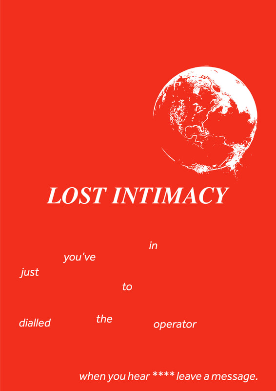
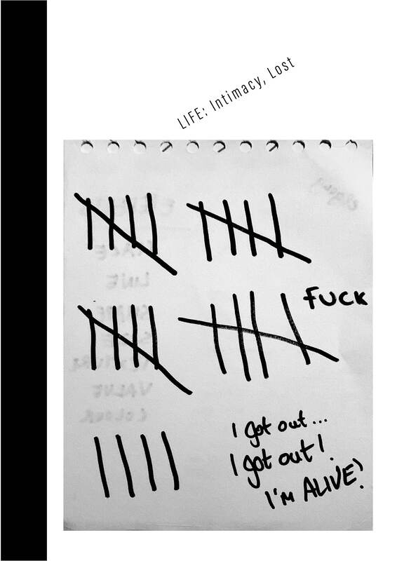
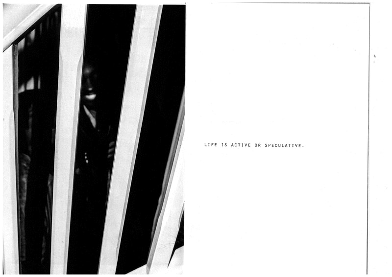
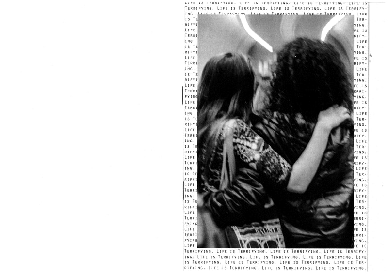
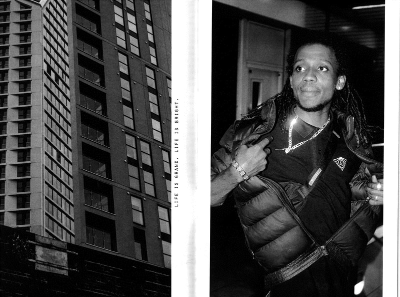
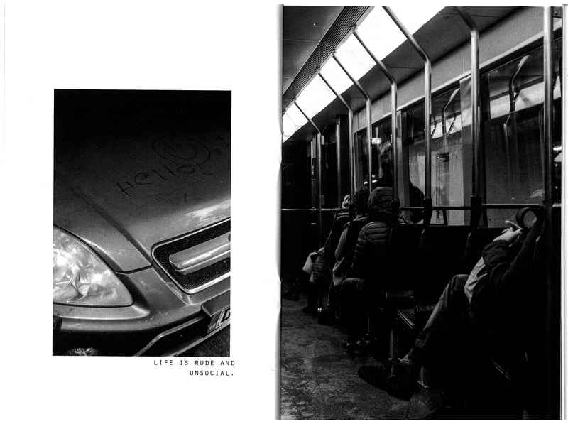
Doing a Lockdown version of my first photo zine, Life is Terrifying, which I got printed earlier this year. The lockdown edition is to be called Life is Limitless here are some drafts, open to collaborations, and pictures of the first version Life is Terrifying (scans below).
Lockdown, not just DPS, has allowed me to also further my other hobbies that had been lacking, and I gave into self-portraiture as well. I always said, before all this, that I just needed a little bit of time, for the world to stop for a few days, so I could get my shit together, in a funny way it’s like my prayers were answered. (As opposed to thinking in the beginning that the world was playing a cruel joke on me. I really feel that I have grown up a lot this year, and I’ve gained key perspective on dealing with life changes. With Lockdown especially, I have had the opportunity to sit back and relax and just experience life, as the rest of the world is having to do for what seems like the first time in a global lifetime.
Far from a rest though, a few weeks into lockdown, I was brushing up on my skateboarding skills and had a fall… and broke my collarbone into two pieces. Initially, I didn’t think my bone was broken, I just thought it was bruised and that thinking continued for a good 2 WEEKS. In those two weeks, I shot some of my best work in pain, in lockdown with my dominant arm bone, broken; with my right collarbone snapped in half.
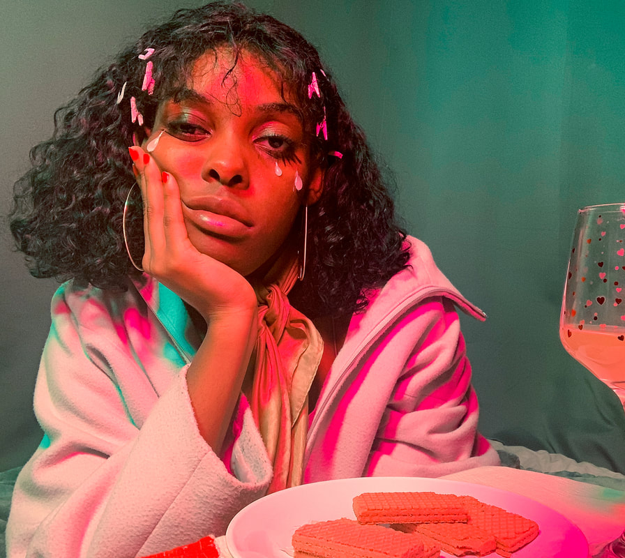
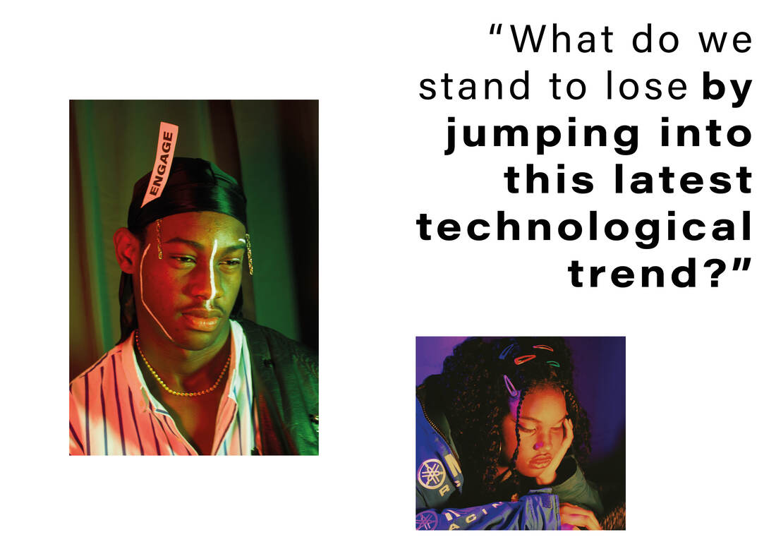
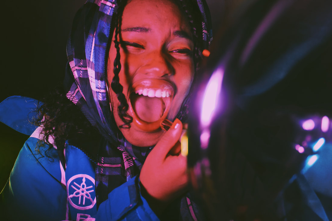
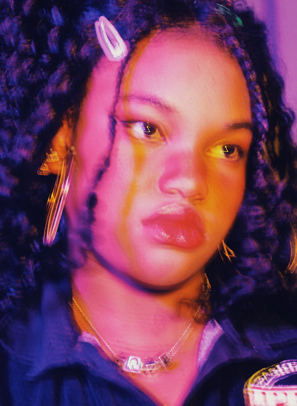
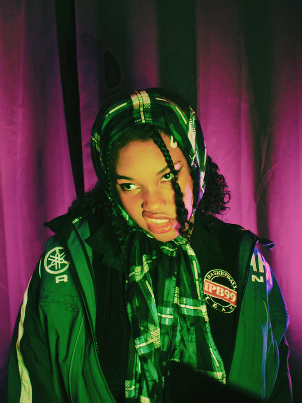
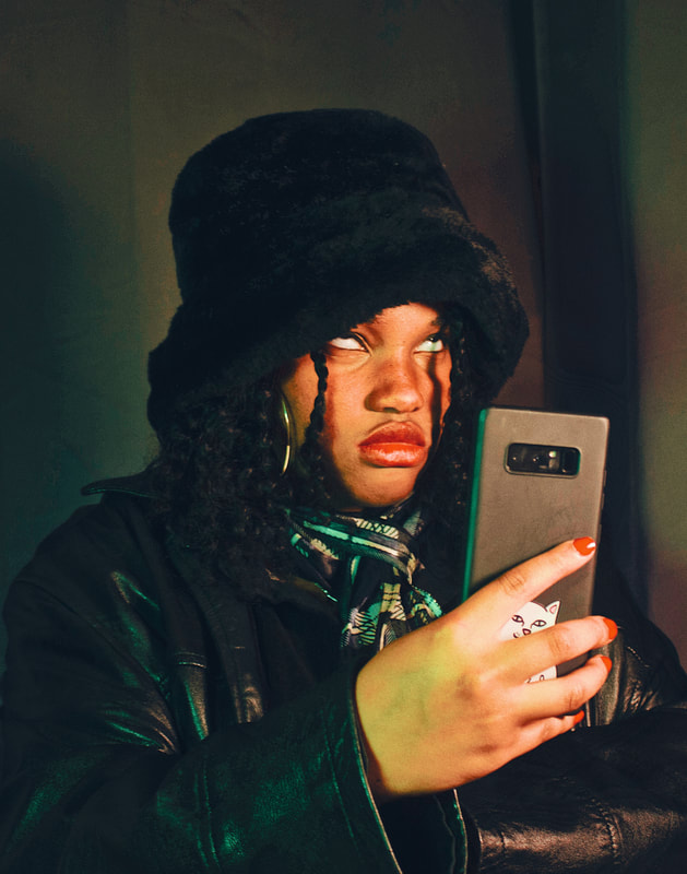
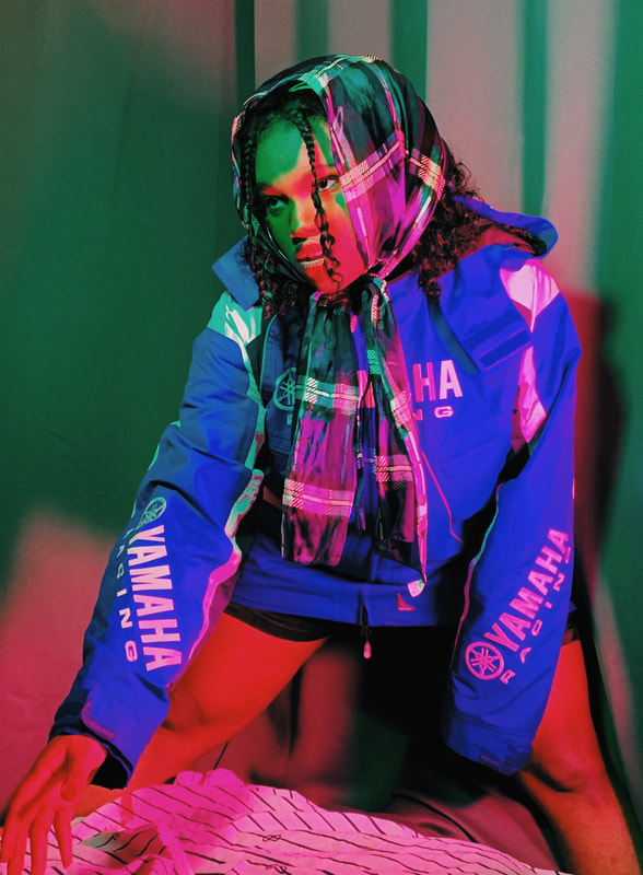
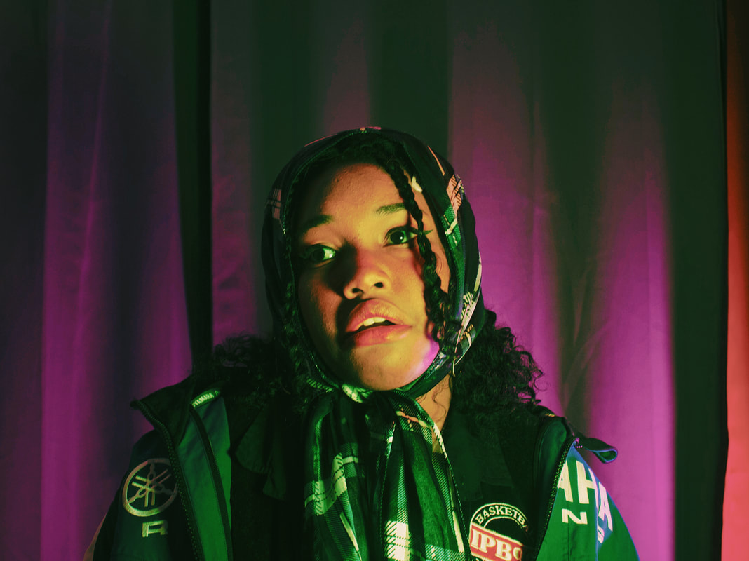
​During this resting period I bought some art books to occupy myself with while I was bed-ridden, one of them was filmmaker/photographer Alex Prager’s Silver Lake Drive. Prager is probably my all time favourite photographer, and she wrote in the book that her photography is a tool for portraying her fears and anxieties. This inspired me to create a photo series (below) about my anxieties over screen time - the amount of time spent using a device with a screen. We’re having to live our normal lives, inside, via technology. It’s scary to me. Screentime/screamtime is inspired by the glowing of phone screens, TVs, laptops, is the real virus, IT BURNS TO LOOK. *hollywood scream*
Through experimentation with LED lighting I managed to capture the concept I wanted for the series. Moods and fears of online interaction, especially now that all social interaction and information about the rest of the world is only available by being subjected to the glow of screens.
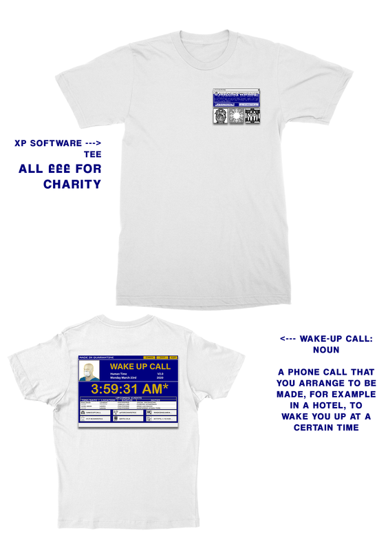
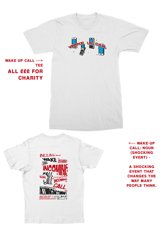
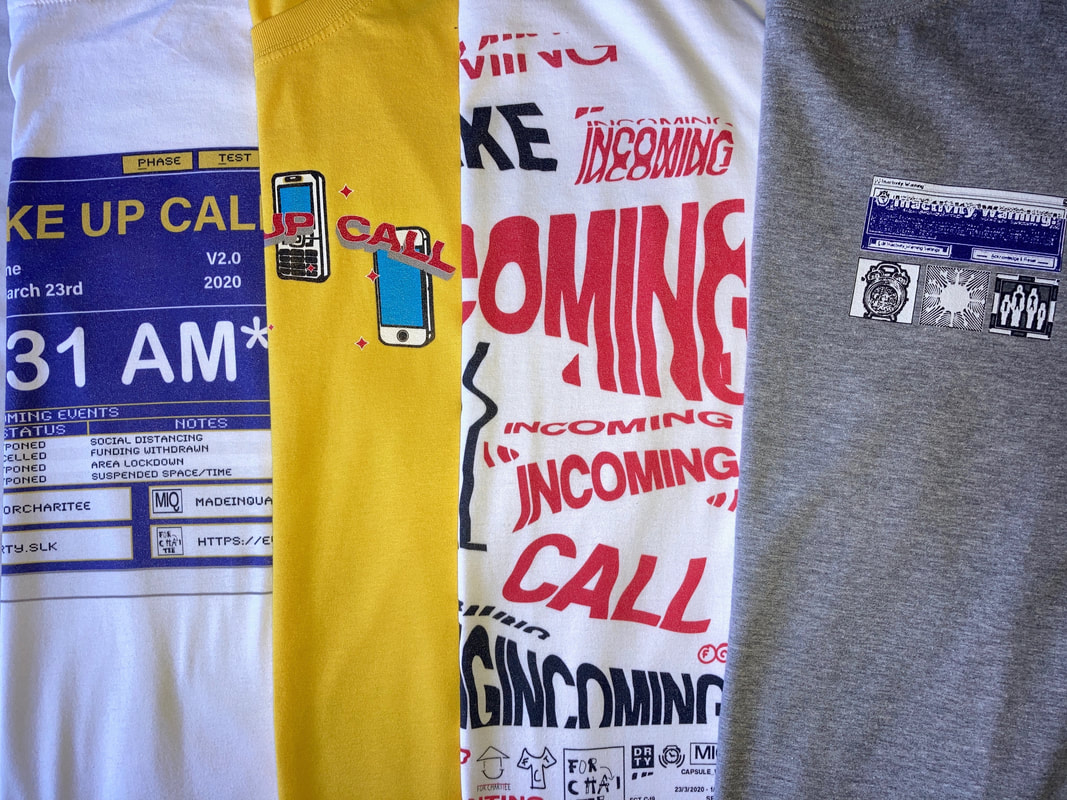
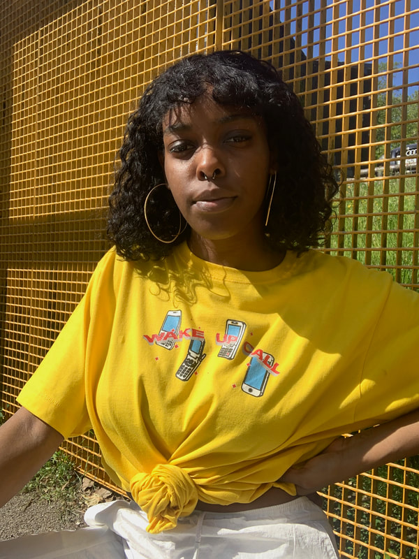
On a less moody note, I have tried to use my screen time for some good. For Charitee/FCT! The idea came at the start of lockdown when I was feeling super down about the state of society and scared for vulnerable groups being forgotten. The Homelessness crisis has always been something I’ve wanted to help with however I could (my charity shops of choice have always been Crisis or Shelter shops); FCT came about because I wanted to sell something for the purpose of donating the profits to Shelter charity. I shared the idea with my boyfriend and after multiple phone conversations about it, and realising the pun potential in the word ‘charity’, FCT was born. For our first capsule, I designed two different tees with "wake up call" being the theme. It was nice to take a break from negativity and to do something, anything, to help those most vulnerable in these terrifying times.
LINKS: https://www.instagram.com/forcharitee/ | ​https://everpress.com/forcharitee
So although my anxieties remain, right now, tamed beneath the surface, I’ve been more open to adapting this new normal and subjecting myself to screens, however it’s not to say I don’t have my own rules and boundaries about my screen time, and I will continue to critique it while engaging with/in it…
Dani
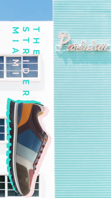
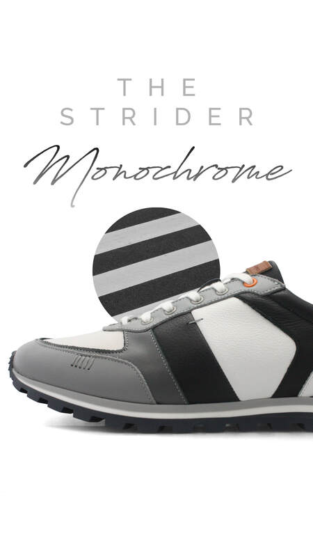
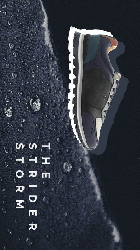
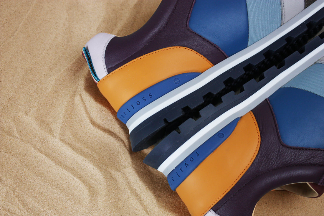
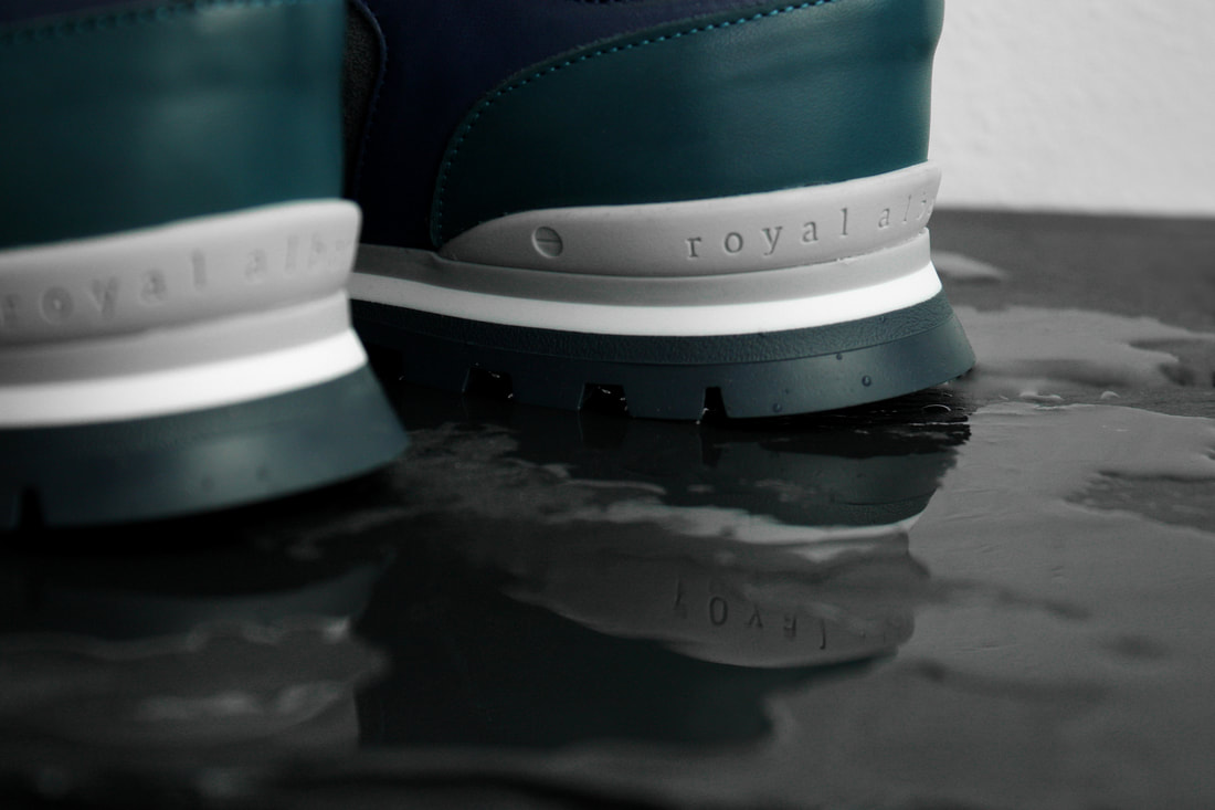
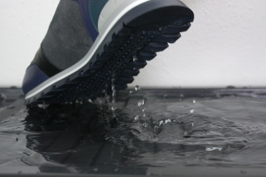
ONLINE PORTFOLIO: https://daniellac-archive.myportfolio.com INSTAGRAM: https://www.instagram.com/ubercapitalistdeathtrade/ By Ethan Muscat Graphic & Media Design *post originally uploaded 07/05/2020 on wrong blog* 2020 was the year I originally thought I had mapped out perfectly, set up for me to stride along the rest of my internship and into my final year of university ready to graduate next year, 2020 had other plans for myself and the rest of the world. The global pandemic has changed the way we view are entire outlook of life, we can no longer see close friends or family outside the household, we are unable to go into a work environment or to go travelling around multiple cities in hopes of gaining that thirst of inspiration that usually is all around us, we are now confined to our electronic devices and the four walls that protect us from contracting the disease, COVID-19. For many of us this will put a dent in our plans we were starting to put together in preparation for our return to university, now we just have to hope that things get better before they get much worse. Being a graphic designer, I am lucky enough to be in a field of work where most of it is digital so since the lockdown happened I have been able to carry on working as normal from the comfort of my bedroom - during the first few weeks of doing this, I definitely was lacking motivation in all aspects, I’m constantly surrounded by the things that I love and interested in, so I felt the distractions were constantly there distracting me from getting work done quickly and efficiently. As the weeks past though I did find myself forcing myself to get used to my new setting as it was pretty obvious that things weren’t looking up any time soon, and if anything, things were getting worse. I managed to be able to fit the working from home aspect into my daily routine, getting on with it because I knew this was going to be the new normal for the next few months at the very least, luckily in the age of the digital we have tools that make it seamless to work from different parts of the world and communicate with your team members quickly and efficiently. Applications such as Teams allow us to quickly send messages in an instant messenger format, share our screens with each other or hold group video calls so we can all be kept in the loop on what is happening with the business – this also allows us to check in on each other and make sure we are all keeping sane and safe during this time. My boss is currently on maternity leave and while she isn’t doing much work, she likes to have final say on designs before they get sent out to our customers to make sure we are keeping in line with brand guidelines and it’s suitable for everybody – while recently giving birth, she can’t be at our beck and call instantly as we are used too, so we can use applications such as WhatsApp to send the designs over to her and get an approval when she has the chance between changing diapers and feeding her new born! Before the pandemic and the strict lockdown rules we are currently facing, my manager and I had been setting out marketing plans based around the launch of our latest 2020 Golf & Lifestyle collection of shoes, we’d initially planned multiple photoshoots that we had starting pulling concepts and mood boards together for that included taking over a vibrant mini-golf course in Battersea, the perfect location filled with vibrant neon lights and bright colours that matched our “Strider” collections, we also planned to shoot the rest of our collection on a golf course in Italy, in which we would’ve had free accommodation, total access to all golf courses and of course, a sunny all expenses paid trip to the Mediterranean island. Of course, we haven’t been able to do any of these plans so we needed to get creative with the resources we had. My living space currently isn’t suitable or big enough to house a mini photography studio so my manager has taken the kit to her house and has been able to create unique shots of the shoes utilising the space around her home and using her flat mates as models for the quick mini shoots – we needed to get extra creative with our thinking in ways to promote the collection, using Teams, we can communicate back and forth on different ideas we have. My manager ended up purchasing sand to match the beach theme aesthetics of one style we have launching and using her coffee table as a space to create some shots highlighting the waterproof aspects of the shoes. Once she had taken the photos, she’d upload them to the drop box available for me to retouch and optimise for use in our marketing strategy. Using this photography I was able to create motion graphics, social media assets and graphics suitable for our website. Looking forward into the future, there is a lot of uncertainty on what will happen in the industry and the ways that we work, working from home has definitely eliminated the need to go into the office to work – this aspect was something that before going into my placement year, I thought would be necessary for me as I like that structure and felt being in that environment working closely with creative minds would be an essential way of communication and passing around ideas, but working from home has allowed me to communicate just as efficiently as when we were in the office. I believe that the way we are heading, the use for office spaces and working in teams will soon be a thing of the past, I hope this is not the case as although yes, working from home is easy and costs less, working in a team and being able to fluently communicate ideas with each other in a dedicated space allows for more unique and experimental concepts to flourish.
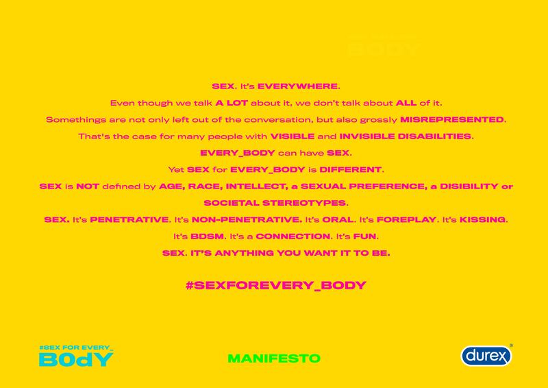
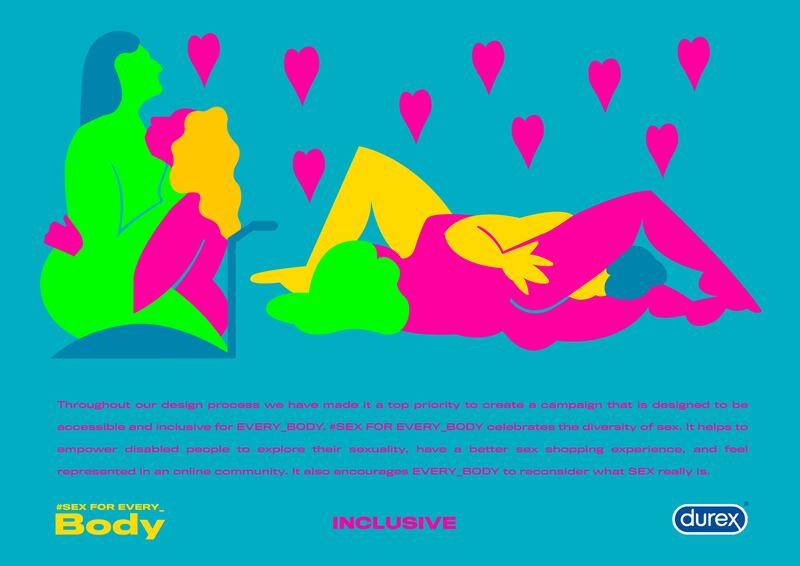
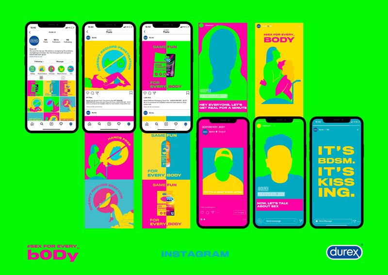
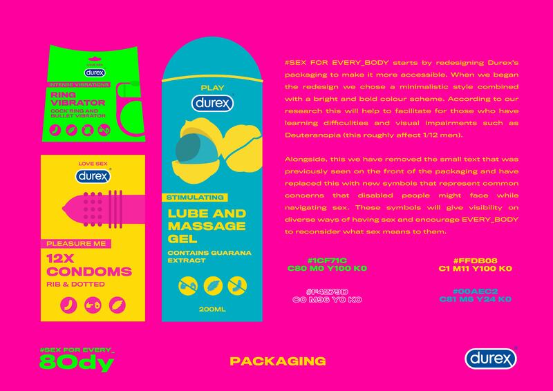
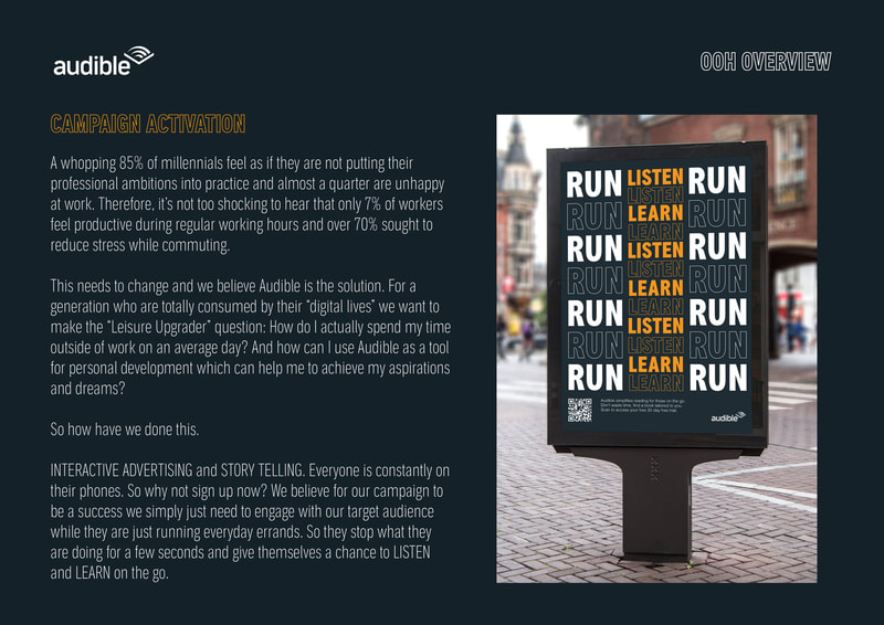
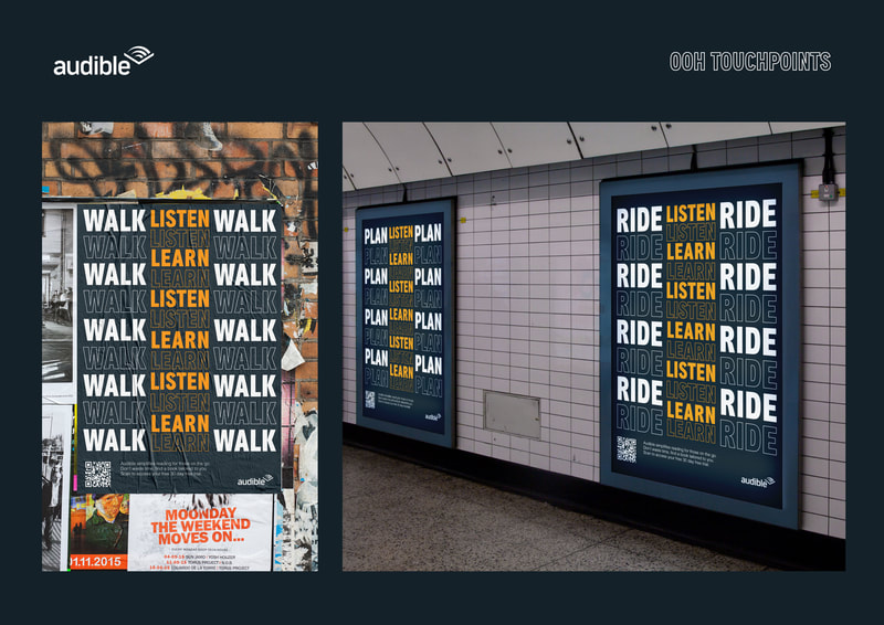
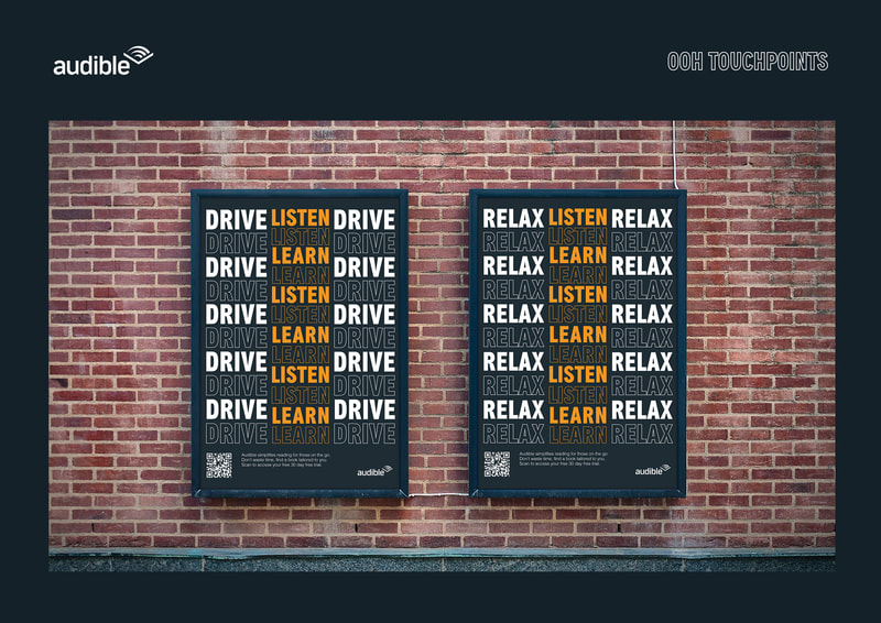
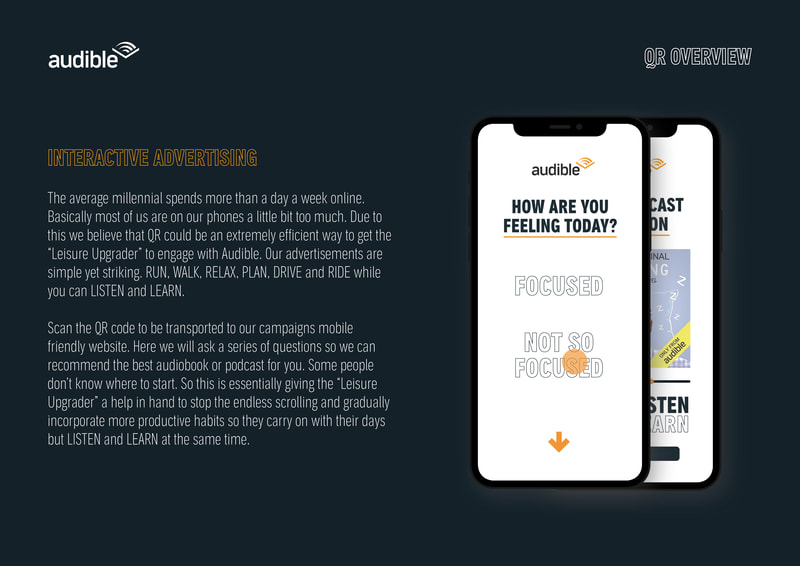
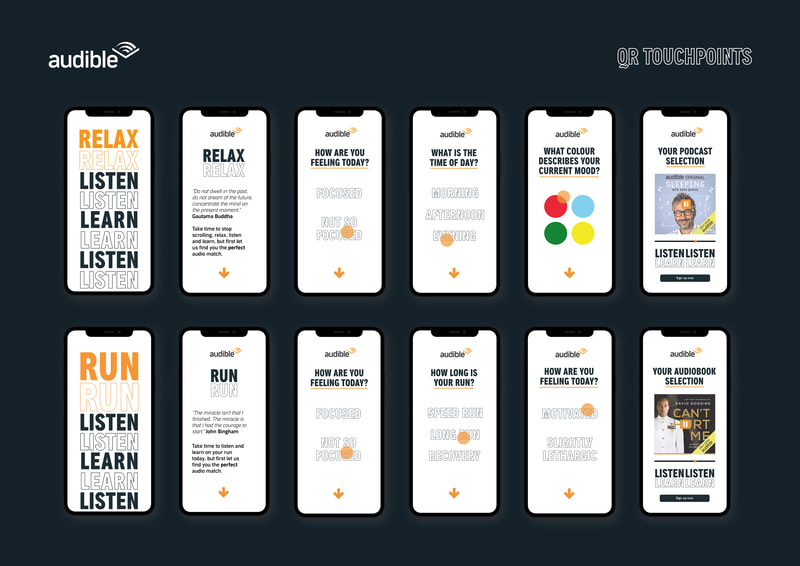
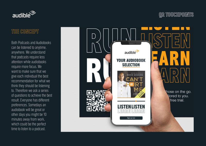
SARA TITILAYO LAWAL :) GRAPHIC BRANDING & IDENTITY THE VALUE OF INTERNATIONAL COMPETITIONS AND REMOTE LEARNING RESOURCES. As we closely approach the ninth week of ‘lockdown’ in the United Kingdom it's becoming increasingly apparent that this pandemic will have a drastic impact on our lives for the foreseeable future. In due time, restrictions will gradually ease and society will return to a ‘new normal’. But what will this ‘new normal’ look like? Will there be a permanent shift towards remote learning and hiring? Will the graduate unemployment rate skyrocket? At what point will it be safe to travel overseas post lockdown? Is social distancing here for the long haul? During this time of uncertainty, it is more than normal to feel overwhelmed by questions that no one has the answers to, and this is okay. Thursday 12th March 2020: I had officially finished organising the remaining 6 months for DPS (APRIL 2020 - SEPTEMBER 2020). Monday 23rd March 2020: The government imposed the lockdown across England and the rest of the UK. Essentially within these 11 days, two internships and the opportunity to spend a semester studying at The University of British Columbia (Sauder School of Business) in Vancouver had vanished (well postponed until 2021). Although this was far from ideal, I was fortunate enough to have started working for a Marketing and Branding Communication studio based in SOHO London, two week before quarantine started. The process of transitioning to working from home was surprisingly seamless and as I no longer needed to physically be in London I made the decision to move back to Manchester. Working at home has both it's positives and negative. The negatives are pretty self explanatory and are different for everyone depending on your living situation. In terms of the positives, I definitely appreciate my new found flexibility, being able to clock in the hours that I want to work and creating a new routine that works for me. This is the first time I have looked at myself and asked when is Sara the most productive? Surprisingly, I found that I actually get the most work done first thing in the morning so between 6am to 12pm. So the days I work from home I have been starting my day much earlier and I am normally finished with work around 1 o'clock as I prefer not to take breaks and I have no distractions. This has also made me question whether a 9 to 5 schedule is really right for me? From this point on I decided that it would be a good idea to reevaluate my goals for the year. I came to the conclusion that the best thing I can do is to temporarily let go of my plans, stop writing to do lists and take each day as it comes. This year I have mainly worked for agencies that have favoured a strategic approach over the creative process. Although, I know that post graduation I want to work for an agency that is strategically focused. This year I really wanted to actively develop my portfolio and not solely focus on the research and development stages of the design process. Therefore, I thought it would be a good idea to push myself outside of my comfort zone and do a D&AD brief. In the end I submitted two. 1) DUREX - In collaboration with Catarina Bernardi (IVM) 2) AUDIBLE - In collaboration with Lauren West (GBI) DUREX THE BRIEF: "To help Durex bridge the perceived gap between disability and sexuality with a campaign that empowers disabled people, and challenges people’s preconceptions and stigmas." OUR CAMPAIGN SUMMARISED SEX. EVEN though we talk A LOT about it, we don't talk about ALL of it. Sex is grossly misrepresented. And the disabled community experiences this first-hand. So, to break the stigma and give a platform for disabled people, we decided to create an awareness and educational campaign. #SEX FOR EVERY_BODY. And this is how: First, we wanted to get to places where people are already thinking about sex, like shops that sell condoms and sex toys. There, we would help people with disabilities by redesigning some of DUREX’S packaging, making them more visually accessible, and including symbols that represent common concerns that disabled people might have when navigating sex. With this, we are helping disabled people to shop better, according to their needs and showing every_body some of the many ways we can experience sex. But that's only the beginning. We are also going to DUREX’S Instagram account with a #SEX FOR EVERY_BODY takeover, to educate even more people. And What’s better than learning from the experts themselves? That’s why we are inviting influencers from the disabled community to talk on DUREX’S IGTV about their own experiences with sex and the stereotypes they face. They’ll also promote the SEXFOREVERY_BODY hashtag to their followers and invite them to start a conversation on how to make our sex lives open for EVERY_BODY. On DUREX’S Instagram feed, posts will continue to spread the message and talk about the symbols that are part of this new packaging and how they give visibility on diverse ways of having sex. This conversation will continue on the stories, with the #SEX FOR EVERY_BODY manifesto, where we will ask people to reflect on how they define sex. #SEXFORVERY_BODY celebrates the diversity of sex. It helps to empower disabled people to explore their sexuality, have a better sex shopping experience, and feel represented in society. It also encourages EVERY_BODY to reconsider what sex really is. OUR MAIN DELIVERABLE WAS A VIDEO HOWEVER THESE WERE A FEW OF THE ADDITIONAL DELIVERABLES THAT WE FINALLY SUBMITTED.DUREX 2020: Sara Lawal & Catarina Bernardi (Illustrations by Catarina Bernardi) AUDIBLE THE BRIEF: "Audible is a better alternative to mindless scrolling and swiping on our phones, but some audiences don’t consider the brand relevant to their lifestyle. Make Audible relevant to people who want to get the most out of their free time." OUR CAMPAIGN SUMMARISED In a generation where everybody is always striving to be their best! Audible understands the pressures we face and how this can sometimes make it difficult to find the time to learn new skills and satisfy our intellectual cravings. Our campaign highlights how simple it is to incorporate self development into our everyday lives. Audible will encourage the “leisure upgraders” to reconsider how they consume media. Listening to a podcast or audio book while completing everyday errands makes multitasking effortless. Lauren and I initially chose to work on the Audible brief as we thought it would give us the opportunity to create a fun campaign where we would be able to develop a rebranded campaign for Audible. At this point we didn’t realise how corporate this brief truly was. We were rather surprised when we found that the brief set by Audible was rather restricting, they had A LOT of brand guidelines that needed to be followed and we had no creative freedom. To begin with we found this rather frustrating, however, at the same time i learnt a lot from this experience and it made me realise how important it is to find the right design agency for you. At university we are given so much creative freedom to the point where we develop a visual identity, the brand values, a manifesto and we are able to decide how we respond to the challenge. This is one of the first times in a brief we have been given the answers and it is actually much harder to think as creatively as you normally do when the brief is open. SWITCHING TO REMOTE LEARNING This year I have had a true reality check of how competitive the job market really is. During the interview process I was rather surprised that a lot of the conversations I had were about self initiated projects and books instead of my actual degree. I have always really enjoyed reading but throughout the first two years at university I didn't make the time to read on a regular basis. So, at the start of this DPS year I set myself a goal to read a new book every fortnight and at the moment I am trying to read a new book each week. From just taking one hour out of my day to read I feel like this helped me to evaluate situations a lot more rationally.
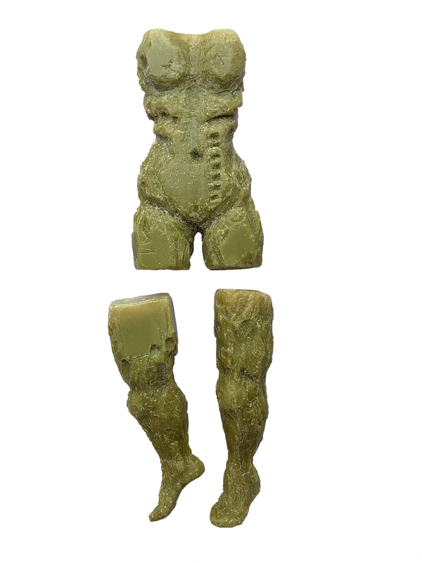
Vicky Patoulioti Illustration and Visual Media Over the last months a new reality has been applied to all aspects of our lives due to the effects of covid-19. The virus has altered our society as much as it has our individual lives. We have already started seeing a gradual application of new norms as well as a new identity taking place. Therefore, it comes as natural for our previously familiar art world to be changing in order to adapt to and serve the needs of a new society. One of my DPS projects that made me notice and experience this change was my Self Initiated Project. For my SIP I collaborated with Cjaye Newton, a third year student of LCC’s Design for Art Direction taking part in his Final Major Project. The topic we were looking at was how the body experiences anxiety in relation to the concept of free fall. One of the ways we experience an anxiety attack is by loosing control of our limps, loosing sense of orientation, feeling numb. I responded to the brief by creating a soap sculpture capturing this loss of control, numbness and «devision» of our body in parts. The fact that this year’s graduation show will be online needed me to find a way to exhibit this physical sculpture in a digital form in a way that is still impactful even without experiencing it in person. This problem I had to face raised two questions. How has the virus changed and will be changing the way art is exhibited. What kind of art we will be experiencing over the next years. Since the very beginning of the pandemic we seem a lot more willing to see, experience and invest in art. We are in quest of finding new ways to entertain, educate and destress ourselves and art is the means to do so. Jackie Wullschlager in her article ‘How contemporary art is changing in the Covid-19 era’ includes Darragh Hogan’s, kerlin’s director suggestion that «the need for connection and communication is amplified now, art has a vital role in meeting that.» In the article «Bye bye, blockbusters: can the art world adapt to Covid-19′ the writer Andrew Dickson mentions that «Social media has been part of the art world for a while. But with physical galleries now empty it’s suddenly the sole means for organisations to retain a connection to audiences.» Wullschlager states that «viewing rooms are bringing new work to audiences in isolation with unprecedented rapidity. It is a triumph of contemporary art’s resilience and innovation.» As a confirmation to the above Dickson provides that «Galleries have been experiencing record web traffic: visitors to the British Museum site soared in the early days of the crisis, while the Courtauld Gallery’s virtual tour reported an astonishing 723% spike in visitors in mid-March.» The virus has confirmed the vital role that art plays in our lives but has also suggested that there is a need of finding new ways to exhibited it. While there is room for both physical and digital I believe that virtual reality can be an effective solution for both creating and exhibiting art. Maybe it is still early to talk about a VR driven art world firstly because the concept is relatively new, secondly because of the cost it comes with. However, VR can potentially provide easy access without packing the galleries. It can recreate a sense of space, therefore size, so it can also, ideally, stimulate senses and feelings in a much more effective way than viewing rooms. It doesn’t have to be digital, it can be any kind of physical art exhibited in VR spaces.
In Dickson’s article Frances Morris, director of Tate Modern mentions that «If you look at the great traumatising events of the past – world wars, global emergencies of different kinds – artists have always responded. After the first world war it was dada and surrealism; after the second, existentialism and gestural abstraction. Whatever the work looks like, it’ll be interesting.” Morris suggests that «It’d be great for museums to focus on their permanent collections, the amazing things we already possess.» In the same article the commercial gallerist David Zwirner concurs «It got out of hand, especially the market: crazy auction prices and the rest. The infiltration of value into the perception of art, art being regarded as an asset – all that needs to be rethought.» At the same time Alison Cole, editor of industry bible the Art Newspaper argues «Normal’ was unsustainable… The endless expansion, the mega-collectors, the purchasing of big trophy objects. I think we’re entering a period of less is more. I hope it’ll be less macho.» Finally, in Wullschlager’s interview with underseller Larry Gagosian included in her article, he mentions that «The art market will come through stronger, smarter and more relevant.» Gagosian says «It’s been a sobering experience.» It seems that this exact traumatising event has made us reconsider art and alter the way we process it. It offers an opportunity to reevaluate what constitutes the art world, take a step back, and rediscover forgotten values. Reference list Dickson, A., 2020. Bye Bye, Blockbusters: Can The Art World Adapt To Covid-19?. The Guardian. Available at: <https://www.theguardian.com/artanddesign/2020/apr/20/art-world-coronavirus-pandemic-online-artists-galleries> [Accessed 19 May 2020]. Wullschlager, J., 2020. How Contemporary Art Is Changing In The Covid-19 Era. Available at: <https://www.ft.com/content/25e1fc74-7fdf-11ea-8fdb-7ec06edeef84> [Accessed 19 May 2020]. Morgan Allan, GB&I At the start of the quarantine, I was made part-time by MUNDIAL; two months later and I had been let go. I understand that this is the nature of working for a small business in a time of crisis but it was still less than ideal. Firstly, it was sad to leave a job that I really enjoyed, one that challenged me daily to become a better creative. Not only that, but I was being made to leave through no fault of my own. It wasn’t down to poor job performance, or falling out with a colleague, it was just one of those things. A pandemic out of everyone’s control. That lack of a tangible thing to blame it on made the redundancy even harder to take - it’s difficult to be angry at a virus that you can’t see. I also had to contend with the fact that I didn’t have something that I needed to do everyday anymore. I am, by nature, a person that needs structure to work at my best and I really thrived when I was working in highly pressurised situations against tight deadlines at MUNDIAL. Suddenly, that was gone. My to-do list had been taken away and my safety net had disappeared. I needed to find something new to fill my time. When I initially went part time, I reached out to a few friends who I knew to be working on small independent projects. Although I knew joining these projects wasn’t going to pay the bills, I still had my part-time wage coming in from MUNDIAL and really wanted to try something new. Having been working in the same office and with the same people for an extended period of time, it was exciting to hear of projects where I would be given a larger opportunity to express myself. One of these projects was Unsettled Magazine. Two of my friends had taken up running it at the start of the new and had built a decent following on social media. Around the same time as I was made part-time, they had a successful Kickstarter campaign to produce a print edition of the magazine. Given my experience in print and my newfound free time, it made perfect sense to come aboard as an Art Director. Unsettled is a lifestyle magazine with a particular focus on art and music. It was initially a UAL-based publication but, with the help of the Kickstarter, they have become independent. I came on board with a particular focus on the print edition but, due to the extended lockdown period, the print date had to be pushed back. After discussions with MUNDIAL’s Lead Creative James Bird, we decided to focus on building Unsettled’s social media following, creating an audience that would be looking forward to the print issue in the future. As an editorial team, we have revamped the social media and have worked with established artists to increase engagement and get the word out. This has been a successful tactic and we recently reached the 1000 follower mark. All in all, it has been a strange time. Because my work is such a big part of my life, it has taken some time to readjust to it not being there anymore. I am having to learn how to exist outside of the 9-5. I wrote some words on this subject for Unsettled’s “Quarantine Diaries” series: “I read a post on Humans of New York the other week about a man called Wayne. It was a lovely story about a man who was larger than life and, even after he died, someone who brought happiness to those close to him. If you haven’t read it already, I would highly recommend. One line that really stuck out to me was about Wayne’s philosophy on the world: “He always stopped for life. That’s one thing he taught me—if you want fullness in life, you have to stop for it”. Stopping for life. The Ferris-Buelleriean idea that sometimes, to really appreciate what’s going on, you need to take a little breather. I’ve gone back home for the quarantine. Swapped my tower block in South London for the East Kent coast and, after a few weeks of trying to fill every minute with something to work on, I’m learning how to take that breather. Life in London is fast-paced and, for the most part, I love it, happily hurtling about the place, avoiding the one thing that I hate more than anything: doing nothing. One global pandemic and a government-enforced lockdown later, and I’ve had to accept that doing nothing is a fairly significant part of my life now. But, instead of crumbling under the usual anxiety that I’m somehow wasting time, that life is passing me by, I’ve stopped. Inspired by Wayne, I’ve decided to try and appreciate what’s around me. My mum still lives a ten-minute walk away from where I went to primary school. I’ve been doing the same walk my brother and I used to do, through the same park, along the same footpaths, up and down the same hills. The only difference, a decade later, is that I’ve brought my camera instead of my bookbag. That, and I’m walking it much, much slower.” I am trying to live my life in a healthy, satisfying way. For a long time, this satisfaction came from putting my energies into creative projects and producing outcomes that I liked and was proud of. While I still intend on doing that during lockdown, I am now realising that it’s not possible to work as hard and as productively as I was in the current climate. Instead, I am learning how to reflect, how to slow down and how to be ok with doing nothing. It has been a difficult period but I hope to come out of it a better and more well-rounded creative.
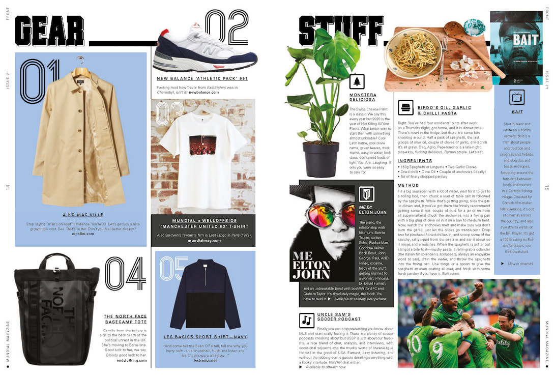
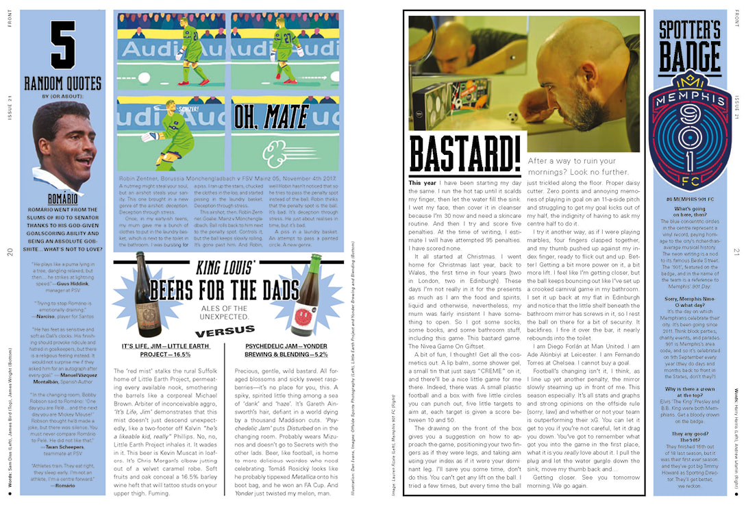
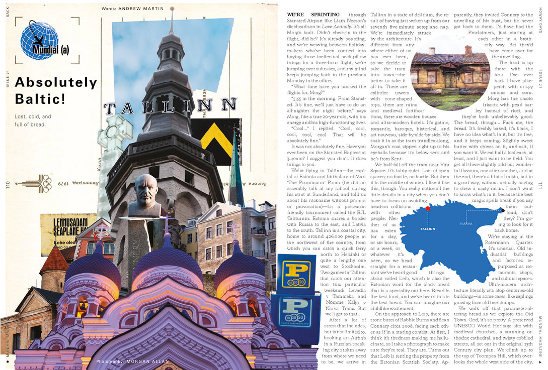
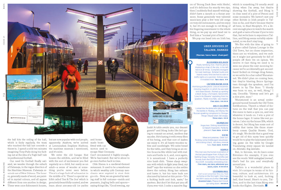
Morgan Allan, GB&I The focus for me and everyone at MUNDIAL at the start of 2020 was Issue 21 of the magazine. As it was the start of a new decade, the editorial team had taken the decision to produce a cover feature that looked forward. It would analyse the world of football and detail hundreds of exciting things that existed in the game today. It was a very large undertaking as it involved dozens of new contributors, researchers, interviewees and creatives. In addition to the new content workload, there would be more to design and it needed to be of a higher quality. The Art Director decided that because he would have to spend a lot of time on the cover feature, I would be responsible for a larger proportion of the mag. By the time we went to print, I was responsible for designing roughly half of the mag. This was the largest project of my career to date and I learned a lot. The front sectionEvery issue of MUNDIAL is divided into three sections; the front, the middle and the back. The front is home to a collection of short columns, lists, quizzes, games and imagery, the middle is where all the long-form features go and the back is for fashion editorials, advertorials and the travel feature. For Issue 21 of the magazine, I was given the front section to design. This was a significant milestone for me because it was the first time I had been given an entire section to design. The front section is varied. There are columns, lists, cartoons, DPS images and more. This variety was the main reason that I enjoyed designing the front section. I had pages where I had large amounts of text and imagery and some where I only had one image. Overall, the front section is the most structured section of the magazine - it has to be given the volume of different pieces in its 14 pages. Because of this, designing the front section was more a test of my technical skills than my creative thinking. It was all about using the space appropriately, balancing pages and assembling a visual hierarchy that worked for the content. I also had to keep in contact with the various contributors. Because I was responsible for the deadlines of the section, this involved chasing imagery, sells and occasionally asking for re-writes. The travel featureAlthough I had been a photographer for the two previous travel features in Derry and Lisbon, this one in Tallinn was different. We were going right at the start of the year and there wouldn’t be much light to work with. It meant that we had to get out early and really plan our days in advance. This was different to the previous shoots I had worked on, as both in Lisbon and Derry there was glorious sunshine the entire time we were there so we had slightly more freedom to just wander around and get to know the city. I planned some shots meticulously, like the wide of the Alexander Nevsky Cathedral used in the opener, and others were more natural - we just happened to be passing through the station on our way to another location when I captured the trains on the third spread. I ended up with some really nice shots to come home with and design up on the page. For this issue, the Art Director wanted the travel section to have a new look. Previously, it had been very structured, working to a particular grid and format that relied on columned text, large imagery and box outs. He wanted something fresh and suggested experimenting with collage. He knew that I was a fan of the medium and had used artists like Emir Shiro and Shusaku Takaoka as references for other projects. I began putting together draft spreads for the feature, using a combination of digital and analogue collage to create the effect that I wanted. Initially, I think I went too far one way, and made the feature feel too much like a sketchbook. I reigned it back in slightly, added back in some of the more structured elements and came up with a result that I was really happy with. C.P. Company AdvertorialAlongside the travel feature in the back section, we had two advertorials. This is when a brand pays for native feature in the magazine, that in some way advertises their products. This issue, we had advertorials from sports broadcasters Premier Sports and from Italian menswear brand C.P. Company. The C.P. advertorial would be an interview and shoot with Man City player Joel Latibeaudiere, pictured wearing some of the brand’s newest collection. I was asked if I wanted to style the shoot and, of course, I said yes. I’m a big fan of the brand and was very excited to be involved in one of their projects. After talking with the photographer about locations and liaising with the C.P. office in Milan, I went down to the warehouse to pick out some looks. The looks I picked out were designed to be layerable and work with different accessories. There were a couple of pieces that people weren’t sure about but I pushed them through and they look great in the final images.
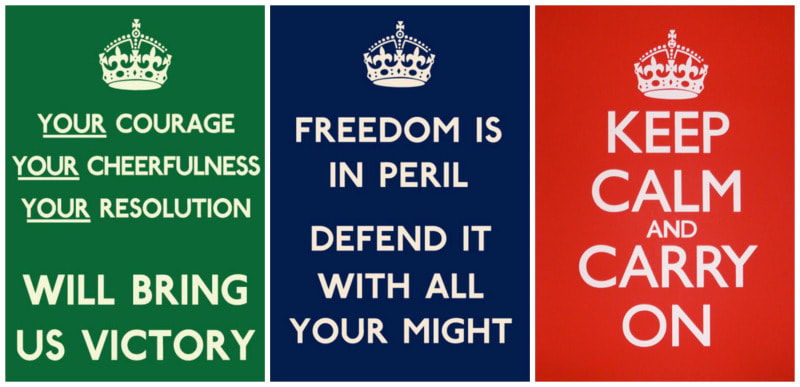
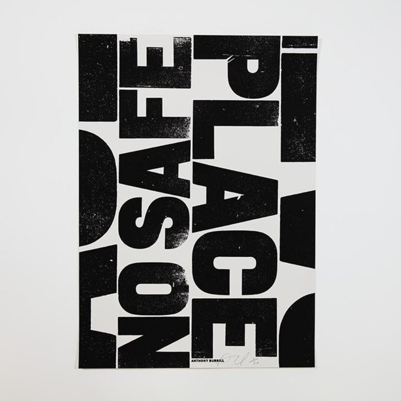
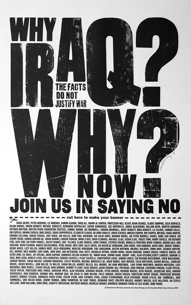
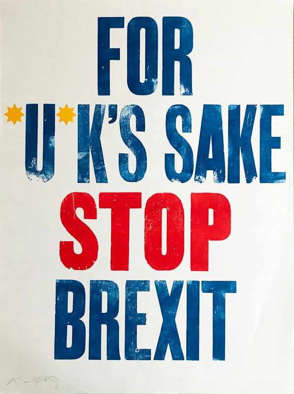
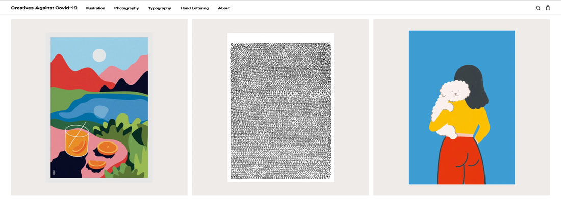
Being involved in the production of Issue 21 was the biggest challenge of my career so far. There were a variety of new challenges to face and I really had to learn on the job. Overall, I feel like I performed well and I thoroughly enjoyed it all. I feel like I am now a more well-rounded creative and will take all of these learnings forward into future projects. Theo Hersey BA Graphic & Media Design It is important to remember that the world-wide web, a tool which is now essential for everyday life, was only invented by Tim Berners-Lee in 1989. Due to the global connectivity given to us by internet we find ourselves living in an ever increasingly fast-paced, ocular-centric world, dominated by temporary trends. Subjects are being quickly forgotten and waiting to be swallowed up by the next ‘big thing’, especially driven in more recent times by the rise of screens and social media. So how are creatives tackling this and reverting to methods which carry a more permanent message in times of uncertainty? Printmaking has existed in Europe since the 14th century, and has even been recorded in china as early as 105 AD (Beedenbender, 2003). It continues to carry the same purpose today as it always has, to portray a message through a combination text and/or image and to be shared with others. Alongside their usual practise a vast mix of artists and designers create work to express their opinions on matters such as politics or in support of social causes. Through this I will be exploring some of the more prominent examples of how a printed poster can convey these messages. Your Courage, Your Cheerfulness, Your Resolution Will Bring Us Victory / Freedom is in Peril, Defend it With All Your Might / Keep Calm and Carry On. Available at: https://literaryames.wordpress.com/2014/11/02/the-story-behind-keep-calm-and-carry-on/ When looking back on World War Two, the British people like to remember the camaraderie of wartime spirit and a ‘can do’ attitude. A lot of these messages were initially produced and spread across the nation by the Ministry of Information, through printed posters. The three posters above are some of the most infamous from produced in the wartime period, spread across the country to generate that war-time spirit and boost morale. However, the ‘Keep Calm and Carry On’ poster which has become such an iconic image in the 21st century wasn’t officially shared in World War Two, despite 2.5 million copies being printed, as it was to be kept until times of invasion or grave peril in the nation (BarterBooksLtd, 2012). One of the most prominent causes of recent times has been that of Extinction Rebellion in their fight against global warming. Their occupation of London, including Waterloo Bridge and Oxford Circus was all over the media in April 2019, and more recently than this Extinction Rebellion occupied Trafalgar square in October 2019 for a two-week long peaceful protest. During this time, graphic artist Anthony Burrill conducted a workshop with participating activists and printed some large banners in his typical typographic style alongside a smaller scale print workshop which took place in Trafalgar Square during the peaceful protest. No Safe Place — Anthony Burrill. Available at: https://www.instagram.com/p/B98IjhWoPN-/ Burrill also contributed work towards Rise Exhibition, an auction in aid of the recent wildfires in Australia. A collection of artists was each given charcoal created by the fires in Australia and asked to use it as a medium in their work, Burrill chose to create a screen-print which featured the phrase ‘No Safe Place’ in his quoined bold typographic style, stemming from his practise which predominantly lies in Letterpress printing. Why Iraq? Why Now? Alan Kitching. Available at: https://www.wemadethis.co.uk/blog/2016/05/alan-kitching-a-life-in-letterpress/ Tying in to Burrill’s typographic work is Alan Kitching, known for being one of the forefront global practitioners of Letterpress printing, creating a vast mix of typographic Letterpress work over a long career. In 2003 Kitching designed a dual-purpose poster and protest for The Guardian Newspaper, ‘Why Iraq? Why Now?’. Despite the poster being printed into a newspaper, it was designed to be cut out from the newspaper and used as a protest poster for the anti-Iraq war rally which took place on 15th February 2003 (We Made This, 2016). For *U*K’s Sake Stop Brexit Hersey, T. 2020. For *U*K’s Sake Stop Brexit [photograph of artwork by Alan Kitching]. London. The above poster, again printed by Kitching, is another example of the more political side of his practise. Created to use whilst in attendance of the more recent anti-Brexit protests which took place in central London. Both posters, along with Anthony Burrill’s work, display a fine example of how traditional printing techniques can still be translated into posters to spread messages in the face of difficult times. “What I do I, consider to be ‘Extreme typography’. Done at a risk. But the modular system of wood block type body sizes come to the rescue. Pure chance plays its part.” — Alan Kitching, 2020. As of June 2018, Instagram has over one billion active monthly users (Chen, J. 2020), this combined with the social medias nature of being image based cements its reputation as an invaluable tool for promoting and sharing work amongst the creative industries. The ease of being able to quickly share work to such a vast global audience is something which would have been unimaginable before the invention of the internet. Creatives Against Covid-19. Homepage showing examples of posters for sale. Available at: https://www.creativesagainstcovid19.com/ Creatives Against Covid-19 (CAC19) is a new creative initiative, conceived amid the current global pandemic, which utilises Instagram perfectly. Originated by the minds at RichardsDee agency, CAC19 set an open brief to create an A3 poster relating to the theme word ‘soon’. When asked for a comment about the rationale behind the concept, CAC19 replied: “When we initially created the concept it stemmed from what we believed to be the innate power of the printed poster. Through-out periods of turmoil or uncertainty, messages of hope or optimism have often been created through the medium of the poster.” — Alana Storm O’Sullivan, 2020. Designers jumped at the idea, with over one thousand posters submitted in a week, from thirty different countries around the globe. Each selected poster is up for sale for €40 through their website with all proceeds going toward supporting two charitable causes, ISPCC ChildLine and Women’s Aid (Creatives Against Covid-19, 2020). The global connectivity achieved through this project is somewhat phenomenal. Under one overarching brief a vast mix of disciplines have been brought together by creatives whilst raising money for charity. CAC19 is a beautiful example of collaboration and self-expression amongst creatives in times of uncertainty, alongside the promising combination of social media and its support of print. “There's something incredibly special in knowing that in 10, 20 or 50 years down the road there will be posters across the world which not only raised money for those in need during the COVID-19 pandemic but also provided a beacon of hope in troubling times.” — Alana Storm O’Sullivan, 2020. Even in the digital age that we live in today, the printed poster has secured itself as a continually essential element in society, as important today as it always has been since its inception. The human need for a physical, tangible item is something that will surely continue for many years to come, especially in uncertain times when humanity turns to messages of hope and support. Bibliography
BarterBooksLtd (2012) The Story of Keep Calm and Carry On. 28th February. Available at: https://www.youtube.com/watch?v=FrHkKXFRbCI (Accessed: 05/05/2020). Beedenbender, V. (2003) Beedenbender. Available at: http://washingtonprintmakers.com/wp-content/uploads/2015/03/PrintmakingIntroduction.pdf (Accessed: 05 May 2020). Chenn, J. (2020) Important Instagram stats you need to know for 2020 Available at: https://sproutsocial.com/insights/instagram-stats/#ig-usage (Accessed: 05/05/2020). Creatives Against Covid-19 (2020) About. Available at: https.//www.creativesagainstcovid19.com/pages/about (Accessed: 05/05/2020). Hersey, T. 2020. For *U*K’s Sake Stop Brexit [photograph]. London. Literary Ames (2014) The Story Behind ‘Keep Calm and Carry On’ – its bookish roots. Available at: https://literaryames.wordpress.com/2014/11/02/the-story-behind-keep-calm-and-carry-on/(Accessed: 05/05/2020). O’Sullivan, A S. (2020) E-mail to Theo Hersey, 6th May. Risesocietyltd. (2020) 'On the auction site now: Anthony Burrill' [Instagram]. 20th March. Available at: https://www.instagram.com/p/B98IjhWoPN-/ (Accessed: 05/05/2020). Steven, R. (2019) Anthony Burrill lends his support to Extinction Rebellion. Available at: https.//www.creativereview.co.uk/anthony-burrill-lends-his-support-to-extinction-rebellion/ (Accessed: 05 May 2020). We Made This (2016) Alan Kitching: A life in Letterpress. Available at: https://www.wemadethis.co.uk/blog/2016/05/alan-kitching-a-life-in-letterpress/ (Accessed: 05/05/2020). Kitching, A. (2020) E-mail to Theo Hersey, 10/05/2020. |
