|
By Hunter Zhu
Graphic and Media design Around the traditional Chinese Mid-Autumn Festival and the National Day Holiday, I successfully completed my busy internship which lasted a month. Later, infused with hope, I took the high-speed train from Shanghai to Hangzhou and transferred to a bus in Tongxiang. After traveling for one and a half hours, I arrived at the famous Wuzhen, a town renowned as “a land flowing with milk and honey, and the home of silk.” When I was learning Chinese in primary school, I had to read a lot of ancient poetry depicting regions with rivers and lakes in the Southern part of China and since then I have been yearning for such destinations. As one of China's top ten most charming towns, Wuzhen is a renowned historical and cultural place and was established as the permanent location of the World Internet Conference since November 19, 2014. Wuzhen enjoys a history of 1,300 years since it was founded during the Tang Dynasty, the most prosperous and glistening period in China's history. And visiting this town can also provide deeper glimpses of the features and styles which were popular during the Late Qing Period and the Republic of China. Portraits of grand buildings, all near water, rise with multi-layered ridges and eaves up to the sky, while stone pathways and old wooden cottages spread out in the most austere way. It is an ancient town where life has lost none of its flavor by housing the local residents up to now. The town features streets formed naturally along the riverside, tangled with bridges and crisscross waterways which divide the whole town into four parts called Dongzha, Xizha, Nanzha, and Beizha, which correspond to the eastern, southern, western and northern areas. Among of them, Xizha is the one in possession of the most distinctive and most wonderful structures, which are set apart by weaving waterways into 12 tiny islands connected by dozens of unique old stone bridges. The place has more rivers and bridges than any other ancient town in China. To me, the following scenic spots are the ones that touched me most when I stayed in Xizha for two days. Bridges in Xizha: Over 70 small bridges stand in Xizha, but each of them has its own personality and the distinction of each bridge can be felt by its own unique style and pattern. Bridge in Bridge, reputed as the most distinguished, is denominated from two bridges that are adjacent and perpendicular to each other. Standing on any of them, you can easily see the other bridge through an opening, and naturally admire the splendid view which is similar to seeing the full moon from a deep well. Natural Dye Workshop: It's a big workshop which runs manually and is eco-friendly as a place for dying, printing, and drying. It’s also a perfect place to explore old, naturally dyed masterpieces and you'll be rewarded with a chance to dye by yourself. The large drying site is paved with blue bricks, and decorated with tall sticks densely standing here and there with cloth racks arranged in a step-shaped manner. Blue calico is one of China's traditional printing and dyeing crafts. It has numerous attractive attributes such as austerity, simplicity, endurance, dirt-resistance, and breathability which made farmers very fond of wearing it. In addition to blue calico which uses bluegrass as the raw material, the Natural Dye Workshop also specializes in a unique multi-color dyeing technique. Multi-color dyeing is rich in its expression of colors which are extracted from all sorts of materials such as tea leaves, mulberry bark, and black eucalyptus leaves. In a way, this workshop is an invaluable cultural inheritance full of the wisdom of our ancestors, which makes us admire the exquisite craftsmanship and skills of the ancient artisans. It has become a symbol reflecting the long history of the Chinese people and a source of our national pride. Wupeng Boat: This narrow boat, covered with a low awning that is woven with thin bamboo strips and painted black, is a unique means of water transportation in Wuzhen. Wuzhen is a typical water town naturally teeming with boats. There is no better choice, I think, than taking a ride on a Wupeng Boat to enjoy the scenery of Xizha at leisure. Sitting on the boat, I could comfortably appreciate the beauties of both riversides, the arched stone bridges, the flat stone paths, and the busy women washing clothes by the river. These all formed a beautiful riverside scene. Wuzhen at night: When the night falls, thousands of lamps light up the streets. They glow through the bridge openings and in the water, and a sea of lights brighten up the rivers. Displaying a sense of quietude and steadiness during the day, Wuzhen at night looks like a dazzling pearl, enticing you in a totally different way. During this year’s internship, aside from work, I think that making full use of holidays to experience life was also extremely significant. Design is actually derived from life, and the purpose of design is to solve problems based on one’s in-depth experiences of the world. For me, traveling in fact serves as a way to experience another life, and during the process of traveling, I am able acquire a lot of inspirations and come to know the circumstances and culture of a nation. For example, in Wuzhen, there are a lot of signboards from ancient China that are kept in good condition and presented in all sorts of manners. As a designer, I took note of many of their visual elements such as typefaces. In Wuzhen, there are also a lot of aesthetic features symbolic of Southern China which I just mentioned, such as bridges and tile-roofed houses. If I can combine their ancient appearance with modern design, I believe they would prove to be quite helpful to my own work as a designer.
0 Comments
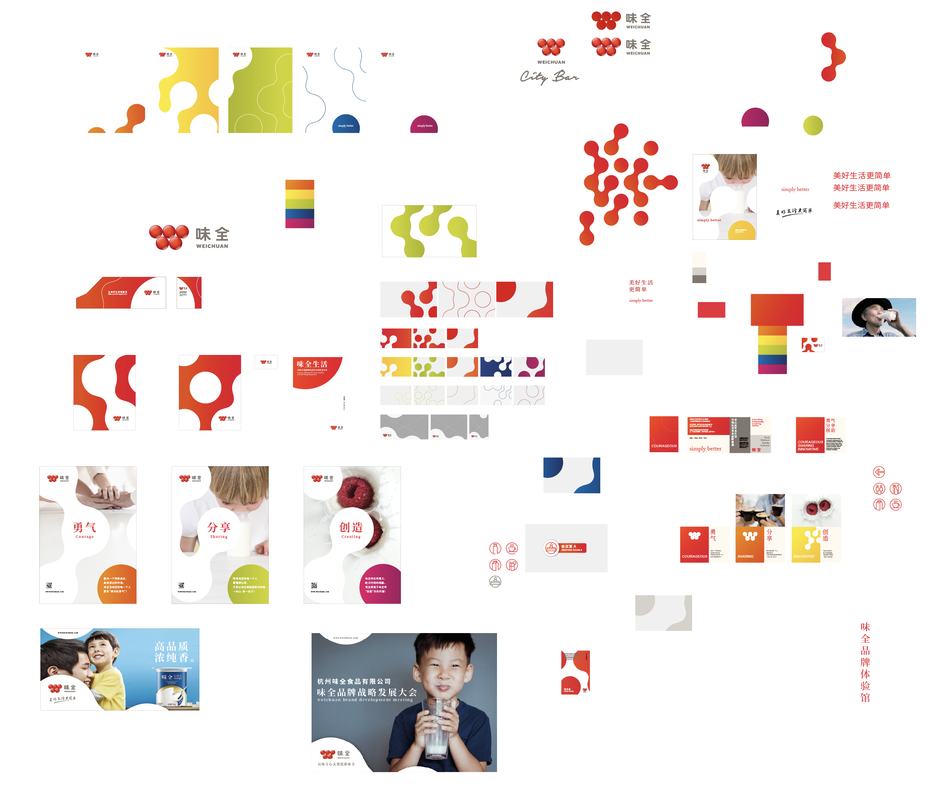
By Hunter Zhu Graphic and Media design As a brand from Taiwan, WEICHUAN was founded in 1953. In the 1960s and 1970s, WEICHUAN GROUP was once the largest enterprise in Taiwan's food industry. In 1968, it began to sell its products in large quantities to the international market due to expansion of the business and continuous development of new products. As the original visual image of the original logo had failed to show the content of operation and development of the company, the company hired the famous Japanese designer Tomohiro as the design consultant to make complete and detailed market research and product analysis to develop the identification plan of WEICHUAN enterprise. Finally, the WEICHUAN logo was determined, i.e. five circles making up a W shape, which symbolized “Rich in Taste”; then series of communication style was developed, and visual images of all departments and products were unified. Establish in 2002, Hangzhou WEICHUAN Food Co., Ltd. It’s a food company which produces lactic acid bacteria, yoghurt and juice, and was established in Hangzhou City, Zhejiang Province, China by WEICHUAN GROUP. Our company undertook the business of visual system design and upgrading of WEICHUAN Hangzhou brand in 2018. The brand innovation design was mainly embodied in five aspects: brand identity, brand color palette, font style, image style, and auxiliary graphics.Our company had tried to use the most intuitive and unsophisticated way of experiencing products in the daily life of the audients, i.e., our inborn “five senses”, taste, vision, touch, smell, hearing, to return to the simplest original wills of ordinary people. Thus, we put forward the concept of changing “Rich in Taste” into “Five Senses” for design of WEICHUAN brand, and changing the five circles symbolizing “Rich in Taste” into “Five Senses” representing taste, vision, touch, smell, and hearing. This change implied the meaning of “make your life simply better ”. For the new LOGO icon, color gradient of orange yellow is added, with the original "WEICHUAN RED" kept unchanged, which brings more sense of transparency and authenticity. The new " WEICHUAN DYNAMIC RED” stands for "courage, share, creative”. We’ve creative the concept of how to express the abundant taste of the beverage by Visual communication, and this is a big and also complex branding visual system contains: the usage of ‘3D’ and ‘2D’ logo, the main color and assistant color, the graphic pattern, and the application designs. And in the same time, we also need to visually explain the value ‘courage, share, creative’. My job is to design the applications like the magazine, van mockup design… And make a motion graphic to express the the main value which to make our client to understand visually, and also the motion graphic can be utilized on the future advertisement. By Hunter Zhu
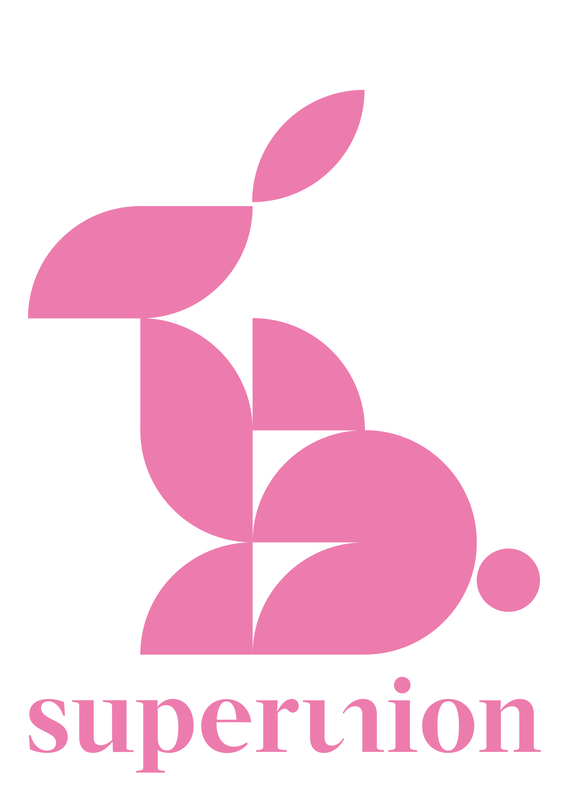
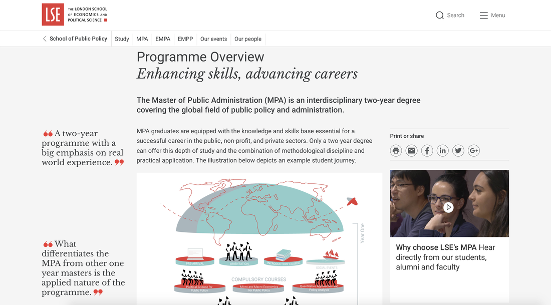
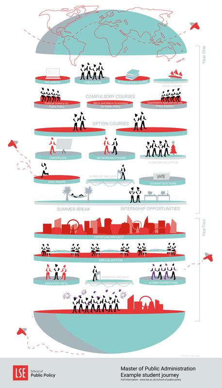
Graphic and Media design Mid-autumn Festival is a traditional festival in China. It is held on the 15th day of the 8th month of the lunar calendar, corresponding to late September of the Gregorian calendar. It is in the middle of autumn so it is being called Mid-autumn Festival. The moon at the night of Mid-autumn Festival is extremely round and bright. When people look up and gaze at this moon which looks as round as plate and as bright as jade, it is natural to look forward to family reunion. People travelling away from hometown would also like to take this opportunity to express their strong yearnings toward hometown and family. Therefore, Mid-autumn Festival is also called as “reunion festival”. Mid-autumn Festival is romantic and loving. From Tang dynasty, on such occasions, family members and friends would sit at the table, eating moon cakes, gazing at the moon and drinking sweet osmanthus flavored wine which are the customs on this day. Nowadays, with the fast life space, getting together with family, friends or business partners on that day is becoming a wish hard to make true. So, people are trying to use another method, making postcards to celebrate this traditional festival and express their genuine wishes to their family, lovers and friends. This year’s Mid-autumn festival is coming which is also the second week since I arrived at this new company. It’s really my honor to receive this very important task which is to design a postcard to express our gratitude to our company’s customers on Mid-autumn Festival. At the beginning of the postcard design, there are a few things I need to be noticed, first of all, as a design company, our postcard should be creative, and the design should contain the branding identity. And at the starting of the design, I need to consider the printing technical. In the final design, I used geometric shapes to combine as a shape of a rabbit, which is a important element of mid-autumn festival. Juliette Stuart ‘Illustration and Visual Media’ is the rather long winded title given to my degree; a course that allows for exploration into the visual world with no limit on medium or method, allowing for students to experiment liberally to find their own style. You would think that this creative freedom would make for well-rounded individuals prepared for any situation or any creative-based job, but myself and the other IVM students have found it slightly harder to find a place for ourselves in in industries that seem dauntingly design-orientated. As the second biggest course in LCC (behind only Graphic and Media Design) we naturally made up a large portion of the DPS students gearing up towards a year out in industry. Yet from the offset the lectures we received, the speakers who came in for lunchtime sessions and the briefs we were set were all heavily seeped in design requirements. Not many people do manage to make successful careers solely out of being illustrators without having to do something else to pay the bills. There were so many of us on DPS – how would we all find employment as illustrators with little design knowledge without having to mould ourselves into something we were not? I started my first placement last week – a position that I landed at the advertising agency Karmarama after winning a competition brief to make them a new company tote bag. They picked the winners solely based on the entries, without reviewing portfolios or conducting interviews – so of course had no idea that I was from an illustration course. My role is as a junior designer on the design team. I was nervous to start, worrying that they would feel robbed of an actual design intern or that a design student would have benefitted more from winning the competition. I had a frustrating first few days when I realised that my Adobe skills were not up to scratch enough to be of proper use working on client briefs, despite spending a large portion of summer working through online tutorials. However, one day in a frenzy of creating visual mock ups for concepts for a poster for a client, I made one text based interpretation that wasn’t as bad as what I had been doing earlier in the day. Sat next to an LCC graduate who also did DPS, I had slowly been learning from him more of the functions of Adobe Illustrator and been getting to grips with making things look like how they looked in my head. I finished at 6, slightly downhearted at not being proud of my work, but when I came in the next day many people had my design on their screens – it turned out that the team members who had been staying in late took it to review and the creative team in charge of the project had picked my version. My text design was being mocked up onto cups, notepads and pens, which of course gave me a confidence boost and broke me out of the shell of fear and doubt of the first three days. I slowly began to realise that actually, I do have a place here as an illustrator. It is just something that makes me a bit different from the rest of the team with design based backgrounds. I managed to get this job with an illustrated piece which probably helped it stand out from the rest. I am also heading into the final stages of a pitch for designing the Christmas window for Wieden and Kennedy, and I reckon that the illustrated mock ups of my idea helped to get it across and made up for the designed aspect that was lacking in the presentation. One morning I was working on a personal piece on a work computer, and many of my colleagues said it was cool. Certainly, it was different to what they were using Illustrator for. Perhaps the way I look at Illustrator and InDesign are different – we see different potentials with the toolkits in front of us. I have also been learning a lot about the design world, and gaining skills relevant to it. In the past week I have extended my knowledge of the Adobe suite far more than the tutorials I spent so long watching. It almost doesn’t matter that the learning curve has been so steep – all my colleagues are lovely and help me out without seeming too bothered. As an intern I think it is expected that I will not be able to handle things totally by myself as others who have been doing it for years could. It has certainly broadened my horizons. I don’t think any illustrators should be put off chasing design based jobs – our skills are still useful, valid and our creative eye essential. I think illustrators should be less precious about refusing to compromise on their specialism, and that designers should be less facetious about the importance of illustration. We have a lot to learn from each other, and I am excited for what is to come in my remaining few months. For confidentiality reasons, I am not able to put up any images of the work I have been doing. To visually translate the complex Curriculum for The Master of Public Administration (MPA)9/11/2018 Melissa Hannah Springall I applied to freelance for The London School of Economics after receiving an job post asking for a graphic designer who had experience with branding and animation. The role seemed to fit perfectly with my current studies and after sending over my portfolio, I was invited to a briefing day hosted by the London College of Communication UAL talent works. Five students from LCC were asked to attend the day. The original brief was to create a static infographic with the possibility to also create a animation, if the university felt would help the project. The morning began with a briefing explaining the curriculum, followed with a Q&A to further understand the brief. Then the afternoon was spent prototyping and pitching our ideas back to the LSE team. Later that week I was excited to be commission to produce the static infographic and animation. This would be a two week long project, a week to create each part. Nearly 80% of the LSE Masters students are international, and for majority English is their second language. LSE wanted a easy way to entice students to explore their course without confusing them with blocks of large complex text. My role was to break down the most important factors of the course and display them in a practical formation. Using infographics and illustration I began to translate the course units into a new visual language. Working with such a high status university was a big plus for me. As a Graphic Branding and Identity student working along brand guidelines came naturally into the experience centered design process. LSE held a brand guideline for the use of Logo, communication and print. Which was introduced to me at the beginning of the job. This was a plus as it allowed to the fine line colour schemes and typography style before digitalizing the design. I felt this was crucial in reflection of the project as it aloud me to grasp the tone of voice and formality style of the LSE brand. Freelancing for this project came as a great device. During the 2 week long commission I met with the client in their office on several occasions, and for the rest of the time worked from home or at the LCC library. Our meetings mainly consisted of reviewing the commission, in addition to this we spent time developing the brief and breaking down the project mission. By the second week the project changed to capture the journey of a masters student. Which we decided would help build a wider image of what the course offerers, including the social events and networking opportunities. Freelancing for me was a great experience, it aloud me to plan my own work schedule and learnt how to motivate myself at the right pace to create results. This was a valuable experience which taught me many transferable skills which I can translate to future projects. I would like to thank the LCC Talent Works team for enabling this and starting my Diploma in Professional Studies with a positive start. I would also thank the LSE team for their cooperation and feedback.. “Melissa has been fantastic: she’s had all the right concepts in her head, she’s explained herself well and her execution of the concepts has been outstanding in speed and accuracy. Moreover she has excellent ‘professional’ skills, with the right levels of formality, quick turnarounds and maybe most important she knows how to keep meetings short! We are very impressed indeed with Melissa and would recommend her.” My work is published on the London School of Economics website and social media platforms. http://www.lse.ac.uk/school-of-public-policy/mpa/programme-overview
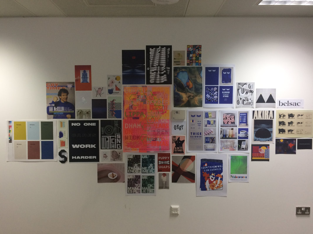
- This is the comparison between the visual identitity of Lianhua and other cases.
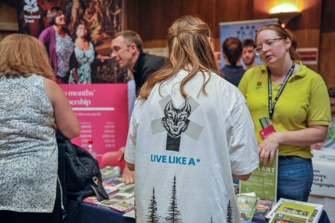
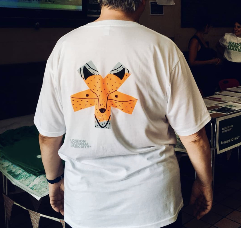
By Hunter Zhu Graphic and Media design In the wonderful September, I came to Shanghai to work as an intern for DPS project in WPP Superunion , a great company that I have been looking up to for a long time. Since January 2018, WPP Group, the world's largest group of advertising communication, restructured its five creative and well-known companies (Brand Union、The Partners、Lambie-Nairn、Addison and VBAT) into a new agency for consultation and design of global brands. The restructured company is named "Superunion", which has set up 23 offices in 18 countries and will mainly provide services for brand image, animation, packaging design and digital media design. Jim Prior, the global chief executive of Superunion, said: "The world needs creative solutions to stimulate growth, which cannot be achieved with traditional methods. This is why we have formed the "Superunion". Originality must be applied to the core of an enterprise, since it can influence the innovation, cultural change, products and services. We will provide more comprehensive services to help customers to achieve success.” I have been working in Superunion Shanghai office as an intern in the Creative Department.The Shanghai office was formerly known as The Brand Union, one of the first international brand consultancies to do business in China. It has been operating in China since 1999, focusing on introducing leading foreign brands into China and looking for effective operating models in line with the local reality. While helping Chinese businesses build their brands, they also help well-known foreign businesses or brands to find an appropriate brand development path when trying to enter the Chinese market. Their customers include both international and Chinese well-known companies. International customers include: American Express, HP, Bank of America, Suntech Power, SABMiller, Unilever, Mars, Motorola, Vodafone, Credit Suisse, Corus and KPMG. Brand Union has enjoyed a sound development in China in recent years. In addition, typical domestic clients include: COFCO, China Mobile, and OCT. Relatively satisfying cases involves ENN Energy and rebranding Legend Capital which has recently announced the completion of Lenovo Investment. In the first week of on and off duty in Superunion, I’ve been given a research task of ours new project which to re-create the brand identity of a Chinese well known chain supermarket called Lianhua. Their theme color is yellow and blue, basically it’s quite similar to the visual identity of IKEA, but that of IKEA is much better than the VI of our client, people can recognize classical ‘blue’ of IKEA in miles, what’s more, the brand identity is been used on every details including: price tag, package, checkout point, wall decoration… in IKEA’s department store. Although the brand positioning of IKEA and Lianhua is quite different, and they are selling different kinds of products. But I think use the case study of IKEA can describe a good future of Lianhua to our client. My job is to research and design the applications like: package for our client. And our department as a outline design team, we believe we can create a remarkable branding image for our client, in order to be successfully survive in the China’s fast-changing retail market which is full of competitions. 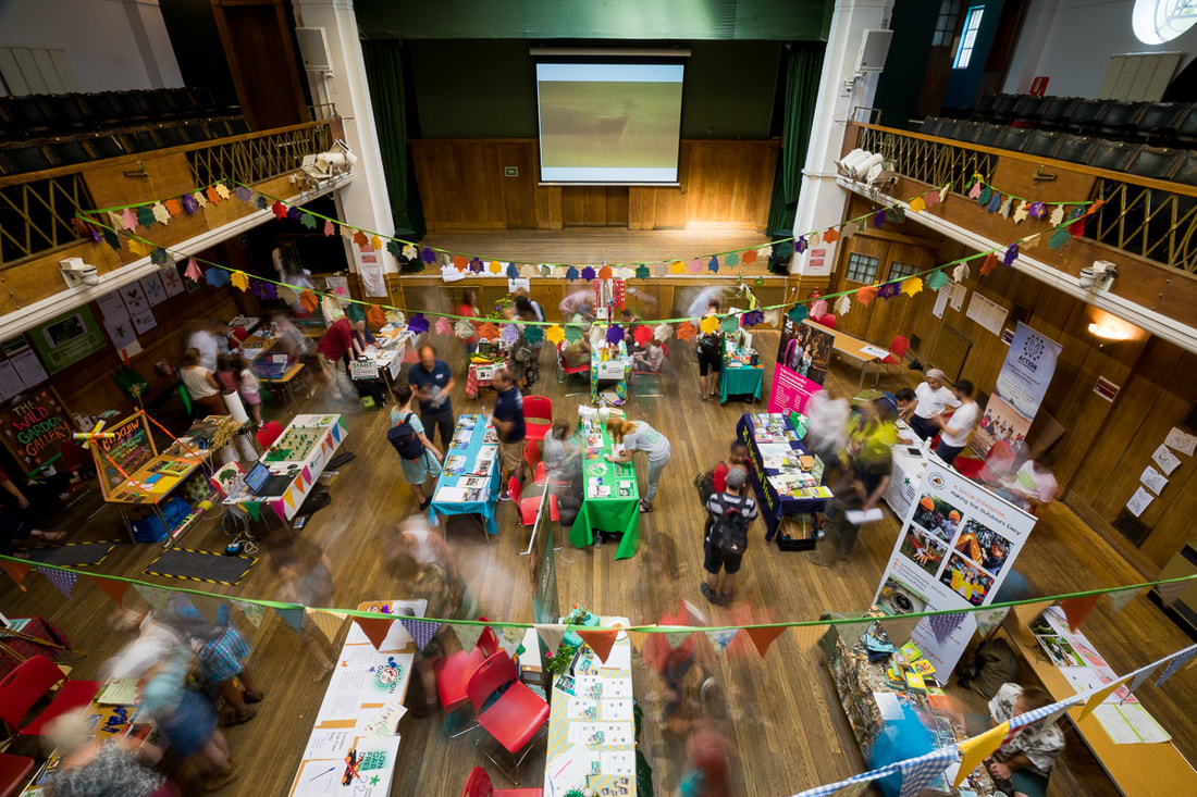 Image credit: Angela Rouse, London National Park City Image credit: Angela Rouse, London National Park City India Wilson Meeting London National Park City Founder, Daniel Raven Ellison, along with Sean Perkins of North was undoubtedly an inspiring experience. Organised by Sarah and Laura, this live brief offered us the opportunity to design a tote bag/t-shirt for the first National Park City Week in London – using the identity, created by North. Getting a glimpse of North’s minimalist Studio, as well as listening to Daniel’s fascinating talk about how London should be considered as an urban jungle, helped me to understand how we should all embrace and encourage the humble wildlife of the urban landscape to thrive. To appreciate the creatures of the city, to get outside and go greener. It was exciting to be part of such a sustainable and socially driven project, something I had not considered before starting DPS. My designs showed various London species taking the form of the London National Park City asterisk, created by North. These acted as conversation starters and emblems of solidarity with one’s spirit animal – bringing humankind closer to nature. After having my ideas kindly presented back to Daniel and North on my behalf (as I was unfortunately away on holiday at the time!), I was so happy to hear that my aster animal range had been selected for the screen-printing stall at the LNPC fair. After collaborating with both Daniel and Josie Molloy (Screen Grab) remotely over email, the designs were eventually developed into a more participatory mark, due to time and budget. A blank asterisk would form the template for my illustrations, encouraging users to draw their own spirit animal and define who they are for themselves. During the process of finalisation, I feel really gave me some experience and an insight into the value of communication, time-management, proactivity and compromise. So, I hope to use these skills in the future. The Fair was held at Conway Hall, as part of the National Park City Week. Josie set up a couple of screens and printed the template on tea-towels and t-shirts. I was also asked to create other animals during the day, from a Queen Bee, to a Dung Beetle and Silver Wolf! I was so glad to see my system in action and seeing people, charged by the cause, engaging with the concept of finding their own spirit animal. Meeting people from all walks of life gather to make a positive difference in the world was humbling. Being able to contribute to the support of the London National Park City was rewarding in itself. It was great fun and an invaluable experience! Thank you so much to Sarah, Violet and Josie for organising and running the stall and to Daniel and Sean for giving me this opportunity! Images of the Fair can be seen on the London National Park City website and Josie Molloy's Screen Grab Instagram. |
