|
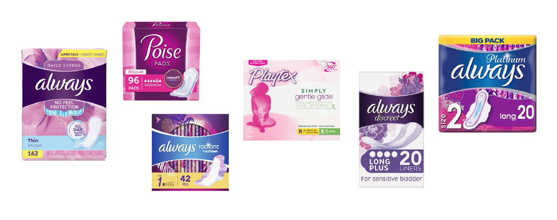
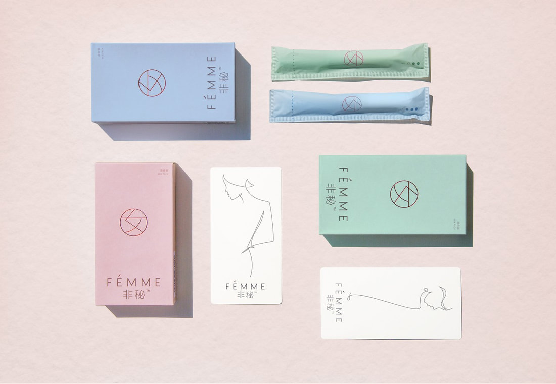
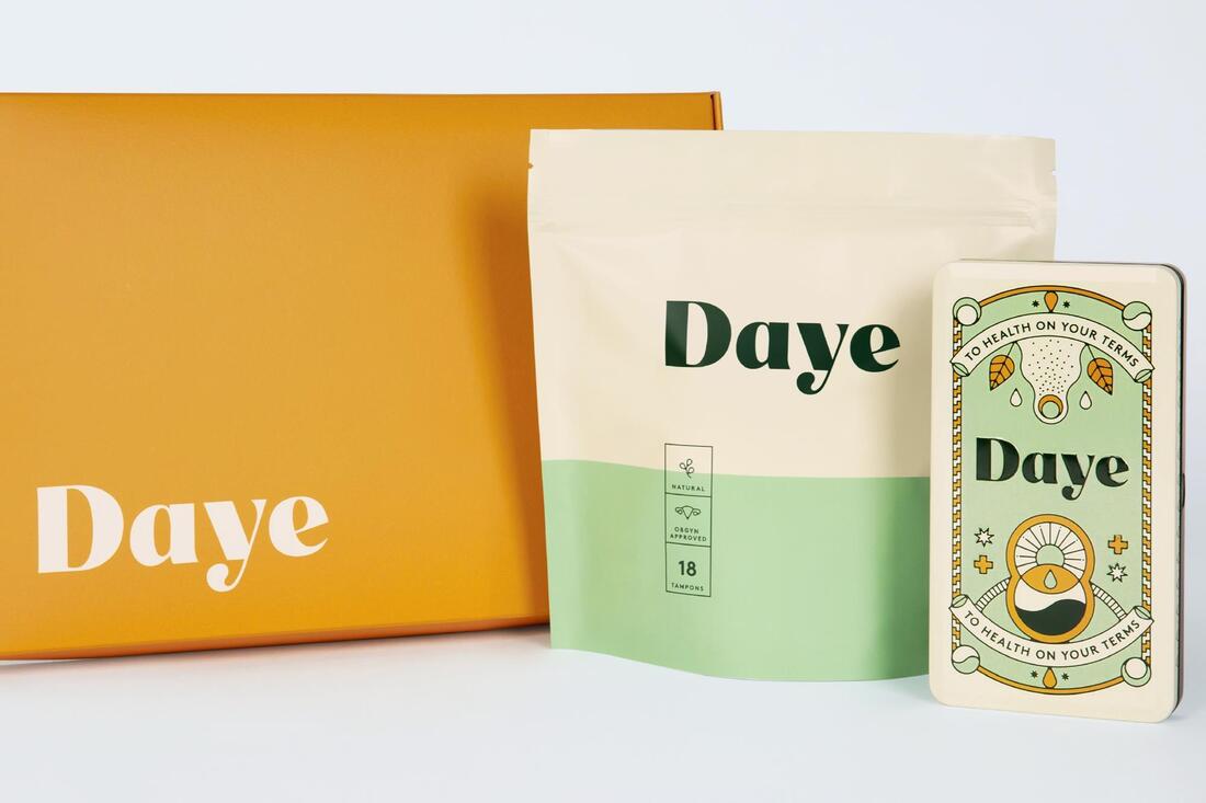
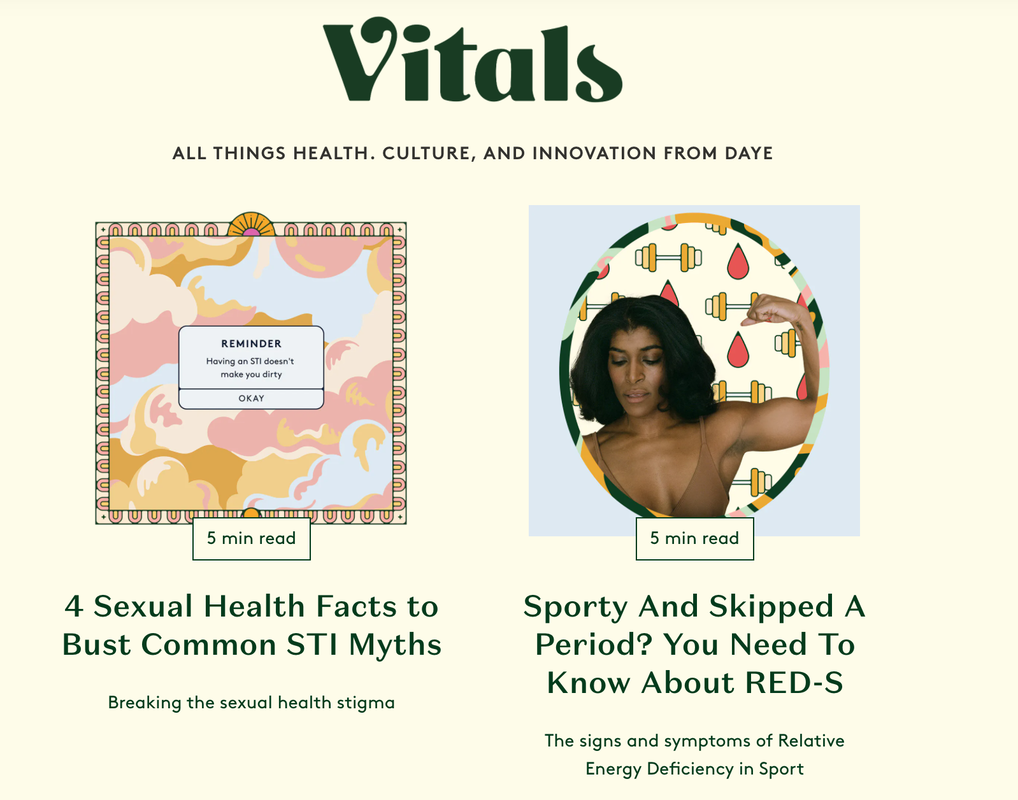
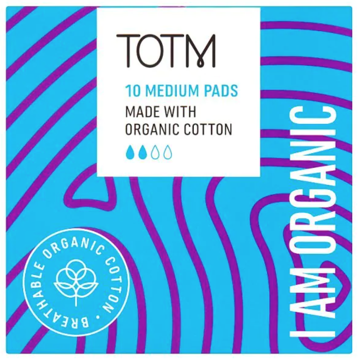
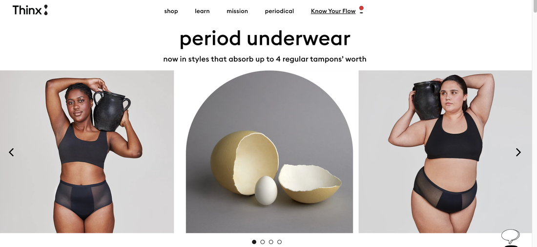
Rosie Williams, GMD 23/12/19 During my recent placement with the London based design agency Rare Design, I identified a new interest in branding and the messages given from certain packaging. Whilst on this placement, I carried out a research project exploring the graphic language and tone of voice used on painkiller packaging. I found it really interesting defining the similarities and patterns commonly seen throughout painkiller packaging and how certain colours, shapes and phrases are used to attract a specific audience. This led me to start subconsciously analysing packaging everywhere I went. Through this I noticed the amount of gender stereotyping used on packaging (especially medical and hygiene products). It has sparked an interest in the branding of menstrual and feminine hygiene, considering why it needs updating and learning more about the new brands and campaigns that are challenging the negative stigmas around women’s menstrual cycle’s and body’s. There are negative associations with the menstrual cycle that need to be challenged and the design of sanitary and feminine hygiene branding can provide a platform for this to happen. Negative connotations surrounding menstruation have been around for a very long time. In the article How did menstration become taboo?, Anna Druet refers to sections of the Quran and bible labelling the menstrual cycle as “impure”, “unclean” and suggesting that anyone who touches a women on her period also becomes unclean. Druet points out that period stigma is a manifestation of anti-feminism. From these negative preconceptions about menstruation it has become a subject that cannot be openly discussed and is viewed as shameful. Through my analysis of sanitary product branding I have discovered a pattern in the tone of voice, language and visual aspects that emphasise these negative beliefs around periods. Words like “discreet” are used, reinforcing the belief that periods are something women should be ashamed of and hide. The unnecessary overtly feminine visual features like the use of pastel pinks and purples, sparkly and floral graphics are common. The font used is often a script font, again reflecting qualities of fragility and narrow societal depictions of what femininity means. This also excludes women that don’t identify with these portrayals of femininity and it is not sensitive to transgender men who still get periods. I have recognised a need for the design style to be updated, not just because of the above reasons but because it’s boring and not current. There is a need for the branding to correspond with the new feminist liberal attitude of today. In the article Branding and Product Design, Monika Hestad discusses the importance for the context of the product to be taken into consideration when designing it’s branding and the damage it can have on a brand if this is not done. This strengthens the argument that sanitary product packaging should coincide with it’s consumer’s fresh attitude towards periods otherwise people will stop buying from that brand. The 2016 article by Sarah Dawood refers to the statistic that only 2% of women in China use tampons, mainly due to their lack of knowledge about the product. This is because of the taboo surrounding periods which is more prominent in China than in westernised countries. The article talks about the Chinese company Yoai rebranding a sanitary product to help crush the negative views and the “patronising” tone used to talk about periods. The design is simple and sophisticated, using a positive tone and encouraging confidence. Other brands that are aiming to challenge the negative stigma around periods are also on the rise. Bodyform has run the recent #bloodnormal campaign to encourage conversation about periods. The campaign exists upon the basis that 350,000 girls are missing school due to feeling embarrassed about their period. It is a campaign to provide education to students about periods to prevent negativity and break the taboo. Another is the brand Thinx. Thinx creates period absorbing underwear that feels like normal underwear. Thinx also promotes a positive ethos around periods and has the aim to educate and encourage confidence about reproductive health and women’s bodies. Their branding is playful, contemporary and relevant. Below are some more examples of feminine hygiene brands that use similar approaches to challenge negative views around periods. These are just a small selection of the upcoming brands that are tackling the issue of period stigmas. Although there are lots more, there is still a long way to go. Feminine hygiene brands have a responsibility to recognise and challenge the misogynistic values that have been embedded into society. They have the ability to open up spaces for discussion about periods, sex, body positivity and to liberate women. I am thankful that my experience working on the painkiller research project with Rare has introduced me to this part of the industry and I am sure it will inform my future decisions in my design career. Reference List Bodyform (2020) Fear Going to School Less. Available at: https://www.bodyform.co.uk/our-world/fear-going-to-school-less/ (Accessed:19/05/20) Clue (2017) How Did Menstruation Become Taboo? Available at: https://helloclue.com/articles/culture/how-did-menstruation-become-taboo (Accessed: 16/12/19) Dawood, S. (2016) ‘This New Tampon Brand Hopes to Empower Women in China’, pp. 1. Hestad, M. (2013) Branding and Product Design. Surrey: Gower Thinx (2020) Underwear that Absorbs Your Period. Available at: https://www.shethinx.com/pages/thinx-it-works (Accessed: 19/05/20)
0 Comments
Leave a Reply. |
