|
Alisa Paykina BA Graphic & Media Design 18000792 Recently, the approach to design has been shifting from a structured practice - design; to one built on experimentation and breaking the rules - anti-design. There are differing opinions following the discourse on which of the two outweighs the other. However, neither of the practices can stand alone without the other, each serving a specific purpose. To better contextualise the fields’ benefits and shortcomings, I will be comparing them in terms of communication capabilities, and how relatability or authenticity and how it could be perceived within modern societies, considering “art has almost always been a reflection / [communication] of society” (Satori Graphics, 2021, 3:57). Design and anti design, are practices used to communicate ideas through a blend of visual and/or typographic elements. Take publications for example, the standardised layouts and grid systems, are used to communicate designers’ intended messages. The use of specific layouts, or the deconstruction of said layouts, embody different moods and meanings. Typically, minimalist publications follow design layouts that surround content within a majority of white space. This practice puts the emphasis on content (imagery or text) instead of design elements. Oftentimes, used by commercial publications, as it easily and clearly communicates the idea across. Similarly, minimalist designs often communicate the notion of luxury, selling a particular lifestyle to readers. This is not always a bad thing, as sometimes “less is more” (Syjuco, 2019). However, in my opinion it is crucial to implement design and anti-design practices based on target audiences and messages. Many times, big brands miss the point when they use minimalist clean aesthetics, when trying to sell to younger generations. Context of the work is important when forming the designs, otherwise “less [can be] a bore” (Syjuco, 2019).  Fig.1 - Assouline: The Impossible Collection of Design Anti-design can be seen as an uprising of its own, critiquing or subverting traditional already accepted notions of design, politics, gender and globalism (Syjuco, 2019). Within this field, designers want to bring their audience something new, fresh, challenging what is typically seen in commercial design, and encouraging audiences to do the same. Anti-design takes these conventional structures and reformats them. Similarly, this is present in the context of publication design,“Readers and publishers are hungry for mags that challenge convention and offer a more authentic experience,” (Jamieson, 2016) and anti-design is what brings that, often seen in the format of indie scene zines as seen below. Presenting content in an almost journaling format, breaking boundaries and making it personal.  Fig.2 - Buffalo Zine No. 3 I believe that the rise of anti design is something exciting, breaking away from the typical repurposed structures and practices that we are used to seeing. With new design solutions, we are able to learn and teach new things, rather than consume recycled designs with slight modifications. Challenging norms is exciting and authentic. Authenticity is a subcategory that falls under communication. Designers, politicians, ad agencies want their audience to connect with them by creating relatable content. The emerging anti-design movement argued “that the Modernist idea of 'the perfect form' that follows a function cannot be reached…” and pushed for designs characterised by kitsch, irony and the distortion” (Martinique, 2016). This approach advocated for a fresh outlook that redefined design and personalised it towards different socio-cultural environments. Authenticity is something quite difficult for commercial brands and politicians to embody.“Ad agencies are desperately trying to appear ‘understanding’ on behalf of their clients and branding consultants” (Johnson, 2020). Designed outputs are typically planned out, structured, and those characteristics are not usually synonymous with the something that is authentic or from the heart. With the recent pandemic, brands struggled with exactly that, producing almost identical content, repeating the phrases such as ‘unprecedented times’, ’new normal’ and others over and over. 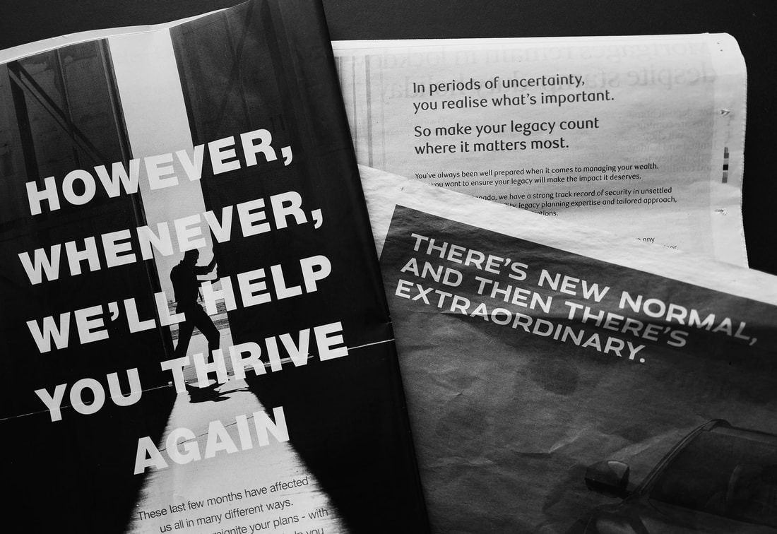 Fig.3 - ‘New Normal Ad’: Unknown Author This proves that following the standardised structure and scripts doesn’t always work, especially with serious health messages. People seek honesty and something personal that can drive conversation rather than being spoken at. Rather than viewing a polished high production corporate piece of content, people would rather see something that is common within their culture. I would for sure. The below example of Social media posts by Johnson Banks and Nick Asbury resonated with me on a personal level. The creators play upon a common cultural visual of the parental advisory label, to communicate the government messaging, prompting audiences to turn these messages into creative comms, including them in the conversation and making it more relatable. 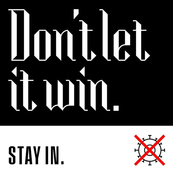 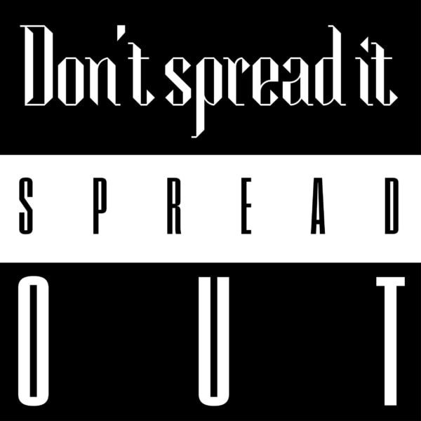 Fig.4-5 - Social media posts by Johnson Banks and Nick Asbury Working at a marketing agency for my DPS placement, I often see authenticity as a common issue. Brands often present audiences with hyper designed content, that although is pleasing to the eye, missing the personal element and in turn results in less engagement. Alternatively, when creatives and influencers represent brands they bring personality and relatability, which in itself can be a form of anti-design in social media marketing, braking away from briefs and letting authenticity out. Even though the content made by influencers is not as polished, it resonates more with audiences, especially Gen-Z. 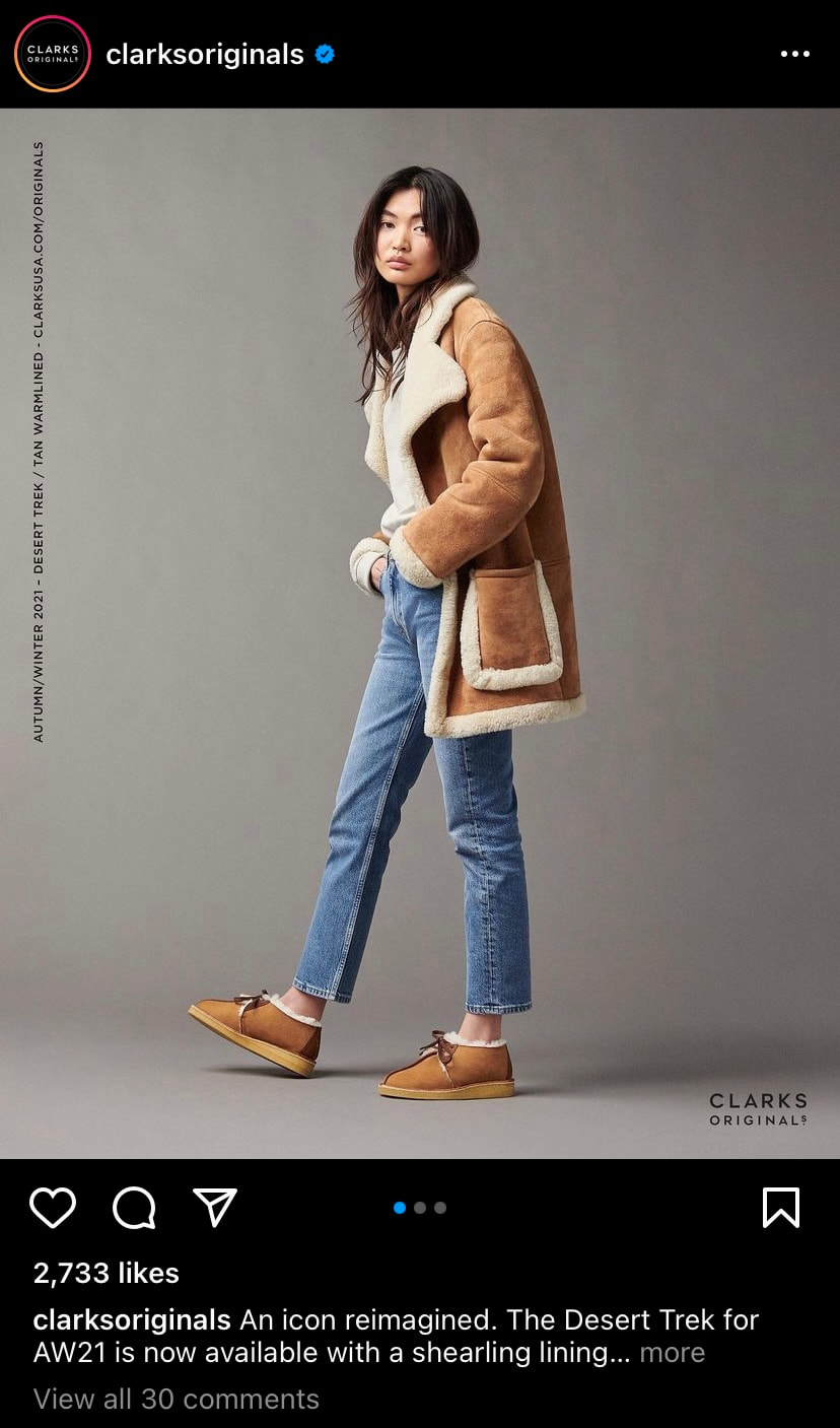 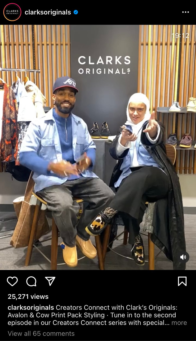 Fig.5 - Clarks Originals Instagram Post (Brand Led) Fig.6 - Clarks Originals Instagram Post (Influencer Led) Overall, my recent DPS experience has opened up my eyes to what people really want in terms of content and designed outputs, something authentic that they can make a personal connection to, and oftentimes that comes in the form of anti-design rather than design. I believe, that it is important to identify target audiences and purpose of message to determine whether design or anti-design should be used. But personally, being in an extremely commercialised world, anti design always wins for me. I believe in challenging the norms and bringing something new to audiences rather than recycling old standardised design practices. BIBLIOGRAPHY
Jamieson, R., 2016. The New Wave of Anti-design Magazines Will Question Your Sense of Taste—and That’s a Good Thing. [online] Eye on Design. Available at: <https://eyeondesign.aiga.org/the-new-wave-of-anti-design-magazines-will-question-your-sense-of-taste-and-thats-a-good-thing/> [Accessed 5 December 2021]. Johnson, M., 2020. Branding, politics and pandemics | Johnson Banks. [online] Johnsonbanks.co.uk. Available at: <https://www.johnsonbanks.co.uk/thoughts/branding-politics-and-pandemics> [Accessed 5 December 2021]. Martinique, E., 2016. Anti-Design Movement - Aestheticism of the Modern Era | Widewalls. [online] Widewalls. Available at: <https://www.widewalls.ch/magazine/anti-design-italian-movement> [Accessed 5 December 2021]. Satori Graphics, 2021. Will ‘ANTI DESIGN’ Takeover The Graphic Design World!?. [video] Available at: <https://www.youtube.com/watch?v=Bv7a3TcxugQ-> [Accessed 5 December 2021]. Syjuco, S., 2019. Less Is A Bore: Maximalist Art & Design. [online] stephaniesyjuco.com. Available at: <https://www.stephaniesyjuco.com/news/less-is-a-bore-maximalist-art-design-at-ica-boston-jun-26-sep-22-2019> [Accessed 5 December 2021].
1 Comment
Evangeline Cousins, BA(HONS) Design for Branded Spaces |

  |   |
The Need for Convention in Television Design
Unconventional magazine appeals to a specific audience whereas television design needs to appeal to a wider audience. In my opinion, anti-design would not be as successful in mainstream television at this moment as the type of design needed to communicate successfully to larger audiences need to be considered contextually and aesthetically. Conventional design suits the psychology of the audience because it is design that they are used to and can be understood clearly. Additionally, television design must be versatile as it is scheduled and repeated across an entire network. There could be space for anti-design in television in the future as the consumption of media evolves, more likely on niche channels and streaming services, where there is more room for freedom of expression and risk taking.
Amazon (2021) Bratz 20 Yearz Special Edition Original Fashion Doll Cloe (Image)
https://www.amazon.co.uk/Bratz-Yearz-Special-Original-Fashion/dp/B08FGLD6V7
Jamieson. R (2016) The New Wave of Anti-design Magazines Will Question Your Sense of Taste - And That's a Good Thing
https://eyeondesign.aiga.org/the-new-wave-of-anti-design-magazines-will-question-your-sense-of-taste-and-thats-a-good-thing/
Martinique. E (2016) Anti-Design Movement - Aestheticism of the Modern Era
https://www.widewalls.ch/magazine/anti-design-italian-movement
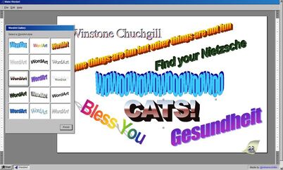
Trend Hunter (2016) Make Wordart (Image)
https://www.trendhunter.com/trends/make-wordart
Williams. M (2021) The Rise of Anti-design
https://www.creativereview.co.uk/anti-digital-graphic-design/
Unconventional magazine appeals to a specific audience whereas television design needs to appeal to a wider audience. In my opinion, anti-design would not be as successful in mainstream television at this moment as the type of design needed to communicate successfully to larger audiences need to be considered contextually and aesthetically. Conventional design suits the psychology of the audience because it is design that they are used to and can be understood clearly. Additionally, television design must be versatile as it is scheduled and repeated across an entire network. There could be space for anti-design in television in the future as the consumption of media evolves, more likely on niche channels and streaming services, where there is more room for freedom of expression and risk taking.
Amazon (2021) Bratz 20 Yearz Special Edition Original Fashion Doll Cloe (Image)
https://www.amazon.co.uk/Bratz-Yearz-Special-Original-Fashion/dp/B08FGLD6V7
Jamieson. R (2016) The New Wave of Anti-design Magazines Will Question Your Sense of Taste - And That's a Good Thing
https://eyeondesign.aiga.org/the-new-wave-of-anti-design-magazines-will-question-your-sense-of-taste-and-thats-a-good-thing/
Martinique. E (2016) Anti-Design Movement - Aestheticism of the Modern Era
https://www.widewalls.ch/magazine/anti-design-italian-movement
Trend Hunter (2016) Make Wordart (Image)
https://www.trendhunter.com/trends/make-wordart
Williams. M (2021) The Rise of Anti-design
https://www.creativereview.co.uk/anti-digital-graphic-design/
Google search results for 'onboarding UI'
Madeleine Boyd
Graphic and Media Design
Graphic and Media Design
If anti-design seeks to disrupt the design trends we are immersed in each and every day, it’s re-emergence throughout the course of the COVID-19 pandemic may have struck the right balance of both the best and worst time to do so. If we start at the beginning of the pandemic for the UK in March 2020, what was arguably the most noticeable shift in how we lived our day to day lives? It became screen-based.
From education and healthcare to shopping and social functions, pretty much every aspect of how we live as a society today was quickly converted to live in a digital world while our physical worlds became more isolated than ever before. I have no doubt everyone remember their own attempts to bridge this physical gap with at least one or two new platforms or features that encouraged us to live our isolated lives in a somewhat more social way. We quickly became oversaturated with digital content in a very short span of time, driven through necessity in an attempt to keep everything moving along as we attempted to adjust to this ‘new normal’. While this is a simple retelling of an unprecedented global event, I see it as what opened the door for an aspect of the anti-design movement to return. Though rather than focusing on its original subjects of physical objects this allowed anti-design to have a presence in the digital sphere we have so quickly adapted to living in.
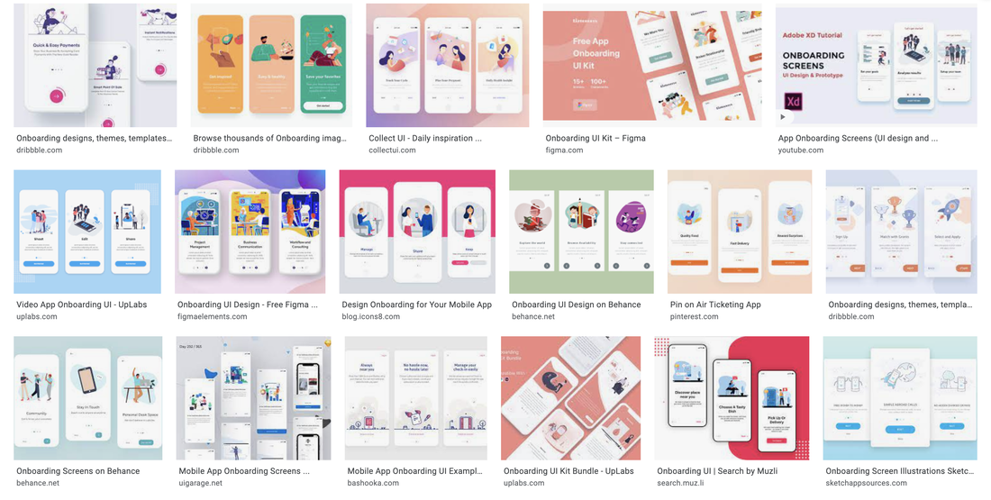
Some argue that digital design overall - be it an app, a website, a program, or some other version of a digital environment a user interacts with - looks the same. While some find the typical ‘modern, minimalist, clean’ interface make a pleasing experience to interact with, others have become tired of the carbon-copy nature of these applications in our digital lives. As someone currently working in a UI/UX field, I find it fascinating to hear and read about these two opposing perspectives, and to see the the ever-growing expanses of both.
It has to be acknowledged that yes, many applications are constructed with a (shockingly) similar look and feel across the board. Some of these features include the same style of illustration, the repeated use of popular stock photos, and rounded corners running rampant to name but a few (Malewicz, 2020). In Daniel Kalick’s 2017 talk on ‘The Rise of Anti-Design’ (AIGAdesign, 2018) he speaks on pattern, business, and simplicity being the three issues with today’s UX design, and highlights simplicity as the leading cause of what we now see as a problem with repetitive and characterless platforms. While anti-design is “an expression of rebellion - bending, stretching, and re-interpreting the rules of [graphic] design” (Over, 2020), digital platforms - particularly those trying to establish themselves in a dense field of competitors - have a very small window to earn the trust of a new user so choose to use familiarity and an overall crowd-pleasing aesthetic to win the most interest in a short span of time.
Anti-design in this space opens the possibility of questioning: how can something entirely new be used to achieve the same thing, but by eliciting a response of excitement or sudden interest rather than being the ‘same old thing’? Of course you can come at anti-design from a range of angles here, but I am choosing to focus on what is essentially breaking apart UI trends that we have become so accustomed to.
Often found alongside descriptors such as ‘brutalist’ and ‘grunge’, has this rougher - and perhaps older - web style been able to make a successful return because we have developed our technology to support this as a purposeful stylistic choice rather than a limitation of something new and still growing? Maybe, but that could lead to a discussion further astray from anti-design and move into another territory entirely. In the sense of UI, anti-design has a tendency to be described as “intentionally creating ugly, disorienting, or complex interfaces…Some use harsh colours, disorienting patterns, weird cursors, and unnecessary distracting animations” (Scacca, 2018). A bold and distracting interface creates a colossal interference in what we expect to see, which must generate curiosity. As mentioned earlier, with the amount of time we have spent staring at screens over the past year and a half, its no wonder that a style so defiantly different rose up from the monotony people were immersing themselves in every day.
What I question in this is approach is the purpose, and if how it may interfere with functionality. Is anti-design more appropriate for certain audiences over others? If in response to overused design trends, what is the true impact of “intentionally creating ugly, disorienting, or complex interfaces”? (Moran, 2017) Is it be in the genuine interest of the companies, brands, or people to take a bold step away from what people already know and trust, or is it a publicity stunt? Is the point of anti-design even to be ‘effective’ in any way at all, or does it exist today to disrupt repetitive trends?
I do not believe there is a singular answer to this, and must depend on a combination of factors from the demographic of users to whether a revolutionary approach to how a user interacts with an interface (for the sake of visual style) is appropriate for certain subject areas.
When our worlds have been turned upside down and we seek comfort in familiarity, what can anti design bring to the table?
From education and healthcare to shopping and social functions, pretty much every aspect of how we live as a society today was quickly converted to live in a digital world while our physical worlds became more isolated than ever before. I have no doubt everyone remember their own attempts to bridge this physical gap with at least one or two new platforms or features that encouraged us to live our isolated lives in a somewhat more social way. We quickly became oversaturated with digital content in a very short span of time, driven through necessity in an attempt to keep everything moving along as we attempted to adjust to this ‘new normal’. While this is a simple retelling of an unprecedented global event, I see it as what opened the door for an aspect of the anti-design movement to return. Though rather than focusing on its original subjects of physical objects this allowed anti-design to have a presence in the digital sphere we have so quickly adapted to living in.
Some argue that digital design overall - be it an app, a website, a program, or some other version of a digital environment a user interacts with - looks the same. While some find the typical ‘modern, minimalist, clean’ interface make a pleasing experience to interact with, others have become tired of the carbon-copy nature of these applications in our digital lives. As someone currently working in a UI/UX field, I find it fascinating to hear and read about these two opposing perspectives, and to see the the ever-growing expanses of both.
It has to be acknowledged that yes, many applications are constructed with a (shockingly) similar look and feel across the board. Some of these features include the same style of illustration, the repeated use of popular stock photos, and rounded corners running rampant to name but a few (Malewicz, 2020). In Daniel Kalick’s 2017 talk on ‘The Rise of Anti-Design’ (AIGAdesign, 2018) he speaks on pattern, business, and simplicity being the three issues with today’s UX design, and highlights simplicity as the leading cause of what we now see as a problem with repetitive and characterless platforms. While anti-design is “an expression of rebellion - bending, stretching, and re-interpreting the rules of [graphic] design” (Over, 2020), digital platforms - particularly those trying to establish themselves in a dense field of competitors - have a very small window to earn the trust of a new user so choose to use familiarity and an overall crowd-pleasing aesthetic to win the most interest in a short span of time.
Anti-design in this space opens the possibility of questioning: how can something entirely new be used to achieve the same thing, but by eliciting a response of excitement or sudden interest rather than being the ‘same old thing’? Of course you can come at anti-design from a range of angles here, but I am choosing to focus on what is essentially breaking apart UI trends that we have become so accustomed to.
Often found alongside descriptors such as ‘brutalist’ and ‘grunge’, has this rougher - and perhaps older - web style been able to make a successful return because we have developed our technology to support this as a purposeful stylistic choice rather than a limitation of something new and still growing? Maybe, but that could lead to a discussion further astray from anti-design and move into another territory entirely. In the sense of UI, anti-design has a tendency to be described as “intentionally creating ugly, disorienting, or complex interfaces…Some use harsh colours, disorienting patterns, weird cursors, and unnecessary distracting animations” (Scacca, 2018). A bold and distracting interface creates a colossal interference in what we expect to see, which must generate curiosity. As mentioned earlier, with the amount of time we have spent staring at screens over the past year and a half, its no wonder that a style so defiantly different rose up from the monotony people were immersing themselves in every day.
What I question in this is approach is the purpose, and if how it may interfere with functionality. Is anti-design more appropriate for certain audiences over others? If in response to overused design trends, what is the true impact of “intentionally creating ugly, disorienting, or complex interfaces”? (Moran, 2017) Is it be in the genuine interest of the companies, brands, or people to take a bold step away from what people already know and trust, or is it a publicity stunt? Is the point of anti-design even to be ‘effective’ in any way at all, or does it exist today to disrupt repetitive trends?
I do not believe there is a singular answer to this, and must depend on a combination of factors from the demographic of users to whether a revolutionary approach to how a user interacts with an interface (for the sake of visual style) is appropriate for certain subject areas.
When our worlds have been turned upside down and we seek comfort in familiarity, what can anti design bring to the table?
Sources
AIGAdesign (2018), User Experience | The Rise of Anti-Design, Available at: https://www.youtube.com/watch?v=s1CLA2MgvrA
Malewicz D (2020), The 5 main anti-trends in design, Available at: https://uxdesign.cc/the-5-main-anti-trends-in-design-e5629c1b217d
Moran K (2017), Brutalism and Antidesign, Available at: https://www.nngroup.com/articles/brutalism-antidesign/
Over (2020), Over’s 2020 Trends Kit - #6 Anti Design, Available at: https://www.madewithover.com/trends-copy/anti-design
Scacca S (2018), Brutalist Web Design: Where Did It Come From and Why Is It Back?, Available at: https://wpmudev.com/blog/brutalist-web-design-where-did-it-come-from-and-why-is-it-back/
Vakhnenko H (2021) Minimalism in Mobile App Design as a Powerful Current Trend, Available at: https://agilie.com/en/blog/minimalism-in-mobile-app-design-as-a-powerful-surrent-trend
Mo Morrell, BA IVM, DPS year 2021.
I’m writing under the pretense that ideas are spoken through design, and that we can agree this is what makes creative practices a universal language; something indispensable in an era of mass miscommunication. It’s time to build on the point that design is the dormant language we need to keep considering, and that it’s important to know what we’re saying - and not saying - using it.
A well designed visual or object can communicate much like a person would; with respect, kindness, threat or malice. A poor design miscommunicates.
This is exemplified by American graphic designer Chip Kidd.
“Anti-design” is different. Anti-design doesn’t need to tell you anything.
It can be considered pointless, a waste of creative input. But it can be argued that anti-design reminds us who we are, reminds us that there are no rules to design. It celebrates design without being designed for anything in particular, simply itself and the language it speaks.
This makes it a valuable asset when considering activism and rebellion through design. This couldn’t be more relevant than in 2021.
Technology can easily be considered the most powerful advancement of the 20th and 21st century. What we want is for technology to empower us all as individuals, but what I’ve found more often in my working practice is that technology is used to capitalist ends - a select few in power above us designing a system that steers our rhythms, through technology that changes our approach to everything from news, health, friendships and financial independence. This kind of control is a misuse of design, dangerous in it’s insidiousness, and permeates cultural thinking as preceding a future dystopia. This is exemplified in the way that science fiction author Philip K. Dick wrote about design, often coming back to objects as a thematic evil with humans at their mercy. A good example of this is in Ubik, 1969.
“The door refused to open. It said, ‘Five cents, please.’ He searched his pockets. Sure enough; payment to his door for opening and shutting constituted a mandatory fee.”
In 2020, as global pandemic became a reality, “dystopia” only expanded in the cultural consciousness. A lockdown with indeterminate end and the effects of social isolation gave me time to examine my perspective on independence and individualism as a designer.
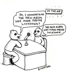
I wasn’t alone in this, as I found many people in my network approach the same thing. Bjenny Montero shared this self-reflexive comic panel, that exemplifies the thought.
It can be considered pointless, a waste of creative input. But it can be argued that anti-design reminds us who we are, reminds us that there are no rules to design. It celebrates design without being designed for anything in particular, simply itself and the language it speaks.
This makes it a valuable asset when considering activism and rebellion through design. This couldn’t be more relevant than in 2021.
Technology can easily be considered the most powerful advancement of the 20th and 21st century. What we want is for technology to empower us all as individuals, but what I’ve found more often in my working practice is that technology is used to capitalist ends - a select few in power above us designing a system that steers our rhythms, through technology that changes our approach to everything from news, health, friendships and financial independence. This kind of control is a misuse of design, dangerous in it’s insidiousness, and permeates cultural thinking as preceding a future dystopia. This is exemplified in the way that science fiction author Philip K. Dick wrote about design, often coming back to objects as a thematic evil with humans at their mercy. A good example of this is in Ubik, 1969.
“The door refused to open. It said, ‘Five cents, please.’ He searched his pockets. Sure enough; payment to his door for opening and shutting constituted a mandatory fee.”
In 2020, as global pandemic became a reality, “dystopia” only expanded in the cultural consciousness. A lockdown with indeterminate end and the effects of social isolation gave me time to examine my perspective on independence and individualism as a designer.
I wasn’t alone in this, as I found many people in my network approach the same thing. Bjenny Montero shared this self-reflexive comic panel, that exemplifies the thought.
I began considering; where do our thoughts go in isolation? What is their value, and what is worth sharing.
There is an invaluable purpose in this kind of work. Empowerment of the individual is the antidote to capitalism. The thoughts of those who would be considered “the consumer” - including those thoughts reflective and with no decided aim - are spoken through decided documentation, experimentation, “anti-design”.
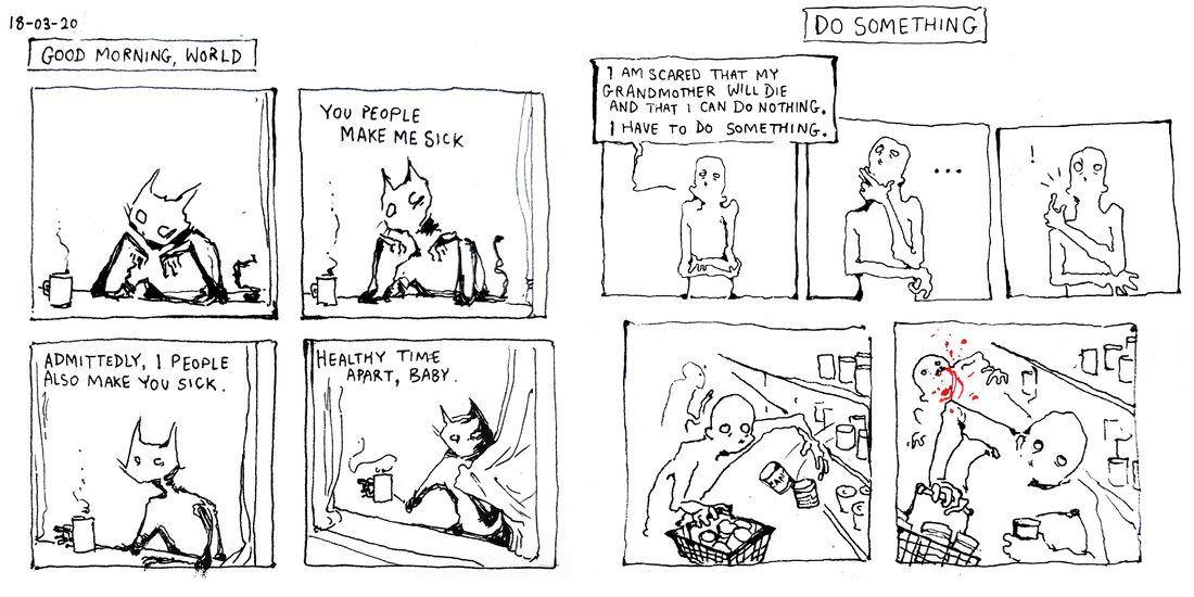
I take part in this in my own practice, something that developed over lockdown. I consider this fundamental to what I want to communicate through my work.
There is an invaluable purpose in this kind of work. Empowerment of the individual is the antidote to capitalism. The thoughts of those who would be considered “the consumer” - including those thoughts reflective and with no decided aim - are spoken through decided documentation, experimentation, “anti-design”.
I take part in this in my own practice, something that developed over lockdown. I consider this fundamental to what I want to communicate through my work.
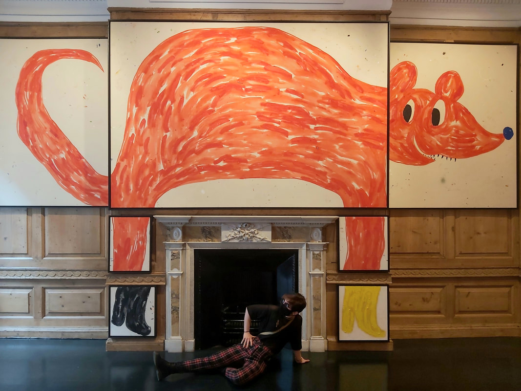
In September, I visited Szabolcs Bozó exhibition at the Carl Kostyál Gallery in Burlington. Bozó is a designer I admire; his work communicates a playfulness, almost a complete meaninglessness, that flies in the face of any commercial gain with his childish and whimsical monsters. Draw to amuse yourself, reclaim your practice. This is a melding of aesthetics and ethics that is relevant to anti-design.
The lifecycle of brand adhered design in technology is something very different. It communicates the same thoughts, from brand to brand: hold attention and gain consumption. For active and thoughtful designers, this is only exhausting.
It’s always bothered me how the soundwaves in the spotify logo lean slightly to the right.
It was only recently that I found through research that this is because the current design is a distillation of the original logo. In the original, it’s clear the soundwaves bounce to the right to balance the space, with four letters on the right of the O and only two on the left. In the distilled version we have today, it just feels like asymmetry.
Look at that 2mm tilt, the designer tried to hold on to the original. They didn’t change and upgrade the design, they shrunk it for simplicity. But they still tried to hold on.
To me, this marks the impetus behind commercial design as an oppressive force.

I would like to embrace anti-design as a pushback.
Going back to Philip K. Dick, I can conclude by celebrating anti-design as a liberation of our abilities, and a call to arms for the dismantlement of power structures - not to forget, we are the minds that designed them in the first place.
“From the drawer beside the sink Joe Chip got a stainless steel knife; with it he began systematically to unscrew the bolt assembly of his apt’s money-gulping door.
‘I’ll sue you,’ the door said as the first screw fell out.
Joe Chip said, ‘I’ve never been sued by a door. But I guess I can live through it.’”
The hilarious art of book design (2012), Chip Kidd. Available at: https://www.youtube.com/watch?v=cC0KxNeLp1E [Accessed: 05/12/2021]
DICK, P. K., & SZAFRAN, G. (1969). Ubik. New York, Bantam Books.
Bjenny Montero, 2021 - (Available at: https://linktr.ee/bjennymontero)
The Carl Kostyál Gallery, Szabolcs Bozo - (Available at: https://kostyal.com/artists/szabolcs-bozo/ [Accessed: 04/12/2021])
The Rise of ‘Maximalism’ and a desire for escapism and fantasy: Medvedow J. (2019) Less is a Bore: Maximalist Art & Design https://www.icaboston.org/articles/ica-opens-major-survey-maximalist-art-and-designjune-26 [Accessed: 05/12/2021]
Jacobo Giquel. Design Management. 19010634.
Since the pandemic struck in 2019, there has been growing evidence of critical writing on the subject of anti-design. With reference to five sources, what is your perspective on the Design/Anti-design discourse?
Introduction.
The subject to debate in this essay is Anti-Design, given the rise in its recurrence since the burst of the pandemic.
When looking into the subject on recent times, such as articles or any other form of informative documents, you come to find the availability of these on the internet and other media forms is scarce; there is a beyond satisfactory amount of Anti-Design content but not in the context the brief suggests.
After reading on Anti-Design, I came to realize that it is more a philosophy rather than a movement inherent to a certain discipline or time. In this essay I will expose Anti-Design as a discipline, provide a variety of contemporary examples which I will ponder upon to finally conclude with a solid, personal statement.
Anti-Design as a philosophy.
Anti-Design emerged as a movement in the Italy of the 60s, and it was a response to the 20th Century’s first five decades design which spoke the modernist philosophy vocabulary. It was the vanguard, the avant-garde in the discipline that aimed to renew the cultural and political role of design. Anti-Design in the 60s was a criticism of consumerism, capitalism and excess. This early stage of Anti-Design was characterised by an acid irony on proportions and the sense of beauty and functionality.
Like every philosophy applied to a discipline, if successful, it branches to other fields of study and performance through time, due to an urge for expression, demand or experimentation. Anti-Design in contemporaneity has seen changes from its roots – the changes in society, culture and politics have reshaped the concept through a handful of additions – the philosophy now seeks for transgression, disruption and the audience’s “shock”.
In current times Anti-Design performs as in its early stages only the philosophic taints have been pushed into the background. These movements possess a dichotomic nature, the philosophical trait that characterise them is only required for ignition and once it has become a mainstream and well-known to the mass trend, it strips off the deeper meaning and boils down to the basics in the surface; take for instance Grunge in the 90s.
Contemporary examples and implications.
In the current Zeitgeist Anti-Design is ubiquitous, indeed, the web Anti-Design proposed in the brief is an example of it; ironically, it is more consumed and in demand than ever before.
Anti-Design examples, as a philosophy, can be seen in a wide variety of fields. Thereupon I will tackle three cases which belong to different fields and industries, yet they share the same backbone which they spin around on.
Balenciaga.
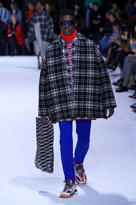
I start off my exposure on contemporary examples with the fashion industry, concretely Balenciaga, the renamed haute couture house. The firm was founded by Cristóbal Balenciaga, a Spaniard 20th Century designer worldly known for the fineness, elegance and sophistication of his garments construction. Despite the designer’s death in 1972, the brand went on producing and selling garments, accessories and perfumes up to current days.
Disregarding its refined birth, Balenciaga vastly differs from its roots’ essence. Now it produces outrageous, out of shape, disproportioned and provocative pieces that seek for the shock of the audience and uniqueness in the market. Imagery:
Balenciaga Fall 2018, Paris Fashion Week.
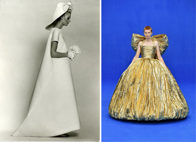
Balenciaga SS 1967. / Balenciaga SS 2020.
In the last image provided above, the drastic contrast between the designer’s vision and the brand’s current confection is blatantly exposed. Design and Anti-Design respectively.
Celebrity Magazines.
Magazines can be considered both a piece of art and design. When constructing a magazine, a handful of influencing factors come into play: the cover, the paper’s stiffness and texture, the binding, the template and ultimately the construction, all among other aspects that contribute to the final composition as a whole.
“Closer” is a celebrity magazine highly popular in the UK. This, as any other celebrity magazine you might find at a kiosk, works as a perfect medium to showcase cultural media idols in between publicity and announcements. These come in thin, oversaturated glossy paper held together by staples. The content spins around public sphere characters and their tensions between one another, or a close-up on the life or details of a given celebrity. Imagery:

Closer, issue 913.
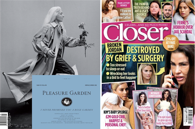
Pleasure Garden Magazine SS 2018. / Closer Magazine January 2018 issue.
The two images depicted above, once again, prove the gap between design and Anti-Design. Pleasure Garden is a British Magazine released on monthly issues, gently standing on firm covers which among contain high quality paper printed with beautiful imagery and writing on the cultural meanings and context of the garden.
Music.
As Plato said: Music is for the soul what gymnastics to the body. Music is beyond an art and form of expression; music ignites soothing, raging, grieving, happiness or melancholy in the depths of the self.
Anti-Design is present in this form too. Lately the trend of pre-cooked rhythms, ambiguous and unsubstantial lyrics have experienced an arousal. Reggaeton, extremely present and popular – especially in Spanish-speaking countries – is the best example of it.
This genre vastly dissonates from the rhythm and lyricism present in rock, contemporary electronic, flamenco, folk or reggae among many others.
Conclusion.
Design and Anti-Design, despite pertaining both to the same discipline, each it’s meant for a different use and function. Whilst design and art perform in the sake of beauty, functionality or aesthetics, Anti-Design plays a ludic role.
The word “function” falls deep into the silk of contemporary society’s subjectivism. Anti-Design has the function of entertaining and shocking us but differently than how design does – and, from my viewpoint, in a less cultural and artistic enriching way.
We, as a society, must be able to differ between enlightenment and leisure, between cognizant and nonchalant, between design and Anti-Design.
Bibliography.
https://www.creativereview.co.uk/anti-digital-graphic-design/
https://www.nngroup.com/articles/brutalism-antidesign/
https://www.widewalls.ch/magazine/anti-design-italian-movement
https://www.statista.com/statistics/321518/women-s-celebrity-weekly-magazines-ranked-by-sales-volume-uk/
https://magculture.com/blogs/journal/pleasure-garden
| |
My name is Tia Johnson, a Graphic and Media design student at LCC and I will be looking at the topic of Anti-design.
During late 2019 when the world was looking forward to celebrating a new decade, the unfortunate event of a global pandemic shook the world to its core and in a way shaped human behaviours and habits in a long-term way; we now see people wearing masks, socially distanced spaces, more sanitisation stations and a wide scale promotion of vaccinations.
Though the promotion of this is through scientific advice to stop a wider spread, how this promotional material got to the public was though campaigns using posters, advertisements and other creative technology to improve and educate within the pandemic.
Since 2019 up to current day, we have seen a rise in designers finding creative strategies to be a part of tackling of the global pandemic; as well as other important issues.
From a brief perspective, we can assume it is because anyone would love to use their talents to promote a world cause or come up with solutions that can better improve the earth; though from scratching through the surface you can start to see that designers are tackling their own problem; irrelevance.
There is now a need to be useful, and a dissolve of creation for pure aesthetics.
This is where we are seeing the rise in anti-design, the anti-design movement rewarded functionality rather than beauty, style, mass-production and greed.
Anti-designers wanted people to think about the objects they were buying or the material they were viewing, even if this product ended up being thrown away in the end.
An example I can give of a pandemic solution that embraces anti-design is the wearable pop-up ‘distance keepers’ designed by Anna-Sophie Dienemann; this accessory is to encourage social distancing as it pops out a ring of personal space for the wearer.
This is something that does not take in fashion as a clothing statement (though she has tried to make the garment as flattering as possible) this is a statement of safety and is functional as a protective device.
Picture: Models wearing the ‘Distance Keepers’ *photographer unknown*
A source I looked at for writing was the quote by Scott Ewen “Designers make the most beautiful trash.” From this quote I was conflicted to his meaning, was it a criticism of the overconsumption of materials used in design? Or was this a critique following design outcomes from corporations and mass production favouring looks to solving solutions?
In my course, I have been taught that a successful graphic designer needs to be a problem solver to add value to design works produced.
This quote also followed through my brain when looking at the article ‘The New Wave of Anti-design Magazines Will Question Your Sense of Taste-and That’s a Good Thing’ and the article ‘Coping with Irrelevance’ by Michael Johnson.
The wave of anti-design has hit the publishing industry, with Indie magazines shifting from the aesthetics of clean, minimalist, white spaced pages to unrestraint of rough, shabby and more-is-more design aesthetic.
Aesthetically, I believe that this shift has been brewing for a while, with the use of minimalism becoming a cliché in modern indie magazines, this new style of magazine allows freedom of creative expression for the designers, which is a refreshment to the ‘rules’ that are set out in publication.
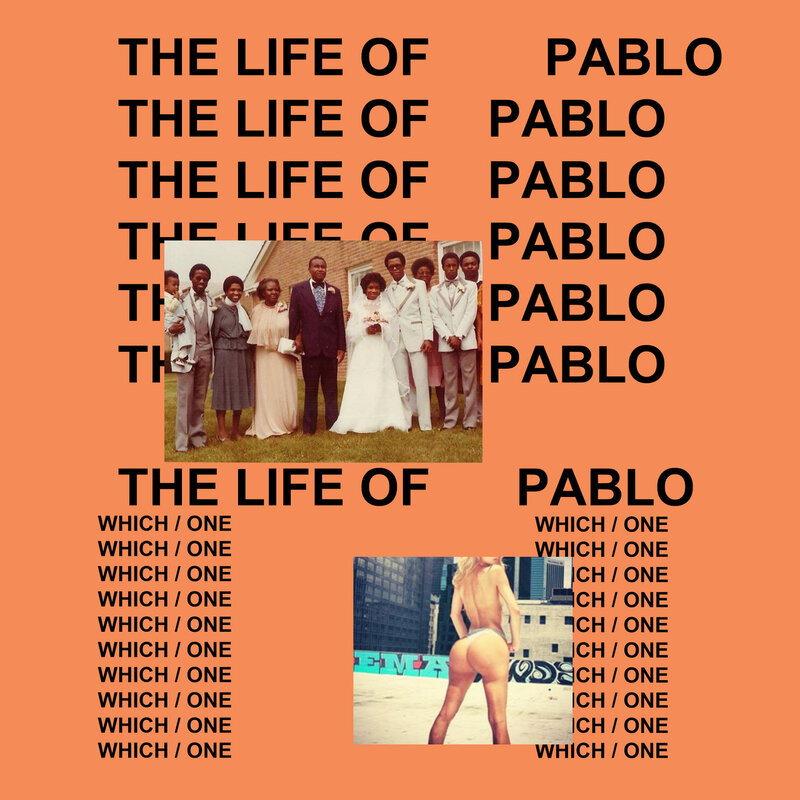
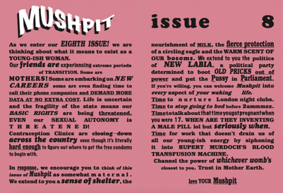
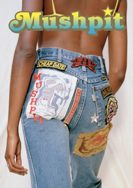
Interviewing Charlotte Roberts and Bertie Brandes, the creators of Anti-Design magazine ‘Mushpit’ they explain they were tired of feeling burned out from needing to produce works that fit mass-production and consumerism saying:
“We were both testing out jobs in fashion and were already quite disillusioned by our experiences. After one too many tellings off about not packing a sample in the correct tissue paper, parodying the industry became a no-brainer. Our aim is to provide an alternative and honest voice for young women.”
With honesty being their strategy, we have also seen a shift in production materials used in indie mags; with experimentation of cheaper paper, low-culture values and much more reductive price points.
This shift to me is to make the magazines more reachable to an audience, so that more people can see the message the magazine is trying to spread; this to me is a good goal however some could argue that it is clashing with anti-design as it could be seen as more mass productive with a lower price point, I argue that this is mainly to ensure different people (particularly working-class people who are pushed out of creative industries) get a view; I just hope that with the worries of sustainability these products are recyclable as the anti-design movement looks more into temporary than long term design solutions; which can have a negative effect on the planet with waste later.
Looking at the article ‘Coping with irrelevance’ by Michael Johnson, we see points of discussion that shows design communicators are going through a struggle of producing relevant works, from a design of the McDonalds golden arches being separated as point to social distancing, good idea but does it provide functionality to the issue?
He argues not, he says there is opportunities for designers to make a difference, however there is misdirection, consumer obsession and unconcentrated; that a few ad posts and posters will not change behaviour and have a strong presence.
I must disagree with his statement that a few adverts and posters will make a difference, throughout the pandemic posters displaying information on correct handwashing, information on the spread and general designs to improve moral of the communities has been a benefit; the government has used the talents of designers to promote campaigns that have in the long run been successful.
I do agree however that designers can think more of a relevant way to promote their skills within the pandemic, with an example of social media posts by Johnson Banks displaying typography layouts conveying the message of social distancing, as its creative and holds purpose.
During late 2019 when the world was looking forward to celebrating a new decade, the unfortunate event of a global pandemic shook the world to its core and in a way shaped human behaviours and habits in a long-term way; we now see people wearing masks, socially distanced spaces, more sanitisation stations and a wide scale promotion of vaccinations.
Though the promotion of this is through scientific advice to stop a wider spread, how this promotional material got to the public was though campaigns using posters, advertisements and other creative technology to improve and educate within the pandemic.
Since 2019 up to current day, we have seen a rise in designers finding creative strategies to be a part of tackling of the global pandemic; as well as other important issues.
From a brief perspective, we can assume it is because anyone would love to use their talents to promote a world cause or come up with solutions that can better improve the earth; though from scratching through the surface you can start to see that designers are tackling their own problem; irrelevance.
There is now a need to be useful, and a dissolve of creation for pure aesthetics.
This is where we are seeing the rise in anti-design, the anti-design movement rewarded functionality rather than beauty, style, mass-production and greed.
Anti-designers wanted people to think about the objects they were buying or the material they were viewing, even if this product ended up being thrown away in the end.
An example I can give of a pandemic solution that embraces anti-design is the wearable pop-up ‘distance keepers’ designed by Anna-Sophie Dienemann; this accessory is to encourage social distancing as it pops out a ring of personal space for the wearer.
This is something that does not take in fashion as a clothing statement (though she has tried to make the garment as flattering as possible) this is a statement of safety and is functional as a protective device.
Picture: Models wearing the ‘Distance Keepers’ *photographer unknown*
A source I looked at for writing was the quote by Scott Ewen “Designers make the most beautiful trash.” From this quote I was conflicted to his meaning, was it a criticism of the overconsumption of materials used in design? Or was this a critique following design outcomes from corporations and mass production favouring looks to solving solutions?
In my course, I have been taught that a successful graphic designer needs to be a problem solver to add value to design works produced.
This quote also followed through my brain when looking at the article ‘The New Wave of Anti-design Magazines Will Question Your Sense of Taste-and That’s a Good Thing’ and the article ‘Coping with Irrelevance’ by Michael Johnson.
The wave of anti-design has hit the publishing industry, with Indie magazines shifting from the aesthetics of clean, minimalist, white spaced pages to unrestraint of rough, shabby and more-is-more design aesthetic.
Aesthetically, I believe that this shift has been brewing for a while, with the use of minimalism becoming a cliché in modern indie magazines, this new style of magazine allows freedom of creative expression for the designers, which is a refreshment to the ‘rules’ that are set out in publication.
Interviewing Charlotte Roberts and Bertie Brandes, the creators of Anti-Design magazine ‘Mushpit’ they explain they were tired of feeling burned out from needing to produce works that fit mass-production and consumerism saying:
“We were both testing out jobs in fashion and were already quite disillusioned by our experiences. After one too many tellings off about not packing a sample in the correct tissue paper, parodying the industry became a no-brainer. Our aim is to provide an alternative and honest voice for young women.”
With honesty being their strategy, we have also seen a shift in production materials used in indie mags; with experimentation of cheaper paper, low-culture values and much more reductive price points.
This shift to me is to make the magazines more reachable to an audience, so that more people can see the message the magazine is trying to spread; this to me is a good goal however some could argue that it is clashing with anti-design as it could be seen as more mass productive with a lower price point, I argue that this is mainly to ensure different people (particularly working-class people who are pushed out of creative industries) get a view; I just hope that with the worries of sustainability these products are recyclable as the anti-design movement looks more into temporary than long term design solutions; which can have a negative effect on the planet with waste later.
Looking at the article ‘Coping with irrelevance’ by Michael Johnson, we see points of discussion that shows design communicators are going through a struggle of producing relevant works, from a design of the McDonalds golden arches being separated as point to social distancing, good idea but does it provide functionality to the issue?
He argues not, he says there is opportunities for designers to make a difference, however there is misdirection, consumer obsession and unconcentrated; that a few ad posts and posters will not change behaviour and have a strong presence.
I must disagree with his statement that a few adverts and posters will make a difference, throughout the pandemic posters displaying information on correct handwashing, information on the spread and general designs to improve moral of the communities has been a benefit; the government has used the talents of designers to promote campaigns that have in the long run been successful.
I do agree however that designers can think more of a relevant way to promote their skills within the pandemic, with an example of social media posts by Johnson Banks displaying typography layouts conveying the message of social distancing, as its creative and holds purpose.

1st Picture: Social Media post by Johnson Banks and Nick Asbury

2nd Picture: McDonalds social distancing promotional poster
I do agree with his statement that some designs seem ineffective and selfish, with McDonalds social distancing poster garnishing a few laughs here and there is doesn’t particularly stand out in comparison to other meaningful designs; some could argue that the McDonalds image is shamelessly self-important.
My summary of what I think of anti-design is that it has good intentions, but I can understand that it may not work in long term solutions such as for corporate or mass production; anti design does though display to me a personal development of an idea and problem solving; which for a creative graphic designer like me is a very interesting movement to document.
Sources used
Michael Johnson. (2020). Coping with irrelevance. Available: https://www.johnsonbanks.co.uk/thoughts/coping-with-irrelevance. Last accessed 05/12/21.
Ruth Jamieson. (2016). The New Wave of Anti-design Magazines Will Question Your Sense of Taste—and That’s a Good Thing. Available: https://eyeondesign.aiga.org/the-new-wave-of-anti-design-magazines-will-question-your-sense-of-taste-and-thats-a-good-thing/. Last accessed 05/12/21.
Jennifer Hahn. (2021). Anna-Sophie Dienemann creates wearable pop-up "distance keepers". Available: https://www.dezeen.com/2021/02/02/anna-sophie-dienemann-bounding-spaces-social-distance-keepers-coronavirus/. Last accessed 05/12/21.
Charles Moffat. (2011). Anti-Design. Available: http://www.arthistoryarchive.com/arthistory/antidesign/#:~:text=Anti%2DDesign%20was%20a%20design,and%20used%20irony%20and%20kitsh.&text=In%20architecture%20this%20was%20also%20known%20as%20the%20Radic. Last accessed 05/12/21.
Ruth Kruger - 19021057
Through my new venture into the industry, I have seen the way that advertising and design can be overused in order to market a brand or product. The market for advertising and the market for overconsumption are often two sides of the same coin. In the effort to stop climate change design also has its part to play. Anti-design can be seen as a way to break the current mould; allowing younger generations to have their say.
“Recent events of 2020 have also caused this uprising in anti-design…looking back through the years art has always been a reflection of society” (Satori Graphics, 2021)
We can attribute this rise in anti-design to the disillusionment of the youth during 2020. Covid not only caused a massive shift in the economy and day to day life but also political unrest. I believe that anti design has now become a tool for these disenfranchised youths to reintroduce politics, socio-economic issues and ‘taboo’ opinions into design. This element of rebellion is not without cause and is probably why this movement is so intriguing. However, I do believe that you have to be aware of some of these rules before you break them. Similar to its comparison to brutalism, anti-design focuses on user disruption instead of integration. “Web brutalism is inspired by the brutalist architecture of the 1950s. Brutalist buildings are characterised by their heavy and ‘ruthless’ appearance.” (Moran, 2017)
Just as brutalism focuses on the idea of form over function, anti-design uses basic blocky elements, clashing colours, illegible type and outdated icons to assault the eyes and gain a reaction from the user.
We often design things to be palatable to a general audience while this new wave of online protest disrupts that. “Anti-design has provoked resistance in the UX community, because in many ways its goals feel like the antithesis of UX design.” (Fagerli, 2019)
The antithesis of UX design is particularly interesting to me because of the specific rules we as designers follow in this particular area. Legibility, harmonious colours, clean and easy to navigate platforms have become the new predictable face of almost any major company. This is considered design purity – following these rules will lead to a ‘good design,’ Following this narrative of purity in design culture - is the real reason there is such pushback on anti-design because it doesn’t follow the rules or because it moves us away from this over designed over saturated market?
“Retro and Vernacular design gave graphic designers liberation, creative freedom, a freedom to be personal and intuitive, and a willingness to go against modern design standards of the twentieth century.” (Willets, 2019)
Just as many designers in 90s New York went against the tide by using “old, ugly and unreadable” typefaces, we should see this new wave as a response to the overly corporate world of design. I do believe that people respond far more to humanising elements of design which is why we often see these ‘retro-resurgences.’
Just like then designers pushed back on what was deemed improper design- “because they began their careers on formal purity and typographic refinement” (Willets, 2019) we see pushback now against this movement because it doesn’t follow the standard definition of design. Having worked for a few places now I have found that companies claim to want something ‘original’ but end up asking me to replicate the same design that everyone else is using. I understand why, if you see other companies implement something successfully there’s no need for you to test the waters yourself. However, this has led to “corporate design” or what I like to call the fruits of capitalism.
“The pursuit for ever-increasing conversion rates, ever-shorter time for the user to find information and ever-optimisation of everything that is measurable in the short-term, creates a bland, dull and uninteresting experience.” (Fagerli, 2019)
This is not to say there isn’t value in this type of design, just that it suffocated the industry and leaves little room for growth. I have often found myself removing my creative visions or quirks from works because it wouldn’t fit with a company’s image, only to realise how generic the image I’ve created actually is. Corporate design takes away this intrinsic human element that I look for in design. Just as people appreciated the resurgence of 70s fonts in the 90s where Helvetica had once reigned supreme, anti-design now has the task of showing us the irony of our over streamlined ‘perfected’ design today.
There are many artists with growing popularity online that I resonated with such as Callum Abbot’s work. Abbot uses a mix of 2000s and early 90s graphics, bold, squiggly and almost illegible type to create this gradient, windows wallpaper, flip phone mess. His work feels so fresh even though it uses recycled elements.
“He found himself sacrificing any actual function of illustration in favour of “communicating the themes of the article,” instead plastering his work “amorphous blobs,” 3D bevels and ecstatic neon colour palettes.” (Bennet, 2020)
It’s such a stark contrast against the most amenable colour and type approach of larger design agencies such as Pentagram who focuses on minimal accessible but also well executed design. I think it’s easy to disregard Callum’s work when comparing it to our usual Instagram feed of minimal branding but there’s a certain charm to it that I can’t shake. In my own work I feel as if I’ve been trying to achieve something more palatable and leaving elements considered too bold for client work behind. I think as designers we should be challenging what ‘good’ design really is constantly…otherwise it’s just boring. Overall, my take if you will is that design should be an ever changing beast, there’s always going to be elements that we dislike and others we are drawn to. But the value in anti-design is that it gives designers a voice and shows how graphic design is an art form before it is a commercial weapon.
Bibliography :
Satori Graphics, 2021. Will ‘ANTI DESIGN’ Takeover The Graphic Design World!?. [youtube video] Available at: <https://www.youtube.com/watch?v=Bv7a3TcxugQ> [Accessed 1 December 2021].
Moran, K., 2017. Brutalism and Antidesign. [Online Article] NNGroup,
Available at: <https://www.nngroup.com/articles/brutalism-antidesign/> [Accessed 1 December 2021].
Fagerli, I., 2019. Why does everything look the same?. [Online Article] UX Collective
Available at: < https://uxdesign.cc/form-is-function-9a58e9f8bb75> [Accessed 2 December 2021].
Willets, B., 2019. Breaking design purity. [Online article] Medium
Available at: <https://medium.com/@brandywilletts/breaking-design-purity-57bef84a81f8>[Accessed 2 December 2021].
Bennet, H., 2020. Callum Abbott on "egalitarian" design, the age of the internet and his striking speculative practice. [Online article] It’s Nice That. Available at: < https://www.itsnicethat.com/articles/callum-abbott-graphic-design-111120> [Accessed 1 December 2021].


Archives
December 2021
June 2021
May 2021
April 2021
March 2021
January 2021
December 2020
November 2020
September 2020
August 2020
 RSS Feed
